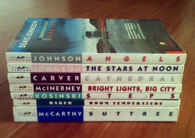
I’ve been a fan of Vintage Contemporaries for years. I’m pretty sure the first one I ever picked up was Raymond Carver’s Cathedral. I recall being vaguely dismayed about the cover and trying to find another used edition, but thrift won out. This was in the early or mid nineties, and book design was trending toward a more minimal, conceptual style.
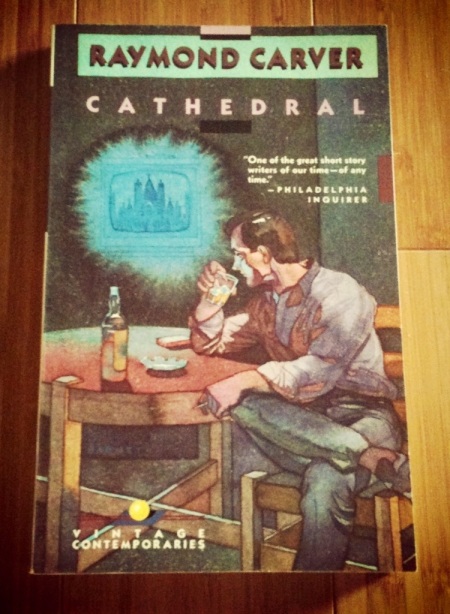
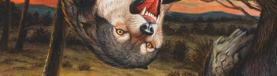
In contrast to a tasteful, minimalist cover, the Vintage Contemporaries edition of Cathedral is garishly literal. Ditto the cover for Denis Johnson’s Angels: sure, there’s a symbolic touch in those storm clouds, and a surreal tweak in the laser lights, but there’s something ghastly about the whole design.

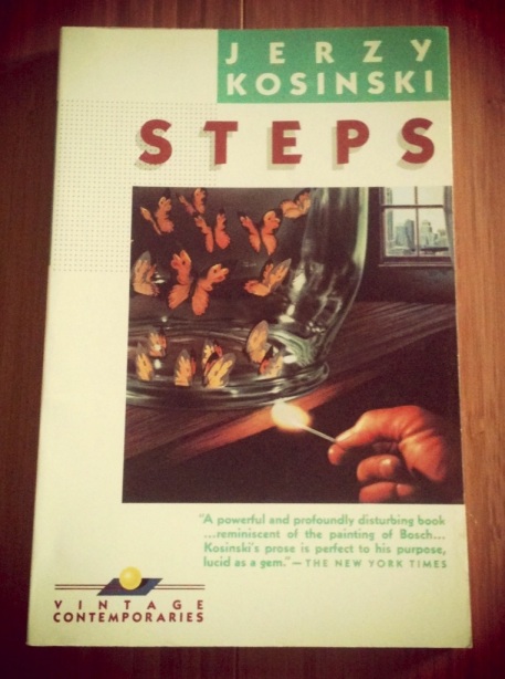
Even the cover for Jerzy Kosinski’s twisted horrorshow-in-vignettes Steps is remarkably literal—sure, the image seems surreal, but it’s straight out of Kosinski’s text. (It’s also one of my favorite covers in the line).
Anyway, in the past few years I’ve kept an eye out for certain titles from the Vintage Contemporaries line, even if I already own the book in another edition—DeLillo, for instance, or Cormac McCarthy. I was thrilled to find this edition of Suttree earlier this year. (And I’d love to get another copy of Harold Brodkey’s First Love and Other Sorrows; I gave mine away to a friend).
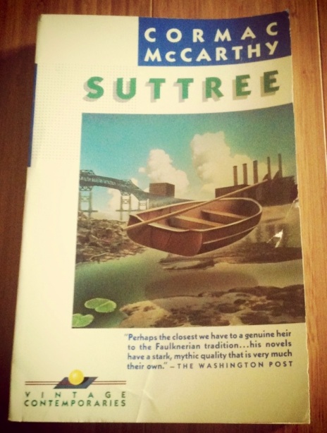
I’d been wanting to write about the Vintage Contemporaries series for a while now, and had even gone so far as to write to a few artists and designers I know to see if they could put me in touch with a source of info. A few weeks ago, Mahendra Singh was kind enough to point out a thorough, in-depth essay on Vintage Contemporaries over at Talking Covers. Plenty of history, photos, and even interviews. It’s the mother-lode, the post I wished I could’ve mustered. (And if I seem a bit jealous, I can console myself in the knowledge that they used my first pic of Suttree. So there’s that). I encourage you to check it out.

I like more minimalist covers myself.
LikeLike
They seem like an acquired taste. The more I see of these covers, the more I am starting to like them. For a while, I thought they were both hideous and beautiful at the same time, but now I think they’re great almost without exception. Pretty nice to see that amount of craziness let loose in a pretty popular series. Compare that to what you see on books today: They’re either literal respectively vaguely relevant photos (without the touch of surrealism) or plain typographical ones, which is a beautiful thing of its own — but certainly not very crazy.
I don’t know if my tastes just go to shit the older I get or if I can kind of appreciate marred beauty more. These covers are like Philip K. dick’s writing — clumsily conveyed but beautiful mindfucks.
LikeLike
“These covers are like Philip K. dick’s writing — clumsily conveyed but beautiful mindfucks.” — Lovely. Yeah, I think you’re spot on.
You know, it’s likely that each age will of course offer its own aesthetic vision of book covers (uh, if book covers are still around in the future)—I think that the current aesthetic reappraisal of cheap Penguin editions, for instance, likely says more about our current age than the past.
LikeLike
Wow! There’s definitely something queasily compelling about these. The whole “just paint a scene from the book!” school of cover art is hilarious, and just a little better than “take a photograph of people posed up like the characters”, tackiness wise. Great post.
It’s not a Vintage Contemporary — it’s so much worse, honestly — but if you haven’t seen the first edition cover of DFW’s debut novel, the Broom of the System, it’s cut from the same cloth. It’s got a bizarre collage of plot elements from the book, done up in a preposterous 80s aesthetic, like sitcom credits or a really bad issue of 3-2-1 Contact. Great for the train! http://truancypark.files.wordpress.com/2012/10/broom.jpg
LikeLike
The DFW cover is not a VC, but it’s definitely of the same school/era. Thanks for the share, Mr. Park.
LikeLike
[…] which has intrigued me for awhile now, Denis Johnson’s Fiskadoro—in the Vintage Contemporaries edition no less!—and Lydia Davis’s novel The End of the Story, which I somehow haven’t read yet. […]
LikeLike
[…] Louie; cover photo illustration by Marc Tauss. I’ve already written about my love of Vintage Contemporaries covers, and finding this copy of Suttree a few years ago was glorious. I’ve been rereading […]
LikeLike