I was delighted to stumble across the design work of Itamar Lerner whilst looking for Joycean images on the web (I now give myself one demerit for using the execrable phrasal verb “stumble across” to describe a web search, two demerits for using the unforgivably pretentious and archaic conjunction “whilst,” a hundred demerits for not editing the original sentence in the first place, and a thousand demerits for this long-winded excuse).
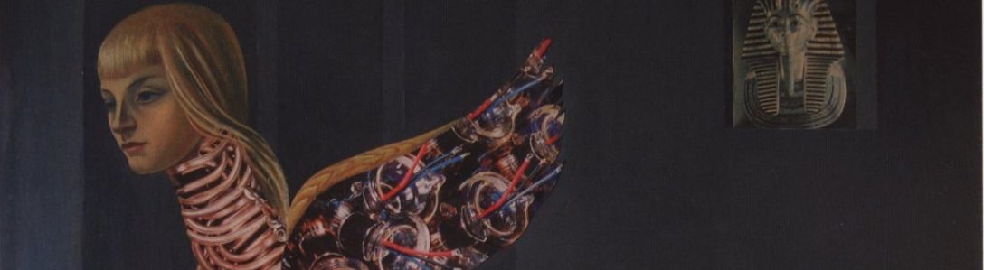
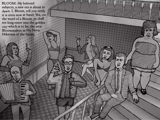
Lerner’s images of Ulysses do justice to both the humor and the pathos of Joyce’s complex episodes. Lerner’s self-described medium of “ink on cut out papers” creates a shaded depth that evokes comic strip art by way of a Punch and Judy show. I like it!
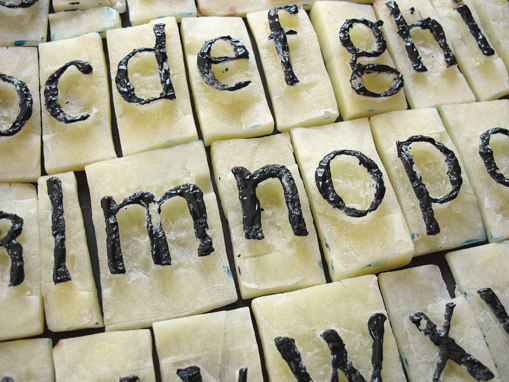
Lerner’s portfolio attests to his masterful fontsciousness: in addition to his original typefaces, he’s designed alphabets in wax, cement, and–my favorite–potatoes:

Speaking of Joyce, “The Boarding House” from Dubliners has been illustrated and animated. It can be viewed here:
http://www.adamsmithacademy.org/Streams/The_Boarding_House_by_James_Joyce1_stream.html
LikeLike