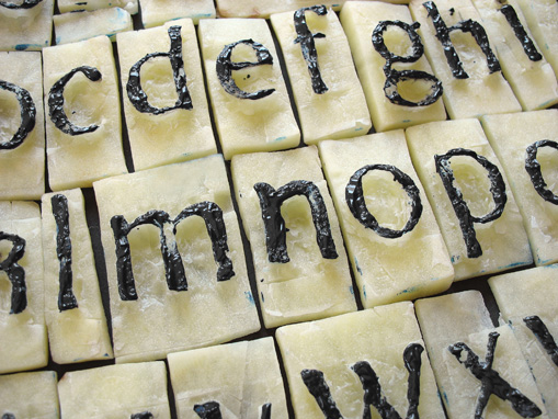
“Directions for the Construction of the Text” — Albrecht Dürer
(From Of the Just Shaping of Letters).
THE letters which are usually called “text,” or quadrate, it was formerly customary so to write, although they are now imitated by the new art, as presently I shall show below. Although the alphabet begins with the writing of A, yet shall I (not needlessly) in the first place undertake to draw an I; because almost all the other letters are formed after this letter, although always something has to be added to it or taken away.
First make your I of equal squares, of which three are properly set one over the other; and the top of the top one, and the bottom of the bottom one, divide in two points, that is to say, into three equal parts: then set a square equal to the others in an oblique manner, so that its diagonal be vertical, and its angle on the first point of the top square. In this way, this oblique square shall extend with its angles more to the left than the right. Then produce upwards on either side, after the width of the superposed squares, right lines to meet the sides of the oblique set square. Next do below precisely as you did above, except that you must set the angle of the oblique square on the second point, that is, the one farthest to the right in the bottom of the lowest square; and let fall your lines on either side upon the transposed square: so will I be perfect; only above it draw with a fine pen a tiny in-crescent. Continue reading ““Directions for the Construction of the Text” — Albrecht Dürer” →

