

I went to the book store this afternoon to pick up a copy of the latest graphic novel in by Kazu Kibuishi’s Amulet series for my kids, and of course I browsed a while. Looking for a copy of Anne Carson’s Plainwater, I ended up finding Angela Carter’s 1972 novel Infernal Desire Machines of Doctor Hoffman. It’s a British edition, 1985, Penguin, with a lovely Boschian cover by James Marsh. Here’s a detail from the cover:

I’ve wanted to pick up Carter’s novel since I read about it on a silly good dystopian fiction list last year, and I’m thrilled that I was able to get one with a Marsh cover. This particular cover, along with Marsh’s cover for The Bloody Chamber, are included in Phil Baines lovely book Penguin by Design.
Baines’s book doesn’t include any of Marsh’s fantastic covers of J.G. Ballard novels, opting instead to include Dave Pelham’s versions. I love both Pelham and Marsh’s Ballard covers, and would love to get my mitts on one at some point. I always browse for old mass market paperbacks of sci-fi authors I like — Philip K. Dick, Ursula K. LeGuin, the Strugatsky Brothers, J.G. Ballard — hoping to find an interesting cover, something inventive and fun, something from before their works were, under the cloak of awful respectability, given safe, boring literary covers. I didn’t find any Ballard editions with Marsh or Pelham covers, but I did come across this lovely pair of mass market paperback:

They’re US Vintage versions, 1985, with covers by Chris Moore. There’s like a proto-Cherry 2000 thing going on here that I kinda love, but I already own these novels, and I don’t love the covers quite enough. So instead, this post. Here are the covers of my copies of Crash and Concrete Island:
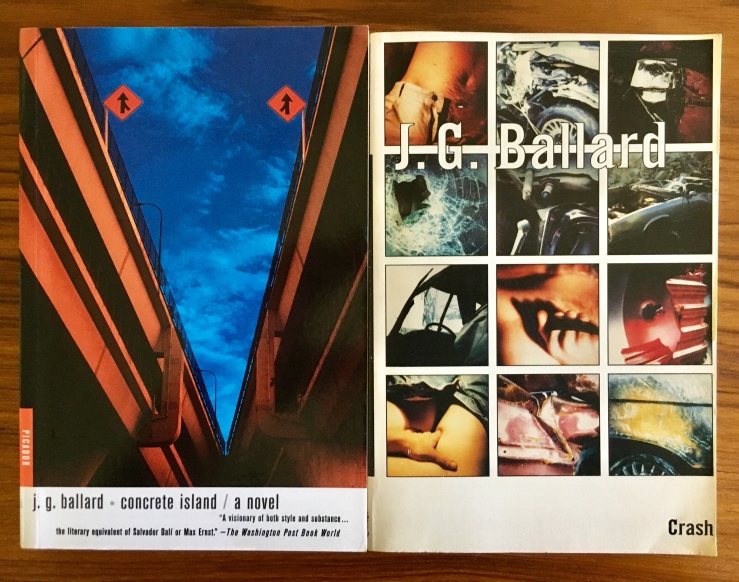
While Henry Sene Yee’s cover design for my copy of Concrete Island (using a photograph by Kevin Laubacher) isn’t terrible, it is a good example of what I mean by boring respectable literary covers. Still, this trade edition (Picador, 2001) is really readable—I mean, it’s easy to read. The pages are nice, the typeset is great, etc. (And the book is killer). I actually like the cover of my copy of Crash, a lot (design by Michael Ian Kaye and Melissa Hayden), but it’s also trying just a little too hard. (Again—very readable version from FS&G’s Noonday Press imprint, 1994).
While I had to pass today on the mass market copies of Crash and Concrete Island today—not because they would have set me back five bucks in store credit, but because I don’t need them, because I hope some kid goes in there and picks them up—while I had to pass on those lurid beauties, I did pick up a mass market 1967 copy of The Crystal World. Publisher Berkley Medallion didn’t bother to name the cover designer/artist, and I haven’t been able to track it down, but it is, I admit, a bit disappointing—an early pulp bid for literary respectability. At least I can be on the look out for a weirder one in the future.
