If you follow this blog even semi-regularly, you may know that I frequently frequent Chamblin Bookmine. This sprawling bookstore, with an inventory of close to three million books (mostly used, and often very weird), is about a mile from my house, and in some small ways might constitute a mute coauthor of this blog. I don’t get to their second location, Chamblin Uptown (in downtown Jacksonville) that often, and even less during the last few years (for obvious reasons), but I went downtown to watch my nephew wrestle last Sunday, and stopped by. In addition to a pair of Ishmael Reed massmarket 1970s paperbacks, I fetched a small stack of first-edition hardbacks by Donald Barthelme, William Burroughs, and Barry Hannah.
I was thrilled to find a first-edition of Donald Barthelme’s first novel Snow White (Atheneum, 1970), with a jacket by Lawrence Ratzkin. The cover sans jacket is also nice:
Overnight to Many Distant Cities isn’t Barthelme’s best collection, but I couldn’t pass up a first edition (G. P. Putnam’s Sons, 1983). The cover features a photograph by Russell Munson.
So far this year, William S. Burroughs’ late novel Cities of the Red Night has been a reading highlight for me: apocalyptic, utopian, discursive, funny, and more poignant than I had remembered when I first read it two decades ago. I couldn’t pass up on a first-edition of its sequel, The Place of Dead Roads (Holt, Rinehart, and Winston, 1983) with a jacket by Robert Reed (working from an old uncredited photograph). I found an audiobook of Dead Roads at my local library, so I might give that a shot.
I also grabbed a signed copy of Barry Hannah’s semi-autobiography, Boomerang (Houghton Mifflin, 1989), with a cover by one of my favorite designers, Fred Marcellino. Here’s the autograph:
Marcellino also did the cover for another signed Hannah I have, Captain Maximus (wait, is this Five Books?):
I found two first-edition hardback Ursula K. Le Guin novels—my favorite Le Guins at that!—for next to nothing last week at my favorite local used bookstore.
The simple, elegant cover for Le Guin’s 1969 novel The Left Hand of Darkness was designed by Lena Fong Lueg. It employs an illustration by Jack Gaughan.
The jacket for 1974’s The Dispossessed was designed by Fred Winkowski.
In 2015, I undertook the project of reading (or in some cases rereading) Le Guin’s so-called Hainish novels. I wrote about those novels in a long post in January of 2016. Of the (maybe) eight novels in the Hainish cycle, The Left Hand of Darkness and The Dispossessed are easily the strongest (although I really loved the one-two punch of Planet of Exile (1966) and City of Illusions (1967)).
Here is what I wrote about The Left Hand of Darkness:
The Left Hand of Darkness is amazing. Perfect in its strange imperfections and crammed with fables and myths and misunderstandings, it is the apotheosis of Le Guin’s synthesis of adventure with philosophy. Darkness is about shadows and weight. About pulling weight—literally, figuratively. It’s also the story of an ice planet. (A stranger comes to the ice planet!). It’s a political thriller. It’s a sexual thriller. But the impression that lingers strongest: The Left Hand of Darkness is one of the better literary evocations of friendship (its precarious awful strange wonderful tenuous strength) that I’ve ever read.
And here is what I wrote about The Dispossessed:
The Dispossessed feels closer to Le Guin’s non-Hainish 1971 novel The Lathe of Heaven in some ways than it does to its so-called Hainish kin. Both novels formally (and spiritually) evoke yin and yang, opposition, conflict, stress, and, ultimately, synthesis. The Dispossessed is a riff on anarchy and stability, allegiance to one’s community and family weighed against personal vision and ecumenical dreams.
I also claimed that The Dispossessed is the best starting place for those new to Le Guin, but I think The Left Hand of Darkness is equally good, as are her Earthsea novels.
I went to the bookstore today to take one last shot at finding a copy of Walker Percy’s 1971 novel Love in the Ruins (preferably a first-edition hardback…why not signed, while I’m dreaming? In pristine condition? Or an interesting beat up mass market paperback? I would’ve settled for an ugly tasteful prestige trade paperback at this point). No luck, but I just checked out a digital copy from my library.
I came across this lovely 1972 Pocket Books mass market paperback copy of Angela Carter’s 1969 novel Heroes and Villains. I’m pretty sure the hornyassed so-seventies cover is by Gene Szafran, but no illustrator is credited. The back cover illustration is some psychedelic horniness too:
I know I’ve ranted on here about the trend towards tasteful book covers over the past few decades. I appreciate simple, handsome covers, to be clear—hey, look at this copy of Mark Spilka’s 1963 study Dickens and Kafka—
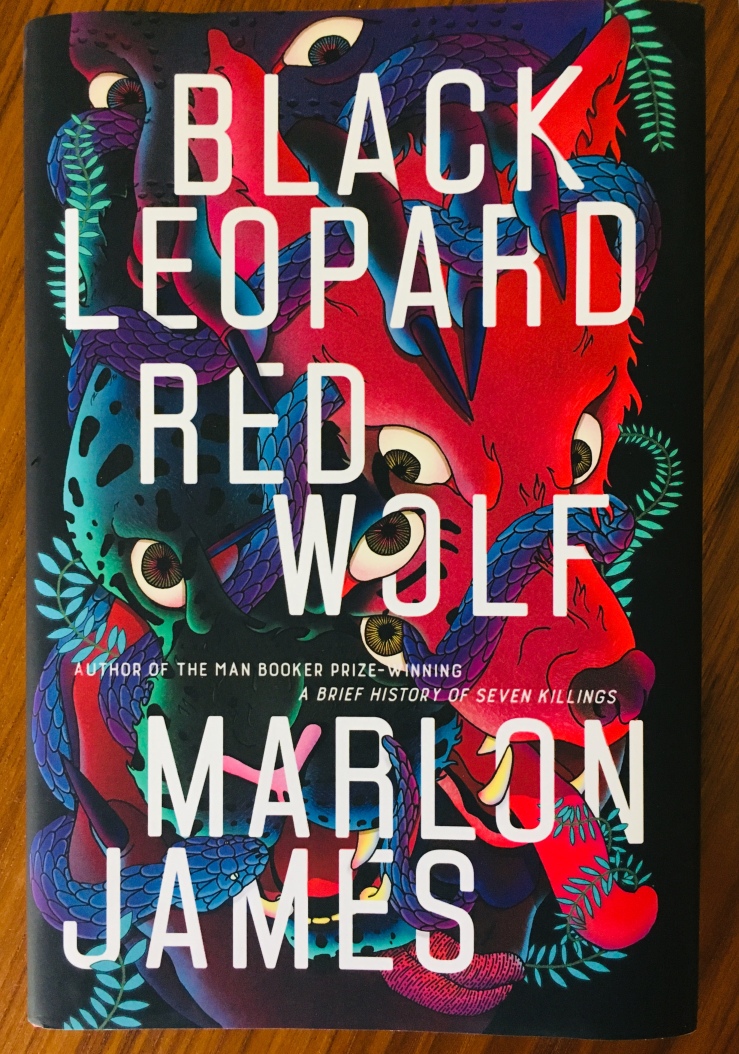
—I mean appreciate simple, handsome covers, to be clear—but there’s a sameness in contemporary design that is a bit wearying—I see so many new books that look like every other new book. I suppose though that the same could be said about the two examples above, each specimens of their time. Perhaps a few decades from now I’ll reflect fondly on the bold, oh-so Instagrammable cover for the first edition of Marlon James’s novel Black Leopard, Red Wolf. (jacket design by Helen Yentus; jack illustration by Pablo Gerardo Camacho):
Chimera by John Barth. First edition 1973 hardback from Random House. Jacket design by George Giusti.
I couldn’t pass up this pristine first edition Barth today when browsing the used bookstore with my kids. I first read Chimera twenty or more years ago, as an undergrad, and it broke my brain a bit.
The Last Gentleman by Walker Percy. Second printing 1972 trade paperback from Noonday. Cover design by Janet Halverson.
Earlier this year in the same used bookshop I came across a first edition hardback copy of Percy’s 1971 novel Love in the Ruins. I hadn’t read Percy at the time (I’ve since loved his later novel Lancelot and been kinda sorta iffy on his famous debut The Moviegoer), but Janet Halverson’s oh-so-seventies Schoolhouse Rock!ish cover grabbed my attention. I really wish I’d bought it now (I think it was six bucks). Two weeks ago I came across two more Percys (Percies?) with Halverson covers, but let them be. But not today—at least not for this copy of The Last Gentleman.
A Woman Named Drown by Padgett Powell. First edition 1987 hardback from FS&G.. Jacket design by Cynthia Krupat, using a photograph by William Wegman.
On the aforementioned-fortnight-last trip to the bookstore, I picked up, somewhat at random, Padgett Powell’s first novel Edisto. I finished it in three days, enjoying it very much, so I couldn’t pass up this copy of his slim second novel today.
I’ve made a habit of prowling around my own shelves each week, trying to build a small stack of books I can part with. I then head up the street to trade the books in. Lately, I’ve done a decent job of leaving with far fewer books than I brought in to trade—hell, last Friday I came back with no books.
I always have a little mental checklist of books I’m hoping to come across. It mutates and swells, and I get lucky a lot of times. Sometimes I grab stuff at near-random. And other week’s are stale. Increasingly, I search for first editions and interesting mass market paperbacks, a reversal of a previous version of myself who found hardbacks clunky and mass market paperbacks cheap. Mass market editions tend to have wilder art, more interesting designs, and generally take more risks than contemporary, respectable trade paperbacks, as do older hardbacks. I ended up with three first editions. I was not especially looking for any of the books I acquired.
I was looking for certain books of course. Here are some interesting book covers I saw while looking for what I did not find.
I was looking for Walker Percy’s second novel Love Among the Ruins. I’d found a copy at this same book store last year—a first edition in beautiful condition with a really cool cover. I almost bought it (I think it was seven bucks) and now regret not having done so. I’m sure I’ll regret skipping on both of these Percy books, both of which have cover designs by Janet Halverson.
I wasn’t looking for anything in particular when I saw this hardback copy of Nevil Shute’s On the Beach, but the font on the spine attracted me. Love the cover painting, which is by Richard Powers (I assume this is a different Richard Powers than the American novelist).
I wasn’t looking for anything in particular when I picked up this Bantam collection of Mark Twain stories, which has a very cool uncredited Giuseppe Arcimboldoesque cover. Not sure why I picked it out. But I love the cover.
I was hoping to score a cheap paperback copy of one of David Marskon’s early novels when I came across this edition of Thomas Mann’s Buddenbrooks with a cover by Ben Shahn.
I was looking for anything by Gerald Murnane when I found this beautiful edition of Robert Musil’s Young Torless.
The bookshop I frequent separates “Classic Fiction” from “General Fiction” (with some somewhat arbitrary distinctions, in my opinion)—so I checked under the “PE” section in general fiction for a stray Walker Percy (no luck). Never heard of J.Abner Peddiwell’s The Saber-Tooth Curriculum but I love the simple expressive cover.
Walking past “PE,” “PI,” “PL” etc. I stopped at section on James Purdy to check out this edition of The Nephew. I’ve never been able to get into Purdy—seems so sad—but I love this cover.
I was looking for an original edition of Charles Wright’s 1973 novel Absolutely Nothing to Get Alarmed About; I have it in an omnibus, but I’d love a stand alone if I could find one. I did see this edition of The Messenger. The cover is terrible and boring and has way too much text on it. I found a copy of The Messenger a few months ago with a far more interesting cover.
I always look for a copy of David Ohle’s cult novel Motorman and I never find it. I do like this vibrant cover for Chad Oliver’s The Shores of Another Sea.
While I was in the sci-fi section, I passed by the Gene Wolfe area, and spied a complete hardback set of his seminal The Book of the New Sun tetralogy. I couldn’t pass up on a first hardback edition of the first in the series, The Shadow of the Torturer:
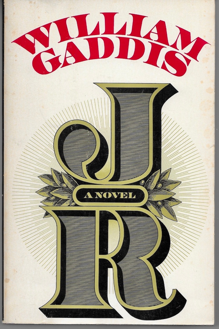
I also picked up a pristine first edition hardback copy of William Gaddis’s 1994 novel A Frolic of His Own. It’s the only Gaddis novel I’ve yet to read and buying a second copy seems like a good motivation to finally dig in.
I also came across a first edition hardback copy of Padgett Powell’s first novel Edisto. I’ve always felt ambivalent about Powell. He was the writer in residence at the University of Florida when I was an undergrad there in the late nineties. He’d taken the post over from Harry Crews, and I always resented that for some reason, brought that resentment to the few readings I attended, never made it through anything but a few stories. But this copy of Edisto was only four bucks. And check out the blurbs on the back:
There’s my guy Barthelme. And then Percy, who brought me to the store today. I’ll give it a shot.
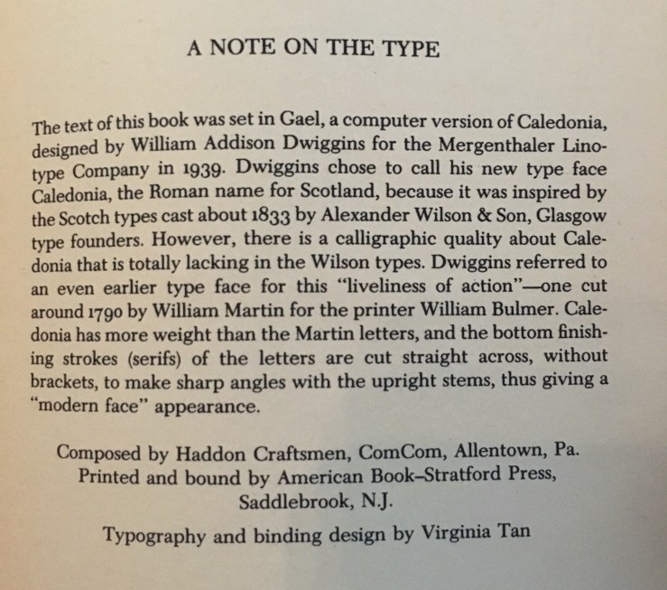
J R by William Gaddis. 2020 trade paperback edition by NYRB. Cover design by Katy Homans. Introduction by Joy Williams (xi pages). 770 pages.
J R by William Gaddis. 1993 trade paperback edition by Penguin. Cover art is a detail of an Associated Gas and Electric Company stock certificate “Courtesy of William Gaddis.” No designer credited. Introduction by Frederick R. Karl (xxi pages). 726 pages.
J R by William Gaddis. 1975 trade paperback edition by Borzoi/Knopf. Cover design by Janet Halverson. 726 pages.
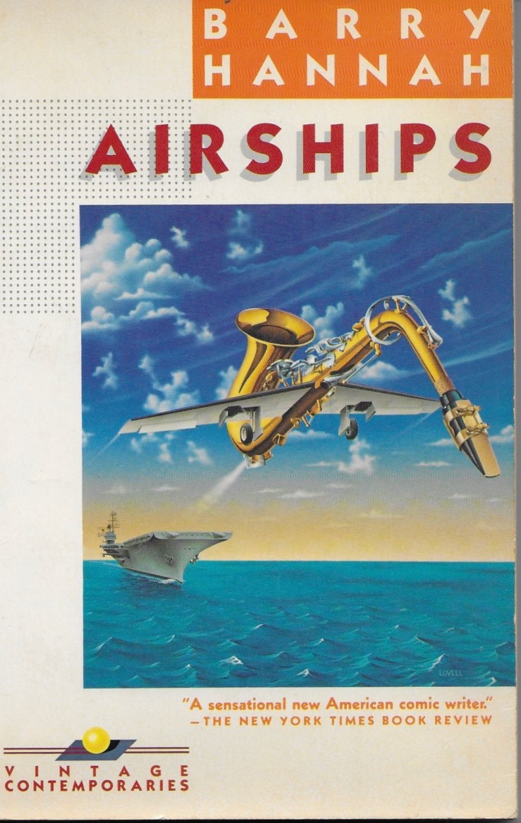
I’ve been a big fan of the Vintage Contemporaries 1980s series for ages now. The books were easily available, cheap and used, in the nineties, and I first read Raymond Carver and Jay McInerney in VC editions, later adding novels by Denis Johnson, Don DeLillo, Jerzy Kosinski to the burgeoning collection. I was thrilled to find a VC copy of Cormac McCarthy’s Suttree years ago; I wasn’t looking for it in particular, but the spine of a Vintage Contemporaries edition is hard to miss in a used bookstore. I picked it up of course, and gave the Vintage International edition I’d read to a friend who’d just finished Blood Meridian. The dark, moody Vintage International covers strongly contrast the bright, vivid VC edition (with a surreal painting by Marc Tauss):
In time, I’d unshelve at least one or two VC editions when browsing a used bookstore, especially if it was an author I’d been meaning to read. I ended up reading and loving Joy Williams’ first collection, Taking Care, that way, as well as Charles Portis’s Norwood (which led to me reading every Portis novel I could get my hands on).
The one I really, really wanted though was the Vintage Contemporaries edition of Barry Hannah’s collection Airships. I must have seen it first–just the spine–in this great write up of VC designs at Talking Covers, and then added it to a mental list of titles to check for. There’s absolutely nothing wrong with the Grove Press copy I have of Airships; indeed, I really dig its photorealistic cover by Hannah’s contemporary Glennray Tutor—but I guess at this point I have to admit I’m collector (of cheap eighties paperbacks).
In his 1978 collection Airships, Barry Hannah sets stories in disparate milieux, from the northern front of the Civil War, to an apocalyptic future, to the Vietnam War, to strange pockets of the late-twentieth century South. Despite the shifts in time and place, Airships is one of those collections of short stories that feels somehow like an elliptical, fragmentary novel. There are the stories that correspond directly to each other — the opener “Water Liars,” for instance, features (presumably, anyway), the same group of old men as “All the Old Harkening Faces at the Rail.” The old men love to crony up, gossip, tell tall tales. An outsider spoils the fun in “Water Liars” by telling a truth more terrible than any lie; in “Harkening,” an old man shows off his new (much younger) bride. These stories are perhaps the simplest in the collection, the homiest, anyway, or at least the most “normal” (whatever that means), yet they are both girded by a strange darkness, both humorous and violent, that informs all of Airships.
Well so and anyway:
Yesterday, browsing my beloved used bookstore, I found, while not really looking for it, the Vintage Contemporaries edition of Airships. I was in the “H” section of General Fiction, looking for something by Chester Himes (which I found, but in the Mysteries section, which I really have never browsed before), and there it was, its spine singing to me from a low shelf. I was happy to note the cover is by Rick Lovell, who’s responsible for my favorite VC editions (along with, obviously, series designer Lorraine Louie). As a sort of cherry on top, my edition has a little gold sticker at the top of the inside cover, proclaiming “Square Books on the Square, Oxford Mississippi.” Hannah taught at Ole Miss for nearly three decades. Square Books is still there.
I was excited with my find and I’m a dork so I tweeted about it. The next tweet I saw in my timeline was this tweet by Christopher DeWeese (retweeted by the writer John Lingan):
In the last email he sent me, David Berman included this fake picture of a new edition of Actual Air in the old Vintage Contemporaries style. Ugh I'm sad. pic.twitter.com/aSHnEGCP2i
David Berman was a poet, musician, and singer (and more) who died almost exactly a year ago. He was kind of a hero of mine, as far as these things go, and as such I never made an attempt to contact him, even when he linked to this blog on his blog, Menthol Mountains. I absolutely love the cover he made—or did he make it? I don’t actually know—but I know that he loved Vintage Contemporaries, that they were important to him. I recall John Lingan tweeting about having to cut some of his discussion about the series with Berman in his fantastic profile of the then-not-late artist. I couldn’t find the tweet, but I reached out to John, and he told me I remembered right; he also told me he recalled seeing a copy of Harold Brodkey’s First Love and Other Sorrows in Berman’s room.
I wonder if Berman and I had the same VC edition of First Love and Other Sorrows? The one with the Rick Lovell cover of butterflies on a sandcastle? Or maybe he had the one with the purple cover? I gave my copy to a good friend years ago, and have never seen one with the Lovell cover since.
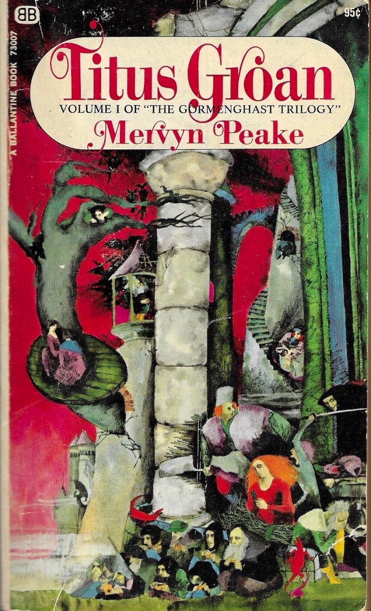
Titus Groan by Mervyn Peake. Mass-market paperback from Ballantine Books, 1968. Cover art by Bob Pepper (not credited); no designer credited.
The first of Mervyn Peake’s strange castle (and then not-castle trilogy (not really a trilogy, really)), Titus Groan is weird wonderful grotesque fun. Inspirited by the Machiavellian antagonist Steerpike, Titus Groan can be read as a critique of the empty rituals that underwrite modern life. It can also be read for pleasure alone.
Gormenghast by Mervyn Peake. Mass-market paperback from Ballantine Books, 1968. Cover art by Bob Pepper (not credited); no designer credited.
Probably the best novel in the trilogy, Gormenghast is notable for its psychological realism, surreal claustrophobia, and bursts of fantastical imagery. We finally get to know Titus, who is a mute infant in the first novel, and track his insolent war against tradition and Steerpike. The novel’s apocalyptic diluvian climax is amazing.
Titus Alone by Mervyn Peake. Mass-market paperback from Ballantine Books, 1968. Cover art by Bob Pepper (not credited); no designer credited.
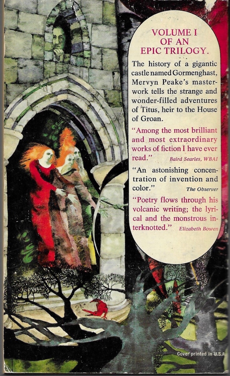
I don’t usually include back covers in these Three Books posts, but I just love the way that Bob Pepper’s back-covers segue into each other.
Is Titus Alone my favorite in the trilogy, or is it just the one I read last? I don’t know. It’s a kind of beautiful mess, an episodic, picaresque adventure the breaks all the apparent rules of the first two books. The rulebreaking is fitting though, given that Our Boy Titus (alone!) navigates the world outside of Gormenghast—a world that doesn’t seem to even understand that a Gormenghast exists (!)—Titus Alone is a scattershot epic. Shot-through with a heavy streak of Dickens, Titus Alone never slows down enough for readers to get their bearings. Or to get bored. There’s a melancholy undercurrent to the novel. Does Titus want to get back to his normal—to tradition and the meaningless lore and order that underwrote his castle existence? Or does he want to break quarantine?
Titus Escapes might have been a better title for Peake’s third book, and its spirit of escape and adventure seem more compelling and comforting to me now than they did a month ago when I read this book.
Don Quixote by Kathy Acker. Grove Press trade paperback, 1986. Cover design by Neil Stuart. Cover illustration by Catherine Denvir.
A messy punkpostmodern cartoon, a big long jazz howl at the moon.
The Egghead Republic by Arno Schmidt; English translation by Michael Horowitz. Marion Boyars trade paperback, 1982. Cover design by Imre Reiner, who likely drew the illustration (although he is not explicitly credited).
I found the first 50 pages utterly exhausting, and there were 100 more. I tried. The cover designer Imre Reiner is most famous for his font designs, but he also illustrated many many books, including a 1941 edition of Cervantes’ Don Quixote.
Sanatorium under the Sign of the Hourglass by Bruno Schulz; English translation by Celina Wieniewska. Cover design by Neil Stuart. Cover illustration by Bruno Schultz. (The novel includes thirty black and white illustrations by Schultz.)
A gross, surreal, dispiriting nightmare. I recall “enjoying” it.
The Last Days of Louisiana Red by Ishmael Reed. 1974 first edition hardback from Random House. No designer credited, but the jacket flap indicates that the cover design was “suggested” by Ishmael Reed. I reviewed Louisiana Red earlier this year on this site.
Blue Beard by Max Frisch. English translation by Geoffrey Skelton. 1983 first edition hardback from HBJ. Design by Amy Hill.
Stanley Elkin’s Greatest Hits by Stanley Elkin. Foreword by Robert Coover. 1980 first edition hardback from E.P. Dutton. Cover design by Janet Halverson.
Negrophobia by Darius James. Cover design by Katy Homans, employing All Cats Are Black in the Dark by Natasha Xavier. Trade paperback, NYRB, 2019.
Darius James’s Negrophobia, first published in 1992, is ugly, hilarious, abject, and gritty, a deep comic dive into American racism and the ways that massculture and urban living propagate and feed off of racism. NYRB’s blurb rightfully compares the novel to the work of William S. Burroughs and Ishmael Reed, but, in its hallucinatory film script form (an apocalyptic angles), it also recalls Aldous Huxley’s overlooked novel Ape in Essence. I loved it and am too much of a coward to attempt a real review.
The Haunting of Hill House by Shirley Jackson. Cover photograph by W. Eugene Smith; designer uncredited. Penguin Classics US trade paperback, 2006.
Jackson’s spooky 1959 novel has some of the best opening lines of a novel I’ve read in recent years. Hills’ final section answers to its weird opening, dramatizing fraught consciousness in turmoil, disintegrating in a ping-pong free indirect style that leaves the reader stunned, puzzled, and wishing for an extra chapter against his better judgment.
Berlin Alexanderplatz by Alfred Döblin. English translation by Michael Hoffmann. Book design by Katy Homans, featuring Georg Grosz’s painting Down with Liebknecht (1919). NRYB trade paperback, 2018.
I picked up Döblin’s 1929 Berlin Alexanderplatz on a whim a while ago at a bookstore and picked it up off the shelf today on a different whim and laughed in sympathy through the first two chapters. It’s a long book but I think I’ll keep going.
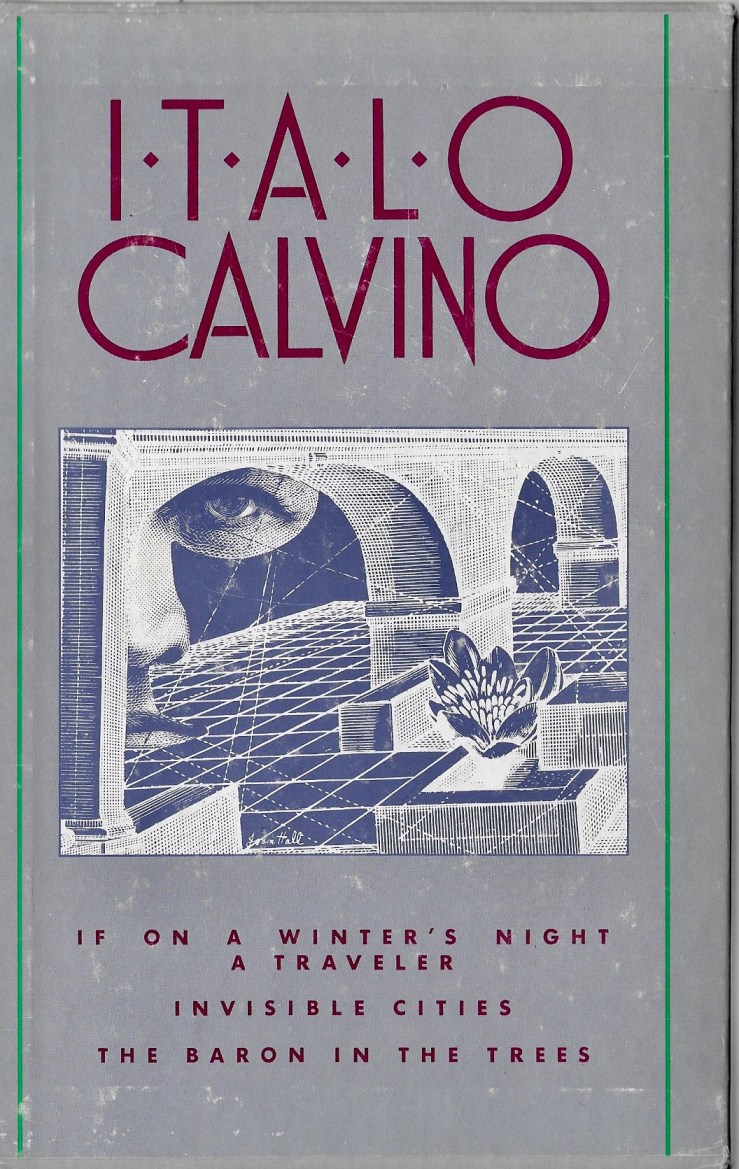
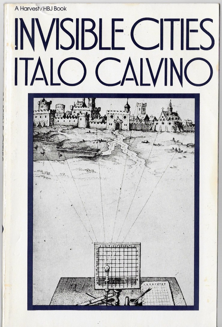
I haven’t read every Italo Calvino novel, but of the ones I’ve read, If on A Winter’s Night a Traveler, Invisible Cities, and The Baron in the Trees are my favorites. I have a Harcourt Brace Jovanovich three-volume in slipcase edition designed by Louise Fili. The illustration on the slipcase is uncredited.
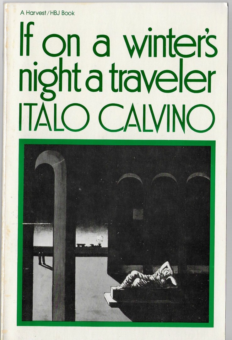
Fili’s design for If on a Winter’s Night a Traveler features Giorgio de Chirico’s 1915 painting Autumnal Melancholy. English translation by William Weaver.
This was the second Calvino novel I read. I was in my early twenties, still very much enamored of John Barth and David Foster Wallace, and Traveler’s formal postmodernism did something electric to me.
Fili’s cover features a woodcut of a seventeenth-century drawing screen. English translation by William Weaver.
Invisible Cities was the first Calvino novel I read. I read it in 2002 when I was 22, mostly in Chiang Mai, Thailand. A friend who met me in Bangkok had brought it with him in his backpack. I couldn’t find more Calvino in Chiang Mai, but I did manage a copy of Pynchon’s V.
Fili’s design for The Baron in the Trees features a detail from on of Pablo Picasso’s drawings for La Guerre et la paix. English translation by Archibald Colquhoun.
Baron is probably my favorite Calvino novel, which is maybe strange because it’s not a very Calvinoesque (Calvinoish?) novel—it’s funny, absurd, and witty, true, but it’s not formally postmodern. It reads very much like a picaresque novel, jaunty and romantic, with an intriguing lead in the rebellious and charismatic hero Cosimo Piovasco di Rondo. Writing this makes me want to read it again.
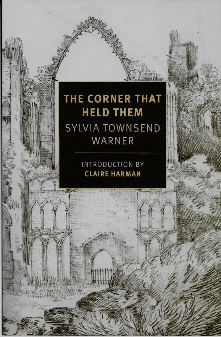
The Corner That Held Them by Sylvia Townsend Warner. 2019 trade paperback from NRYB. Cover design by Kathy Homans featuring an image titled Ruins of Castle Acre Priory Church, c. 1780-1820 (artist uncredited).
Ironic, mordant, energetic, and packed with life, Sylvia Townsend Warner’s fifth novel The Corner That Held Them (1948) tells the story of a backwater convent over the course of a few hundred years. Warner’s story weaves her nuns’ mundane world into something grander and funnier than might be expected of such a premise.
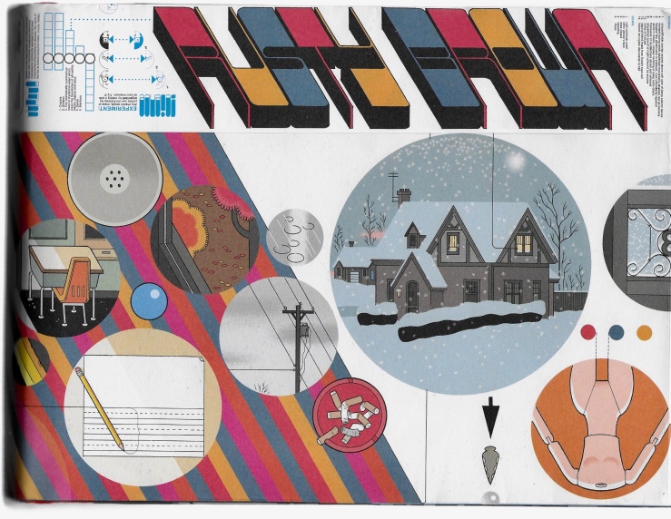
Rusty Brown by Chris Ware. 2019 first edition hardback from Pantheon. No cover designer or artist credited, but the work is unquestionably Ware’s.
Rusty Brown is ostensibly the first part of Ware’s third novel. It ends, after 350 pages, with the word “INTERMISSION” vibrating across two pages, promising us a second part. I hope that that second part will not take Ware as long to produce as this first part, which took the better part of two decades. Like Jimmy Corrigan: The Smartest Kid on Earth (2000), Rusty Brown is crushingly sad and aesthetically brilliant; like Building Stories (2012), Rusty Brown adds up to more than the sum of its parts—its fragments come together to tell the story of sad lives intersecting. It’s moving, it’s funny, it’s beautiful, it’s challenging, and I hope that we don’t have to wait too long for the next installment.
The Doomed City by Arkady & Boris Strugatsky. 2017 trade paperback from Gollancz. English. Cover illustration by Eamon O’Donoghue; no designer credited. English translation by Andrew Bromfield.
“The Experiment is the Experiment” repeat the citizens of the titular doomed city in the Strugatskys Kakfaesque dystopian novel, which was written in the early 1970s but wasn’t published until 1989. The Experiment, purportedly run by the Mentors, seemingly begins as an egalitarian project, but soon devolves into civil war against baboons, and eventually a dictatorship. There’s a late act expedition across the desert to infiltrate the fabled Anticity. Baggy and abject, The Doomed City was not the best Strugatsky novel I’ve read, but I enjoyed its weirder moments very much.
I went to the book store this afternoon to pick up a copy of the latest graphic novel in by Kazu Kibuishi’s Amulet series for my kids, and of course I browsed a while. Looking for a copy of Anne Carson’s Plainwater, I ended up finding Angela Carter’s 1972 novel Infernal Desire Machines of Doctor Hoffman. It’s a British edition, 1985, Penguin, with a lovely Boschian cover by James Marsh. Here’s a detail from the cover:
I’ve wanted to pick up Carter’s novel since I read about it on a silly good dystopian fiction list last year, and I’m thrilled that I was able to get one with a Marsh cover. This particular cover, along with Marsh’s cover for The Bloody Chamber, are included in Phil Baines lovely book Penguin by Design.
Baines’s book doesn’t include any of Marsh’s fantastic covers of J.G. Ballard novels, opting instead to include Dave Pelham’s versions. I love both Pelham and Marsh’s Ballard covers, and would love to get my mitts on one at some point. I always browse for old mass market paperbacks of sci-fi authors I like — Philip K. Dick, Ursula K. LeGuin, the Strugatsky Brothers, J.G. Ballard — hoping to find an interesting cover, something inventive and fun, something from before their works were, under the cloak of awful respectability, given safe, boring literary covers. I didn’t find any Ballard editions with Marsh or Pelham covers, but I did come across this lovely pair of mass market paperback:
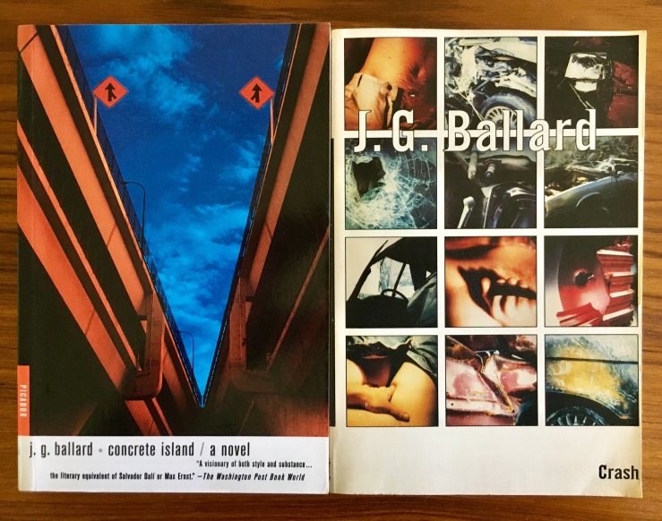
They’re US Vintage versions, 1985, with covers by Chris Moore. There’s like a proto-Cherry 2000 thing going on here that I kinda love, but I already own these novels, and I don’t love the covers quite enough. So instead, this post. Here are the covers of my copies of Crash and Concrete Island:
While Henry Sene Yee’s cover design for my copy of Concrete Island (using a photograph by Kevin Laubacher) isn’t terrible, it is a good example of what I mean by boring respectable literary covers. Still, this trade edition (Picador, 2001) is really readable—I mean, it’s easy to read. The pages are nice, the typeset is great, etc. (And the book is killer). I actually like the cover of my copy of Crash, a lot (design by Michael Ian Kaye and Melissa Hayden), but it’s also trying just a little too hard. (Again—very readable version from FS&G’s Noonday Press imprint, 1994).
While I had to pass today on the mass market copies of Crash and Concrete Island today—not because they would have set me back five bucks in store credit, but because I don’t need them, because I hope some kid goes in there and picks them up—while I had to pass on those lurid beauties, I did pick up a mass market 1967 copy of The Crystal World. Publisher Berkley Medallion didn’t bother to name the cover designer/artist, and I haven’t been able to track it down, but it is, I admit, a bit disappointing—an early pulp bid for literary respectability. At least I can be on the look out for a weirder one in the future.
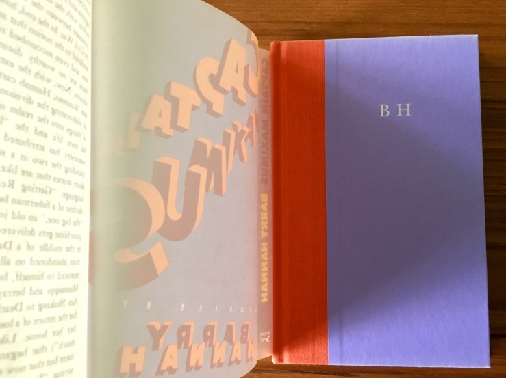
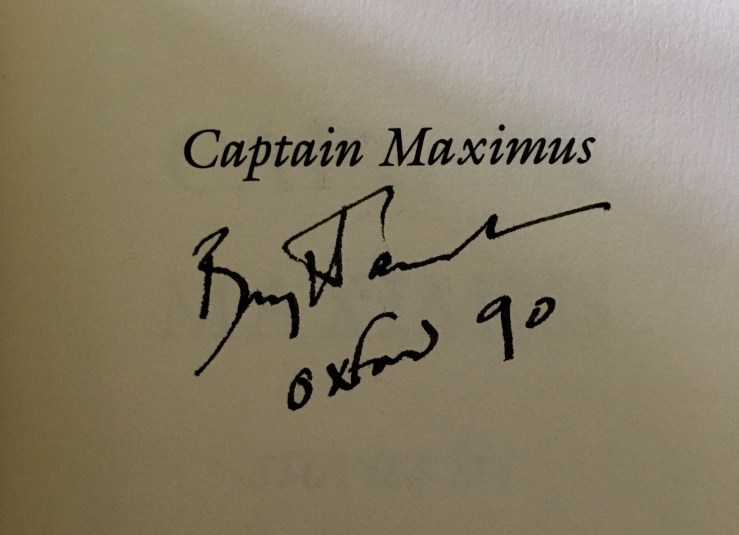
Earlier this summer I visited Alias East Books East in Los Angeles, where the clerk kindly let me handle a signed first edition of Barry Hannah’s novel Ray. It was like sixty bucks, so I didn’t handle it too fondly. But somehow the image of the signature rattled around in my silly skull all summer—probably because I spent a big chunk of July slurping up Long, Last, Happy. I wanted to find out some info about Hannah’s last quartet of stories—the last four stories in L, L, H—and doing a search of his name in Twitter led me to a link for a signed first-edition hardback copy of his slim 1985 collection Captain Maximus. (The title is a joke on his then-editor, Gordon “Captain Fiction” Lish, who apparently Hannah referred to as “Captain Minimus” in some of their letters). I might have had a scotch or two, but I bid on the book (eighteen bucks). No one else bid on it, so it’s mine now.
The cover is lovely, purple and orange, designed by Fred Marcellino, and under the bright shiny jacket is this:
I love the reserved arrogance of those initials!
And of course the signature, dated five years after the book’s publication and geographically anchored to the town my grandfather and namesake attended college in—
I didn’t actually own a copy of Captain Maximus beforehand, and I think the only stories from it included in Long, Last, Happy (which, by the way is a great starting place for Hannah) are “Fans,” “Ride, Fly, Penetrate, Loiter” and “Even Greenland” (you can read “Even Greenland” at Ben Marcus’s website). This particular copy has clearly never been read. Which leads me to this afternoon. I went to my favorite used bookstore to pick up a copy of Ishmael Reed’s The Terrible Threes—I just finished The Terrible Twos, a novel that is too prescient and too funny and too cruel and you should read it read it read it—and well anyway, I went to see if maybe they had a copy of Yonder Stands Your Orphan, which they didn’t the last time I was there, but they did today. Under it was a well-thumbed 1986 Penguin paperback edition of Captain Maximus. I need to read Yonder (which hell by the way my god what a bad cover c’mon people) before I can write the Thing I want to write on the final stories in Long, Last, Happy (or at least I think I need to read it, or anyway, I want to). And the second copy of Captain Maximus, at three dollars in store credit, is something I don’t have to worry about cramming into a pocket or dropping into a bathtub or eventually giving away to a friend.
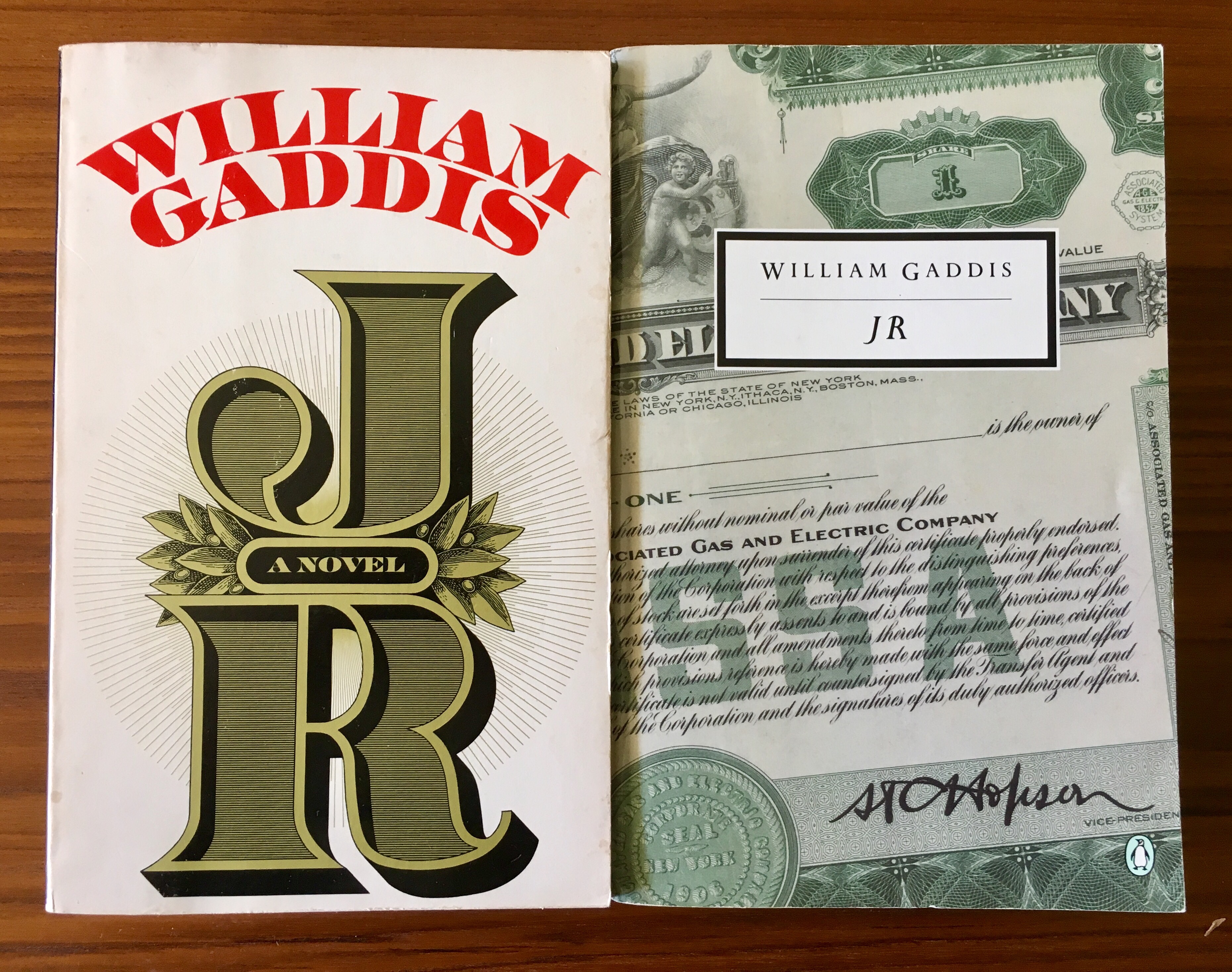
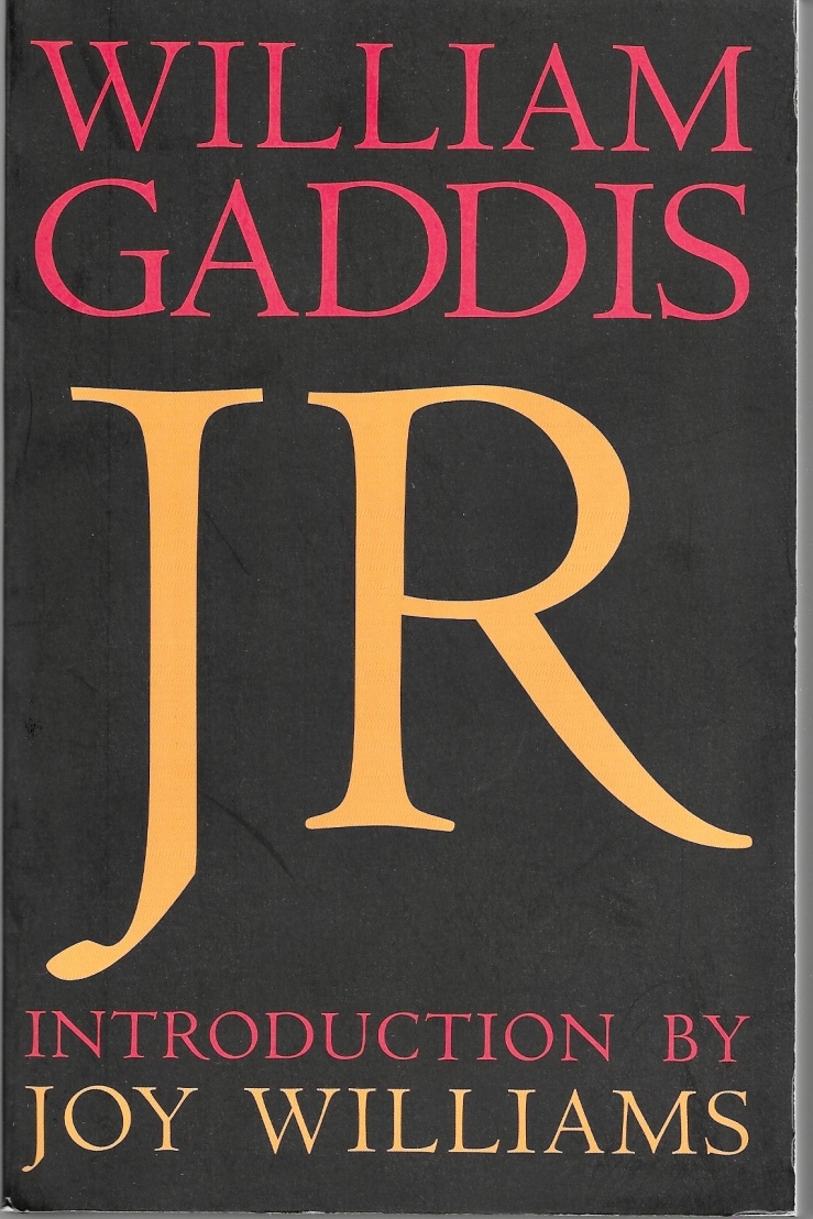
I was at the bookstore last week, killing a spare hour, looking for nothing in particular, when I spotted a first edition Knopf paperback copy of William Gaddis’s novel J R. The book is one of my favorites—I first read it in 2012 and then again in 2016 (which maybe means I’ll reread it again in 2020?). I’ll cobble really quickly from my 2016 review here:
Only a handful of novels are so perfectly simultaneously comic and tragic. Moby-Dick? Yes. Gravity’s Rainbow? Absolutely. (G R and J R, a duo published two years apart, spiritual twins, massive American novels that maybe America hardly deserves (or, rather: theses novels were/are totally the critique America deserves)). I guess maybe what I’m saying is J R is the Great American Novel to Come . . .
The book is a performance, an opera, an essay on America, a howl, a condemnation, a farce, a romance, a tragedy. When I read it in 2012 I couldn’t believe how prescient it was, a feeling reconfirmed with force four years later. J R diagnoses and describes and ridicules American corporatism, the industrial-military-entertainment-banking-education-etc. -complex. And then it weeps.
. . . in J R the reader becomes the performer, making the voices, singing the voices, (muttering the voices), navigating all the trash, the entropy—J R is a novel of unraveling, where art trips over commercial trash and literal trash–old ads, betting tickets, stock ticker tape, phone book pages, train tickets, scraps. Is there another American novel so aware of its own textuality, its own metatextuality—I mean one that doesn’t goddamn wink all the time at its readers like so much clever postmodern slop?
Well so and anyway, I was browsing the shelves of my local, looking for nothing, as I said, although I was ambling through the “GA-” section in the hopes of maybe picking up a copy of William Gass’s The Tunnel, when I spied the J R, with its bold oh-so-seventies design, its big stiff spine unbroken and seemingly unbent. After handling it a few minutes, I resigned myself to a pic and a tweet—
tfw you find a first edition paperback of a book you already own in another edition and you have to talk yourself out of buying it pic.twitter.com/TRuKPXK7xU
I didn’t intend to buy another paperback copy of J R, even a first edition, even though it was only seven bucks, and even though I have trade credit out the ying-yang there—I mean, I have a perfectly fine Penguin edition; better to leave the J R for some other person to acquire, no? But qithin a few minutes Twitter folks had talked me out of my plan to not acquire it, advice that was perhaps not unwanted.
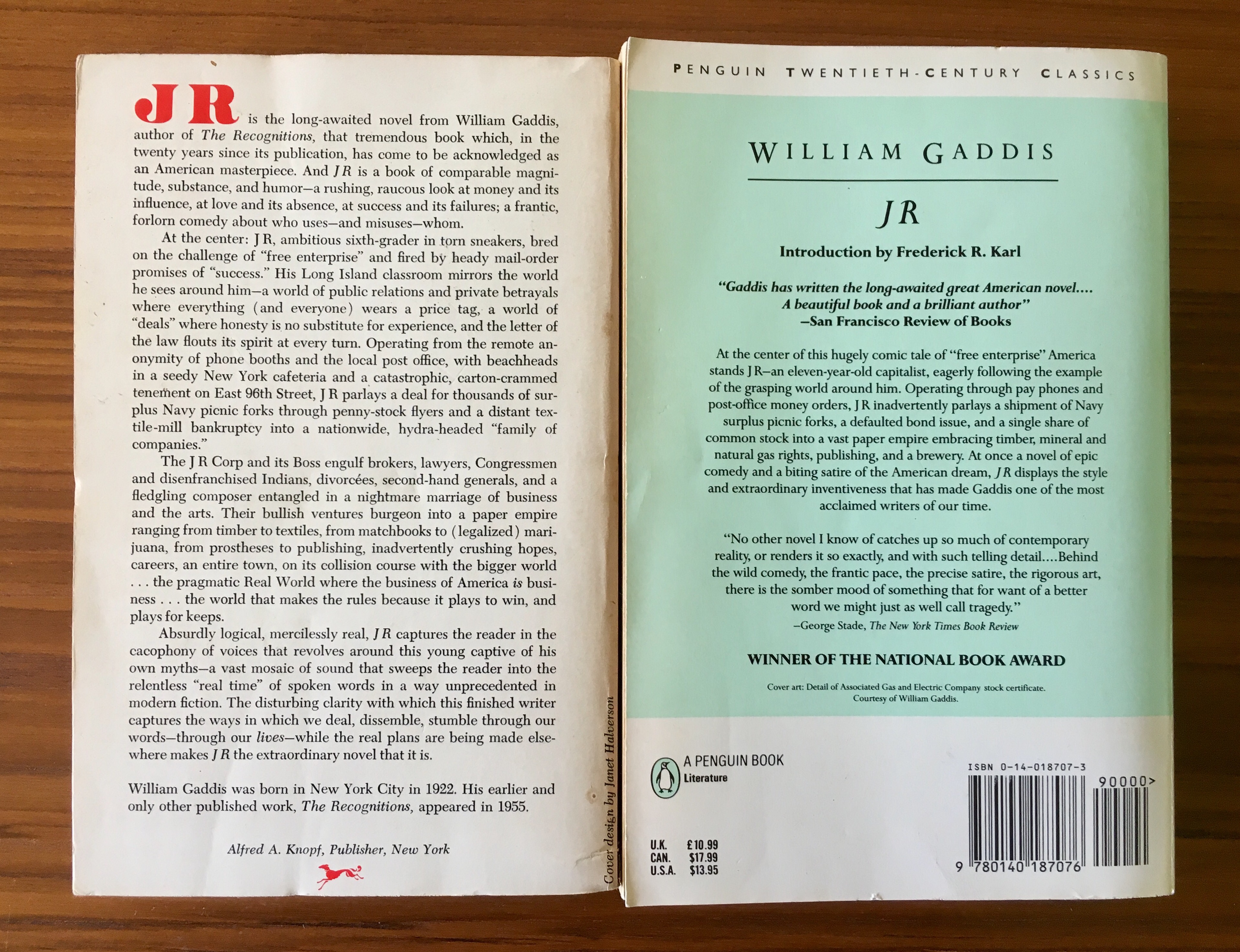
The Knopf edition—the cover design is by Janet Halverson, by the way—has a much longer summary blurb than my 1993 edition (and indeed, a much longer summary blurb than one usually sees on a paperback). The Penguin edition features an introduction by Frederick Karl (that readers should wait to read until after they’ve finished the book), a bibliography of “Suggestions for Further Reading,” and a new dedication page: “For Matthew: Once more unto the breach, dear friend, once more” (I’m guessing the dedication is to Gaddis’s son Matthew). The ’93 Penguin does not have this though:
But! The Penguin edition’s colophon promises that “Errors in the original publication have been corrected by the author for the first Penguin edition” (1985 btw).
Other than that, the two edition are pretty much typographically the same—the pages are aligned, and both editions are consistent with the same typographical oddities, like JR’s famous handwritten “Alsaka” memo and his logo designs and Gibbs’s pocket scrap citations.
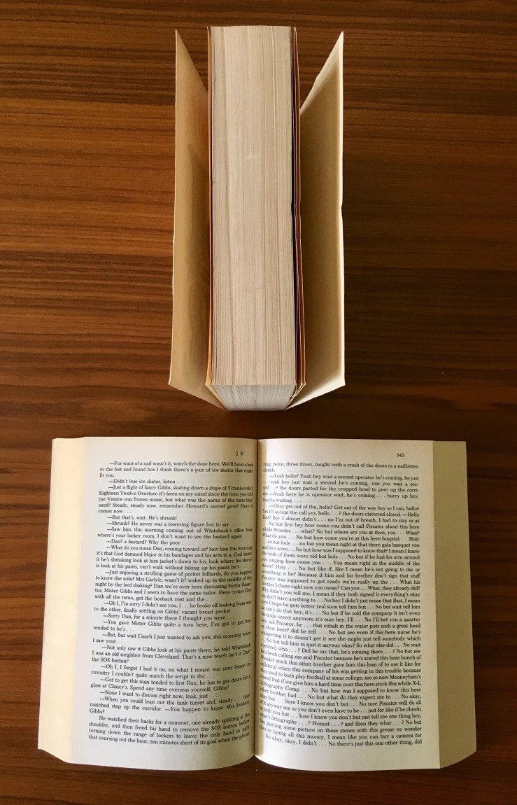
The big difference between the two editions (besides the cover, obviously) can be summed up in this image—the seventies Knopf is above the nineties Penguin:
The Penguin edition is slightly larger with much better binding. I’ve read it twice and I never had to break its spine; I’m pretty sure that the Knopf I picked up has never been read—and also that a serious reading would crack its spine pretty badly.
The most recent edition of J R is from Dalkey, and includes an essay by Rick Moody as its introduction. I don’t have a copy of it, but it has 752 pages—the other editions have 726 pages (which the Gaddis Annotations project match up to). I’ve handled the Dalkey, and I recall it being smaller and stiffer than the Penguin. Basically, I think, as of now, the Penguin edition is probably the best option for anyone wanting to read the book. So I love the cover of the 70’s first edition I’ve got, but I doubt I’ll be reading it soon (or, like in 2020 when I read the book again).
The Left Hand of Darkness by Ursula K. Le Guin. First edition mass market paperback from Ace Books, 1969. The marvelous Klimtish cover is by Leo & Diane Dillon. I wrote about the novel here.
The Order of the Day by Marcio Souza. English translation by Thomas Colchie. First edition mass market trade paperback by Bard/Avon, 1986. No illustrator credited.
Neuromancer by William Gibson. 1988 mass market trade paperback by Ace Books. Cover art by Richard Berry. A friend foisted this on me; I never gave it back, which was wrong. I don’t think I can overstate how important this book (and the following two in the so-called “Sprawl Trilogy”) were to me in the late nineties. In fact, Gibson was one of the first things I wrote about on this blog. (Don’t click on that link; the early days of this blog were Bad).


 I was hoping to score a cheap paperback copy of one of David Marskon’s early novels when I came across this edition of Thomas Mann’s Buddenbrooks with a cover by Ben Shahn.


 year ago. He was kind of