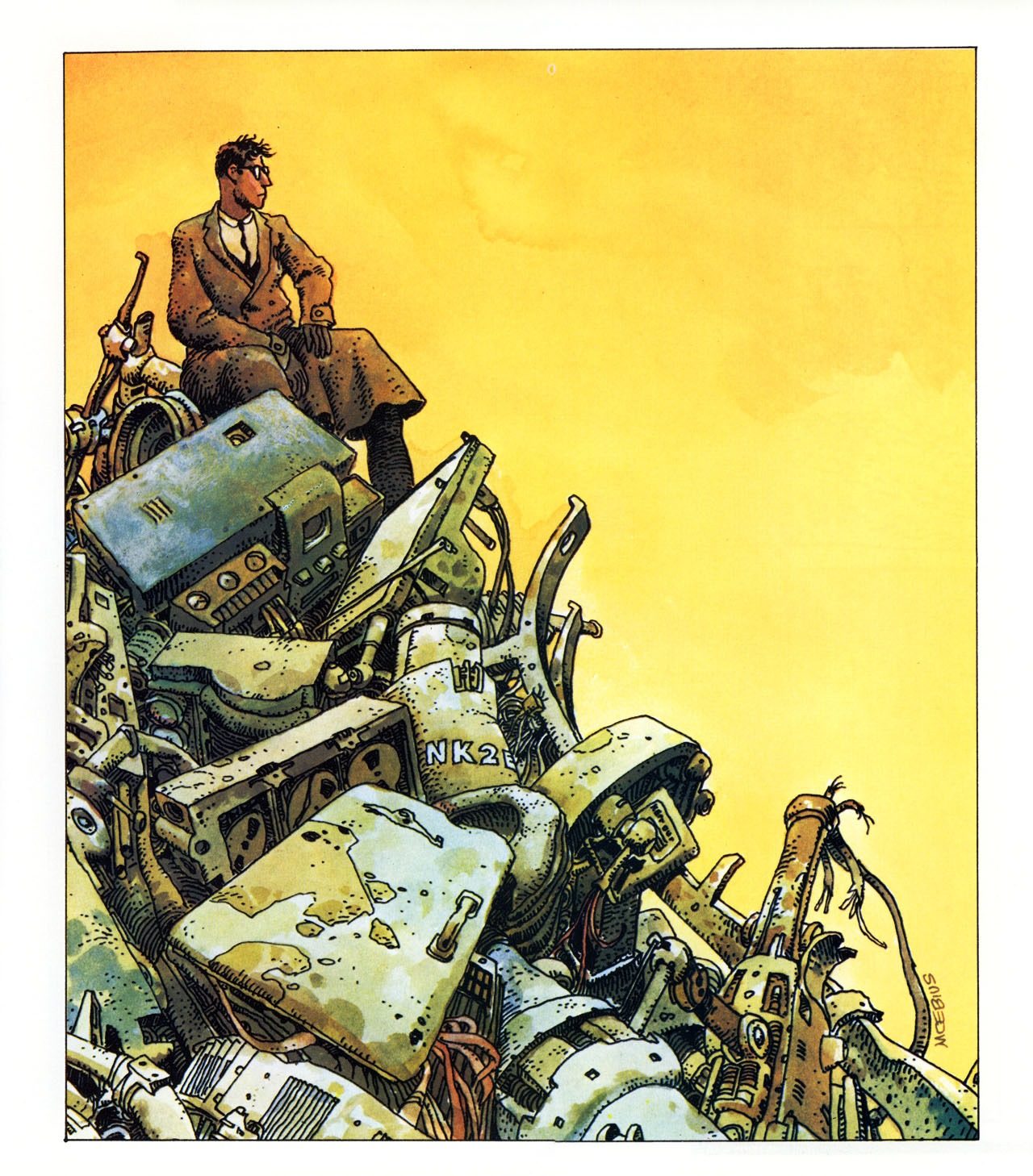
Cover illustration for the French translation of Kurt Vonnegut’s novel Player Piano, 1975 by Moebius (Jean Giraud, 1938–2012)

Cover illustration for the French translation of Kurt Vonnegut’s novel Player Piano, 1975 by Moebius (Jean Giraud, 1938–2012)


The Living End, Stanley Elkin. First Warner Books printing (1980). Cover art by Don Ivan Punchatz; cover design by Gene Light; cover type by Richard Nebiola. 141 pages.
An excerpt from The Living End:
God gave a gala, a levee at the Lord’s.
All Heaven turned out.
“Gimme,” He said, that old time religion.” His audience beamed. They cheered, they ate it up. They nudged each other in Paradise.
“What did I tell you?” He demanded over their enthusiasm.
“It’s terrific, isn’t it? I told you it would be terrific. All you ever had to do was play nice. Are you disappointed? Is this Heaven? Is this God’s country? In your wildest dreams-let Me hear it. Good-in your wildest dreams, did you dream such a Treasury, this museum Paradise? Did you dream My thrones and dominions, My angels in fly-over? My seraphim disporting like dolphins, tumbling God’s sky in high Heaven’s high acrobacy? Did you imagine the miracles casual as card tricks, or ever suspect free lunch could taste so good? They should see you now, eh? They should see you now, trembling in rapture like neurological rut. Delicious, correct? Piety a la mode! That’s it, that’s right. Sing hallelujah! Sing Hizzoner’s hosannas, Jehovah’s gee whiz! Well,” God said, .1 that’s enough, that will do.” He looked toward the Holy Family, studying them for a moment.
“Not like the creche, eh?” He said.
“Well is it? Is it?” He demanded of Jesus.
“No,” Christ said softly.
“No,” God said, “not like the creche. just look
at this place- the dancing waters and indirect lighting. I could put gambling in here, off-track betting. Oh, oh, My costume jewelry ways, My game show vision.Well, it’s the public. You’ve got to give it what it wants. Yes, Jesus?”
“Yes,” Jesus said.
“It just doesn’t look lived in, is that what you think
“Call on someone else,” Christ said.
“Sure,” God said.
“I’m Hero of Heaven. I call on Myself.”
That was when He began His explanations. He revealed the secrets of books, of pictures and music, telling them all manner of things-why marches were more selfish than anthems, lieder less stirring than scat, why landscapes were to be preferred over portraits, how statues of women were superior to statues of men but less impressive than engravings on postage. He explained why dentistry was a purer science than astronomy, biography a higher form than dance. He told them how to choose wines and why solos were more acceptable to Him than duets. He told them the secret causes of inflation-“It’s the markup,” He said-and which was the best color and how many angels could dance on the head of a pin. He explained why English was the first language at Miss Universe pageants and recited highlights from the eighteen-minute gap.
Mary, wondering if she showed yet, was glad Joseph was seated next to her. Determined to look proud, she deliberately took her husband’s hand. So rough, she thought, such stubby fingers. He explained why children suffered and showed them how to do the latest disco steps. He showed them how to square the circle, cautioning afterwards that it would be wrong.
He revealed the name of Kennedy’s assassin and told how to shop for used cars.


A Maze of Death, Philip K. Dick. Dawn Books, first Daw printing (1983). Cover art by Bob Pepper. 191 pages.
In my review of Philip K. Dick’s 1970 novel, I wrote that A Maze of Death is
…a mishmash of metaphysical mumbo jumbo, filtered through touches of space opera and good old fashioned haunted housery. A Maze of Death is a messy space horror that threatens to leave its readers unsatisfied right up until the final moments wherein it rings its sad coda, a reverberation that nullifies all its previous twists and turns in a soothing wash of emptiness. Not the best starting place for PKD, but I’m very glad I read it.


The Last Days of Louisiana Red, Ishmael Reed. Bard Books, First Bard Printing (1976). Cover art is by Andrew Rhodes (not credited). 191 pages.
From my review of The Last Days of Louisiana Red:
Ishmael Reed’s 1974 novel The Last Days of Louisiana Red is a sharp, zany satire of US culture at the end of the twentieth century. The novel, Reed’s fourth, is a sequel of sorts to Mumbo Jumbo (1972), and features that earlier novel’s protagonist, the Neo-HooDoo ghost detective Papa LaBas.
In Mumbo Jumbo, Reed gave us the story of an uptight secret society, the Wallflower Order, and their attempt to root out and eradicate “Jes’ Grew,” a psychic virus that spreads freedom and takes its form in arts like jazz and the jitterbug. The Last Days of Louisiana Red also employs a psychic virus to drive its plot, although this transmission is far deadlier. “Louisiana Red” is a poisonous mental disease that afflicts black people in the Americas, causing them to fall into a neo-slave mentality in which they act like “Crabs in the Barrel…Each crab trying to keep the other from reaching the top.”


Robinson, Muriel Spark. Penguin Books, (1964). Cover art by Terence Greer. 175 pages.
Terence Greer illustrated six midsixties Muriel Spark Penguin editions. I would love to own the other five.
Robinson is Spark’s second novel, and not her finest (of the ones I’ve read I’d argue for Loitering with Intent or The Prime of Miss Jean Brodie.)

I love to browse my local used bookstore of a Friday afternoon. This afternoon I came across a copy of my favorite Harry Crews novel, A Feast of Snakes. It’s a 1978 massmarket edition from Ballantine. The lurid cover captures the novel’s lurid spirit. It wraps around; here’s the back (I’d scan the whole thing flat but I don’t think the book’s spine would survive):

The art seems to be signed with the (last I’m guessing?) name “Gentile.” If anyone can confirm I’d appreciate it.
I shared the cover on Twitter, where one user pointed out that the publishers seemed to be “pre-emptively casting the film,” with Ed Asner in a supporting role. I’m guessing they would’ve wanted Burt Reynolds for Joe Lon.
The cover captures the sweaty abjection of A Feast of Snakes—it’s a nasty, gnarly novel that pushes the so-called “Southern Grotesque” style into new, gross, territory. If you haven’t read Crews, it’s a perfect starting point (although I’m sure that the novel is like, problematic or whatever in many, many ways). I love the cover, as I’ve said–it fits the novel wonderfully, unlike the more “respectable” cover for my 1998 edition (which I’ll be trading in now):

From the novel: not quite a recipe for snakes:
When they got to his purple double-wide, Joe Lon skinned snakes in a frenzy. He picked up the snakes by the tails as he dipped them out of the metal drums and swung them around and around his head and then popped them like a cowwhip, which caused their heads to explode. Then he nailed them up on a board in the pen and skinned them out with a pair of wire pliers. Elfie was standing in the door of the trailer behind them with a baby on her hip. Full of beer and fascinated with what Joe Lon could feel—or thought he could—the weight of her gaze on his back while he popped and skinned the snakes. He finally turned and looked at her, pulling his lips back from his teeth in a smile that only shamed him.
He called across the yard to her. “Thought we’d cook up some snake and stuff, darlin, have ourselves a feast.”
Her face brightened in the door and she said: “Course we can, Joe Lon, honey.”
Elfie brought him a pan and Joe Lon cut the snakes into half-inch steaks. Duffy turned to Elfie and said: “My name is Duffy Deeter and this is something fine. Want to tell me how you cook up snakes?”
Elfie smiled, trying not to show her teeth. “It’s lots of ways. Way I do mostly is I soak’m in vinegar about ten minutes, drain’m off good, and sprinkle me a little Looseanner redhot on’m, roll’m in flour, and fry’m is the way I mostly do.”
I did a Big Clean a weekend or two past, including a thorough dusting of shelves. I always try to purge titles that I know I’ll never read, reread, or that I have no real attachment to. I filled a box with about 25 books, mostly novels, mostly paperbacks, and took it to my favorite used bookstore.
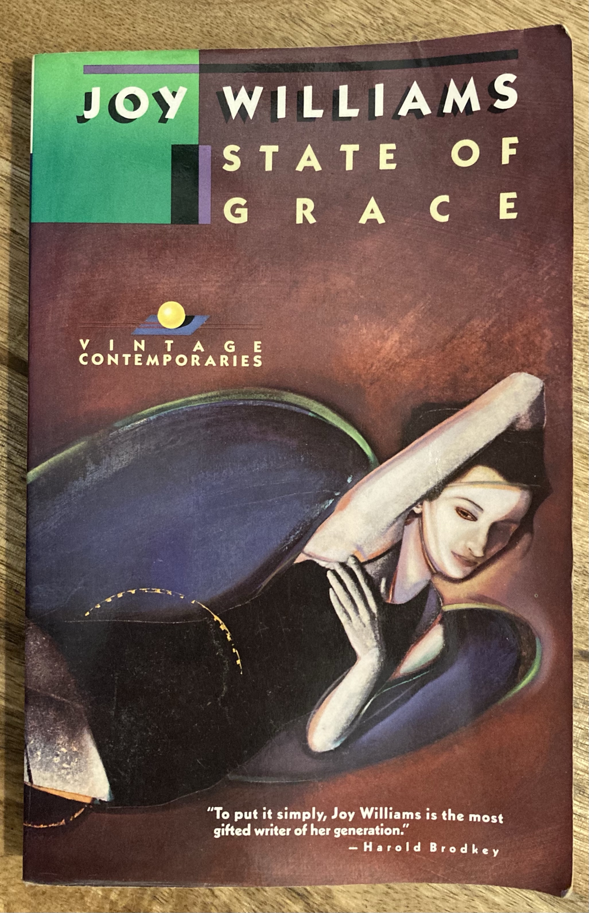
There, I found to my joy Joy Williams’s first novel State of Grace in my beloved preferred ugly Vintage Contemporaries edition. (I loved Williams’s collection Taking Care, which I read as a VC edition.) I’ve got a big stack of newly-published novels that I need to get to once I finish rereading Whale-Book, but who knows. Maybe I’ll get to it sometime before summer.
In the meantime, here’s the first graf of Gail Godwin’s 1973 NYT review:
The fated heroine of this bleak but beautifully‐crafted first novel may well be the final, perfected archetype of all the “sad ladies”: that formidably fashionable sorority which has impinged on the past decade or so of American fiction. But I’ll remember Kate Jackson; I’ll reread her stubbornly depressing story, picking out those cleverly‐hidden but ever‐present clues of grace. Kate is no simple “slice‐of‐despair” character; her sad story becomes, through the author’s skill and intention, transsubstantiated into significant myth. This book is neither a self‐indulgent journal of despair, nor journalism of despair. It is premeditated, articulate, artistic—a novel.
As always, I browsed. Here are some covers that caught my eye, but I did not leave with them–just these photos:


I’ve made a habit of prowling around my own shelves each week, trying to build a small stack of books I can part with. I then head up the street to trade the books in. Lately, I’ve done a decent job of leaving with far fewer books than I brought in to trade—hell, last Friday I came back with no books.
I always have a little mental checklist of books I’m hoping to come across. It mutates and swells, and I get lucky a lot of times. Sometimes I grab stuff at near-random. And other week’s are stale. Increasingly, I search for first editions and interesting mass market paperbacks, a reversal of a previous version of myself who found hardbacks clunky and mass market paperbacks cheap. Mass market editions tend to have wilder art, more interesting designs, and generally take more risks than contemporary, respectable trade paperbacks, as do older hardbacks. I ended up with three first editions. I was not especially looking for any of the books I acquired.
I was looking for certain books of course. Here are some interesting book covers I saw while looking for what I did not find.


I was looking for Walker Percy’s second novel Love Among the Ruins. I’d found a copy at this same book store last year—a first edition in beautiful condition with a really cool cover. I almost bought it (I think it was seven bucks) and now regret not having done so. I’m sure I’ll regret skipping on both of these Percy books, both of which have cover designs by Janet Halverson.

I wasn’t looking for anything in particular when I saw this hardback copy of Nevil Shute’s On the Beach, but the font on the spine attracted me. Love the cover painting, which is by Richard Powers (I assume this is a different Richard Powers than the American novelist).

I wasn’t looking for anything in particular when I picked up this Bantam collection of Mark Twain stories, which has a very cool uncredited Giuseppe Arcimboldoesque cover. Not sure why I picked it out. But I love the cover.
 I was hoping to score a cheap paperback copy of one of David Marskon’s early novels when I came across this edition of Thomas Mann’s Buddenbrooks with a cover by Ben Shahn.

I was looking for anything by Gerald Murnane when I found this beautiful edition of Robert Musil’s Young Torless.

The bookshop I frequent separates “Classic Fiction” from “General Fiction” (with some somewhat arbitrary distinctions, in my opinion)—so I checked under the “PE” section in general fiction for a stray Walker Percy (no luck). Never heard of J.Abner Peddiwell’s The Saber-Tooth Curriculum but I love the simple expressive cover.

Walking past “PE,” “PI,” “PL” etc. I stopped at section on James Purdy to check out this edition of The Nephew. I’ve never been able to get into Purdy—seems so sad—but I love this cover.
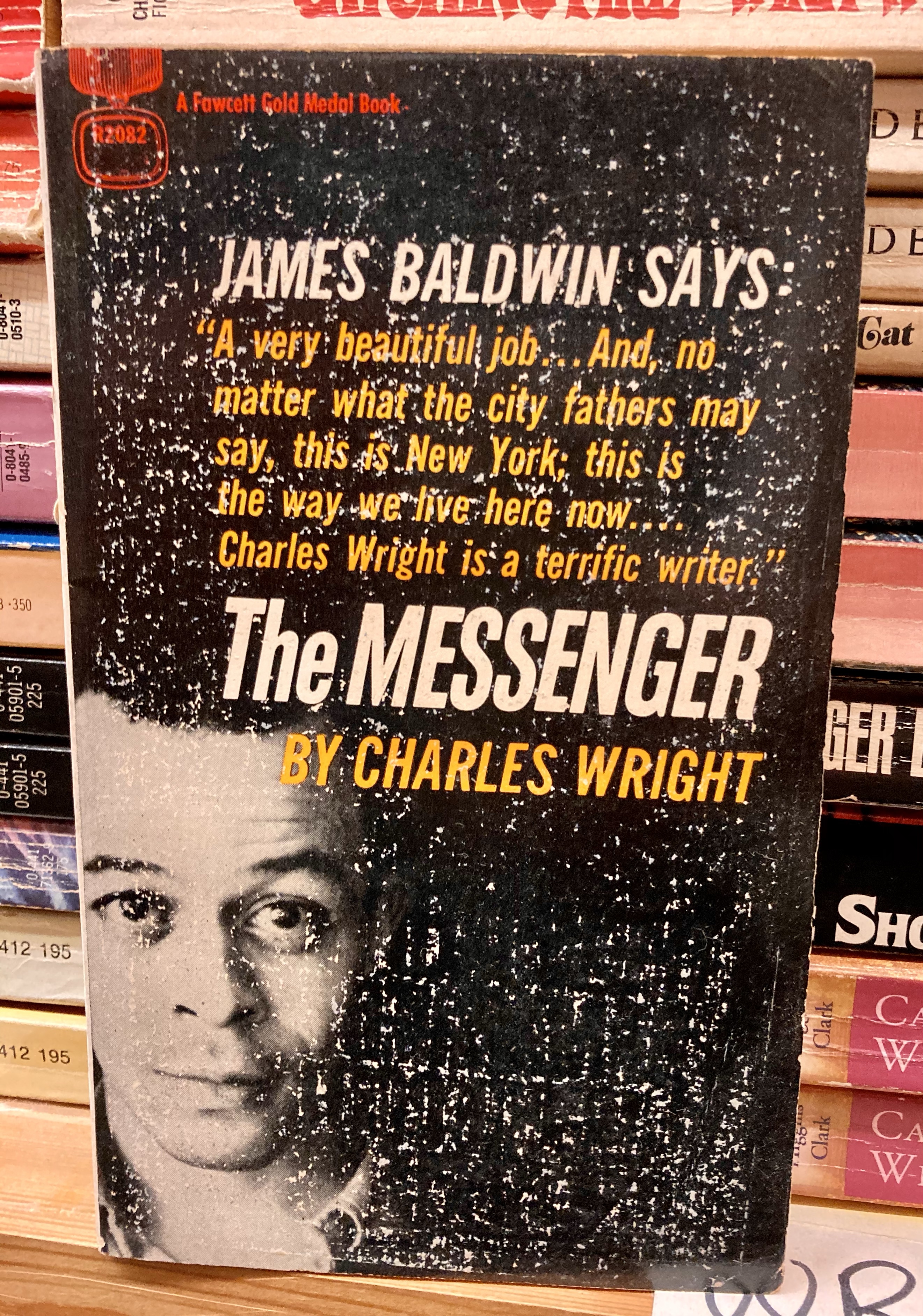
I was looking for an original edition of Charles Wright’s 1973 novel Absolutely Nothing to Get Alarmed About; I have it in an omnibus, but I’d love a stand alone if I could find one. I did see this edition of The Messenger. The cover is terrible and boring and has way too much text on it. I found a copy of The Messenger a few months ago with a far more interesting cover.

I was looking for one of the William Melvin Kelley novels I don’t have. I found a bunch of mass market copy paperback versions of his first novel, A Different Drummer. The copy on the left has a cool cover. I think I like my new reissue better though.
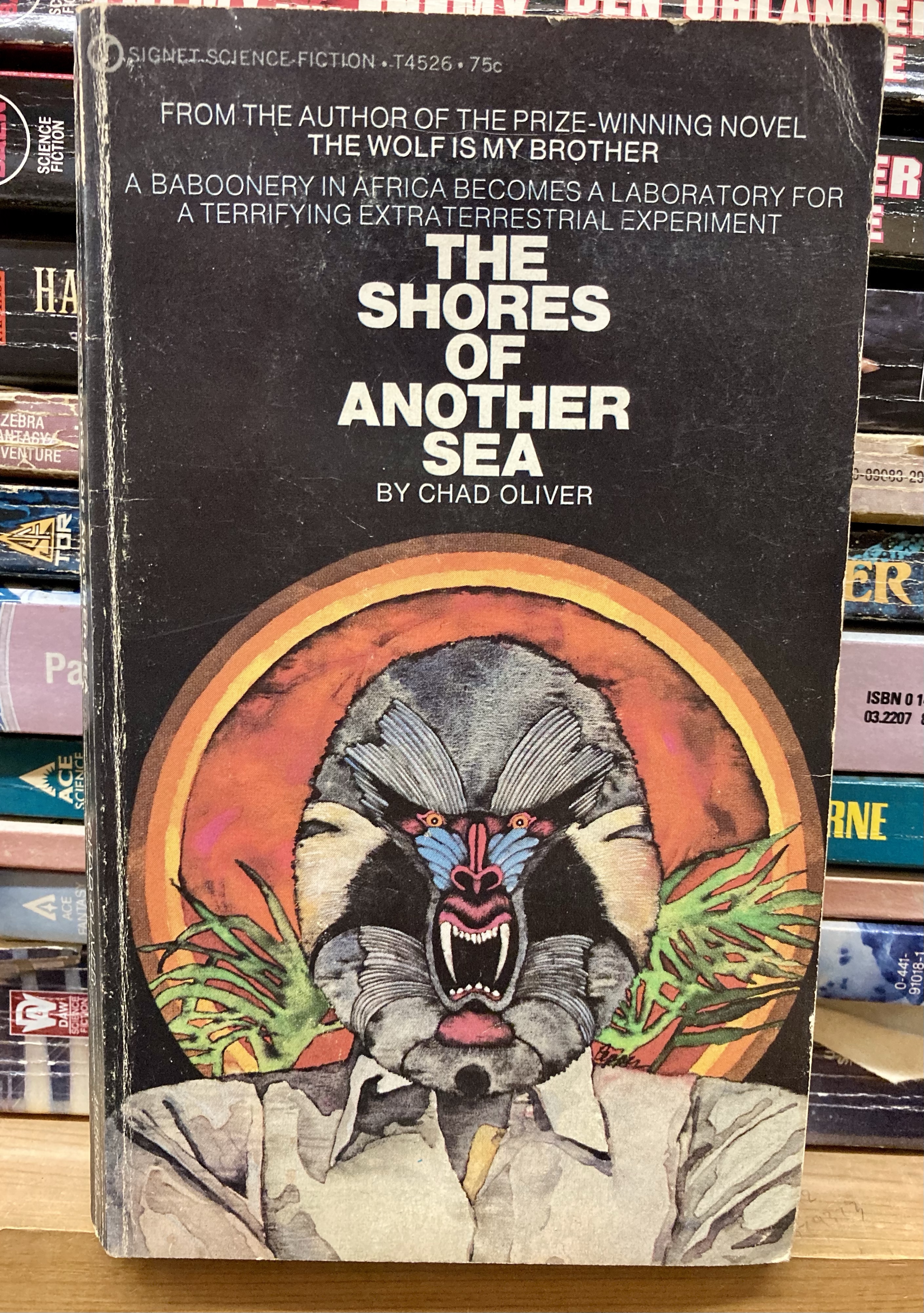
I always look for a copy of David Ohle’s cult novel Motorman and I never find it. I do like this vibrant cover for Chad Oliver’s The Shores of Another Sea. 
While I was in the sci-fi section, I passed by the Gene Wolfe area, and spied a complete hardback set of his seminal The Book of the New Sun tetralogy. I couldn’t pass up on a first hardback edition of the first in the series, The Shadow of the Torturer:
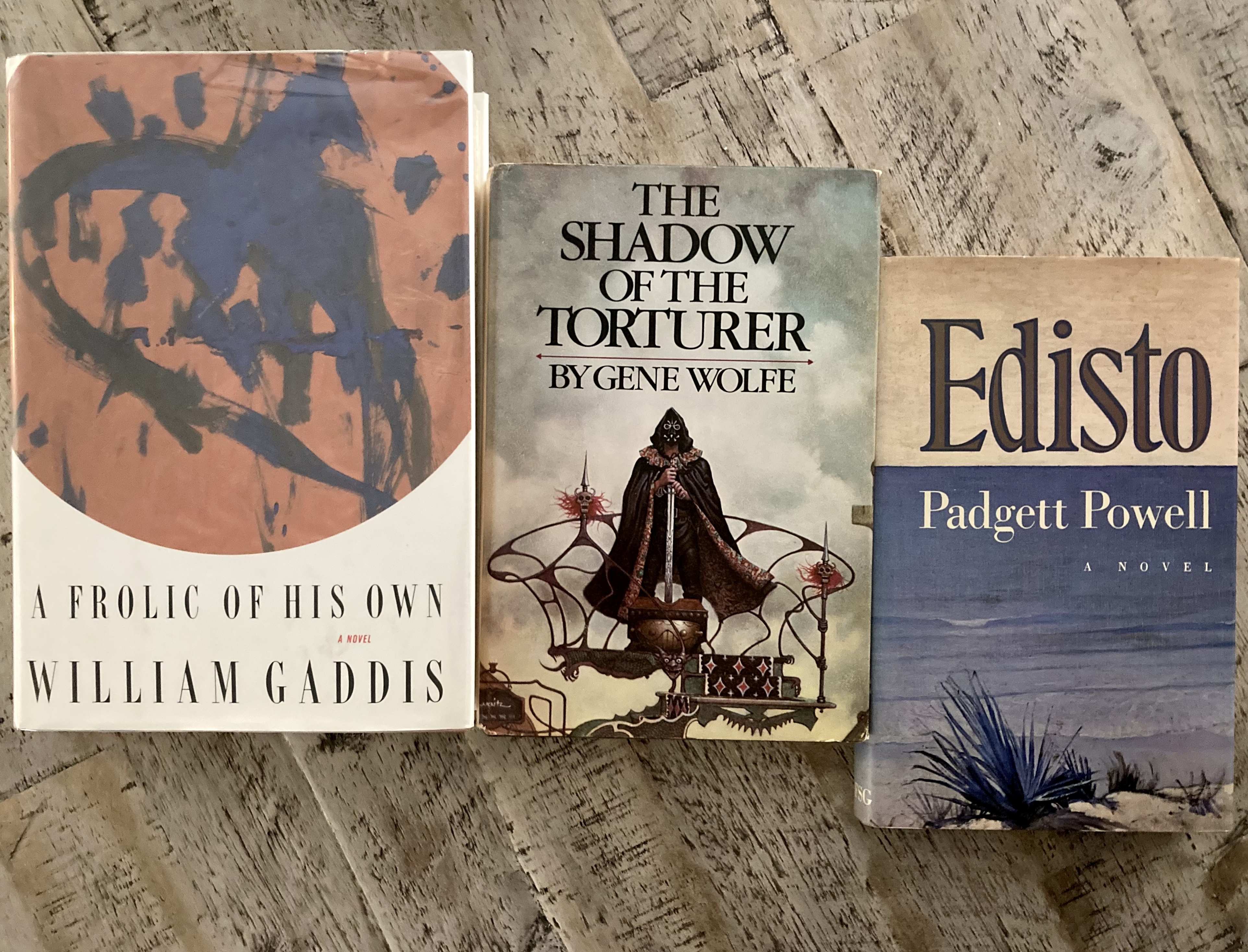
I also picked up a pristine first edition hardback copy of William Gaddis’s 1994 novel A Frolic of His Own. It’s the only Gaddis novel I’ve yet to read and buying a second copy seems like a good motivation to finally dig in.
I also came across a first edition hardback copy of Padgett Powell’s first novel Edisto. I’ve always felt ambivalent about Powell. He was the writer in residence at the University of Florida when I was an undergrad there in the late nineties. He’d taken the post over from Harry Crews, and I always resented that for some reason, brought that resentment to the few readings I attended, never made it through anything but a few stories. But this copy of Edisto was only four bucks. And check out the blurbs on the back:
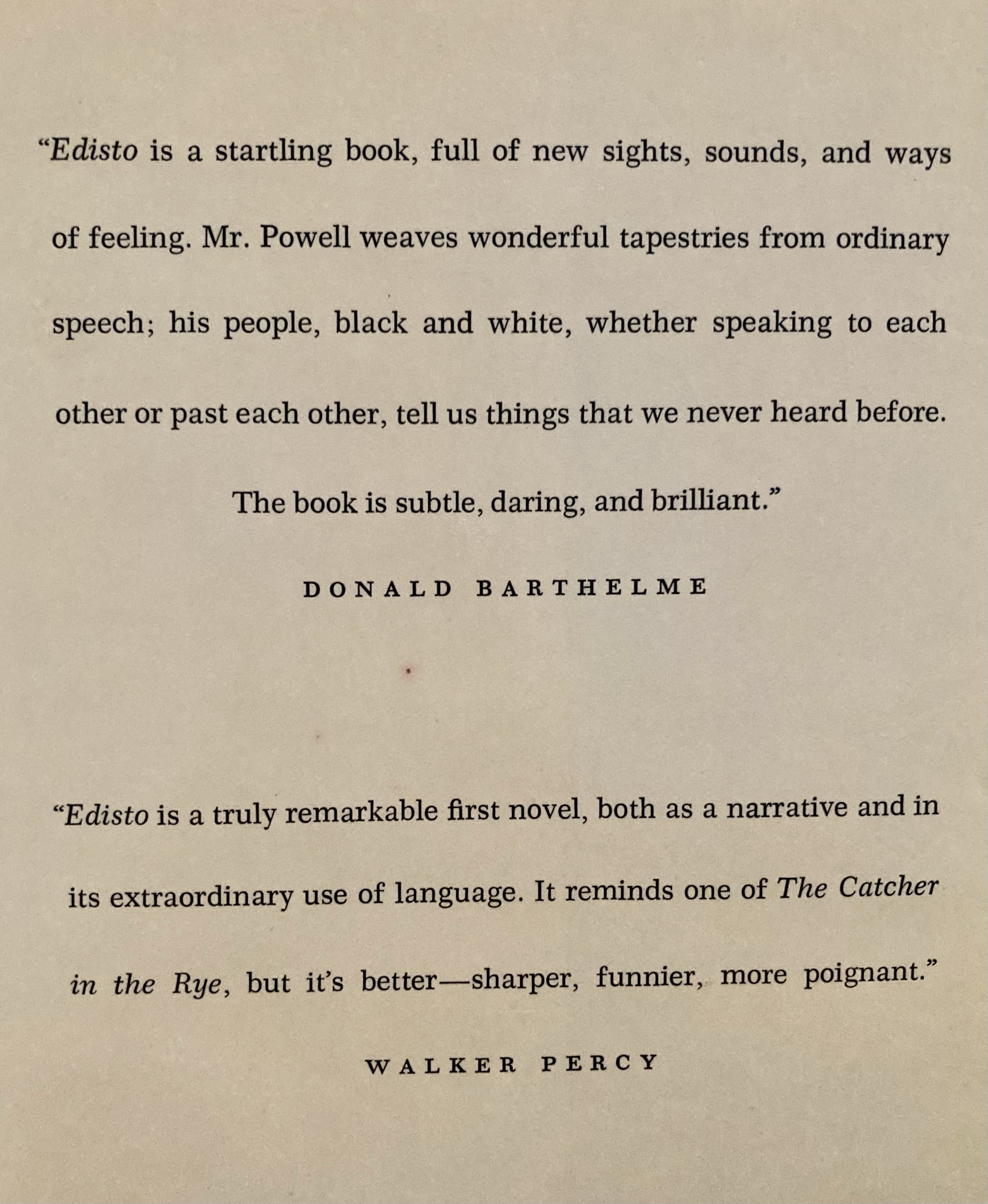
There’s my guy Barthelme. And then Percy, who brought me to the store today. I’ll give it a shot.
After one week of abstinence I drove the mile or so to the used bookstore I go to too often and browsed.
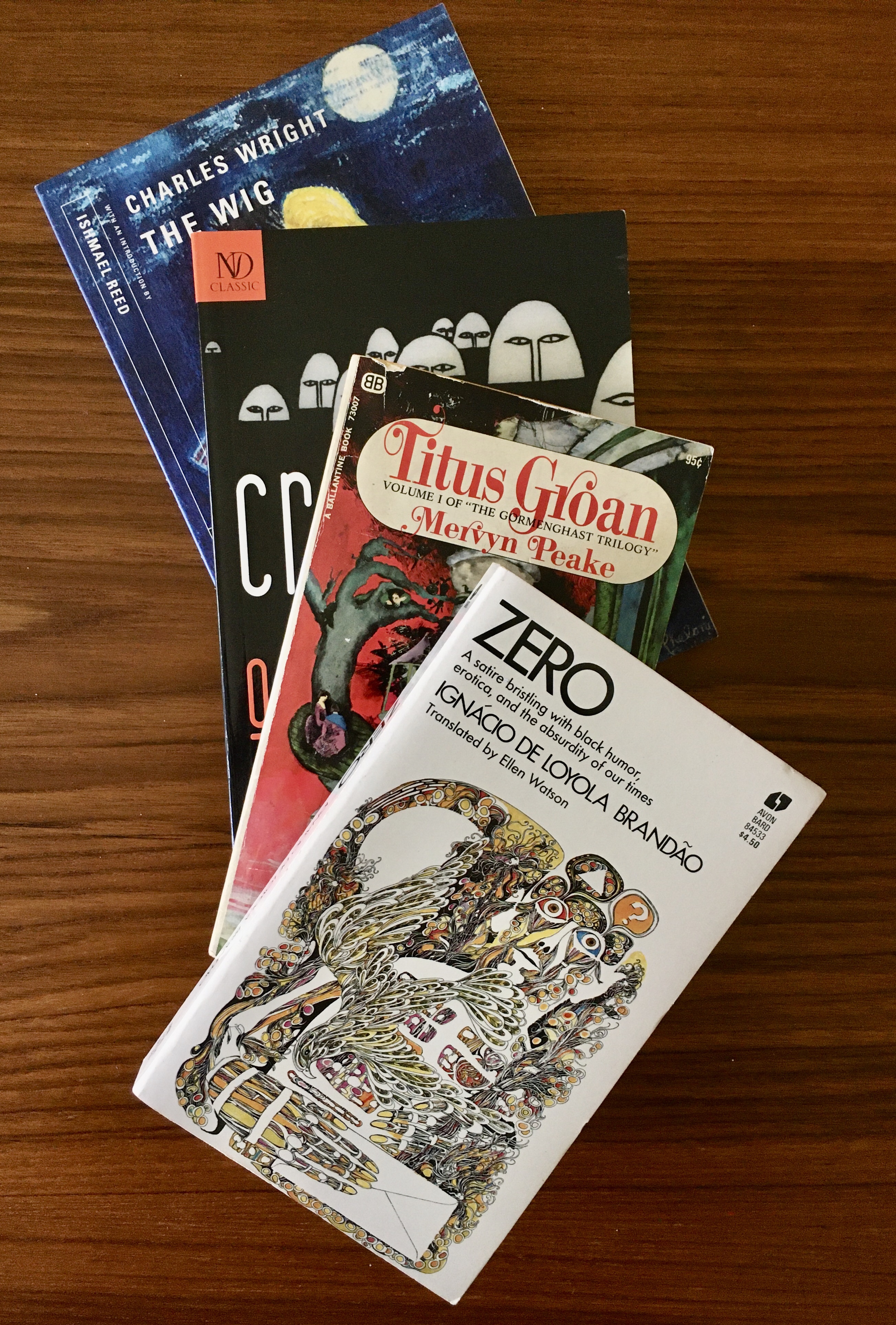
I was specifically looking for the other Gormenghast books by Mervyn Peake, the 1956 novella Boy in Darkness, and the unfinished Titus Awakes, completed by Peake’s wife Maeve after his death. I’m in the last few pages of Titus Alone, and I guess I don’t want to exit his proseworld just yet. Anyway, I went to this bookstore almost every week of February looking for Peake books with no luck after having picked up Gormenghast there on a lark a while back. I ended up buying the first and third of the Gormenghast trilogy online, because I couldn’t find them there, but today I found the complete trilogy in matching Ballantine editions. I did not find the other Gormenghast books though.

As much as I hated to break up the triplets pictured above, I picked up the Ballantine Titus Groan and adopted it to fit my other Ballantine editions. There is a specific student I have in mind whom I think will love the Penguin edition of Titus Groan I’ll give him next week (even though my dog bit it).
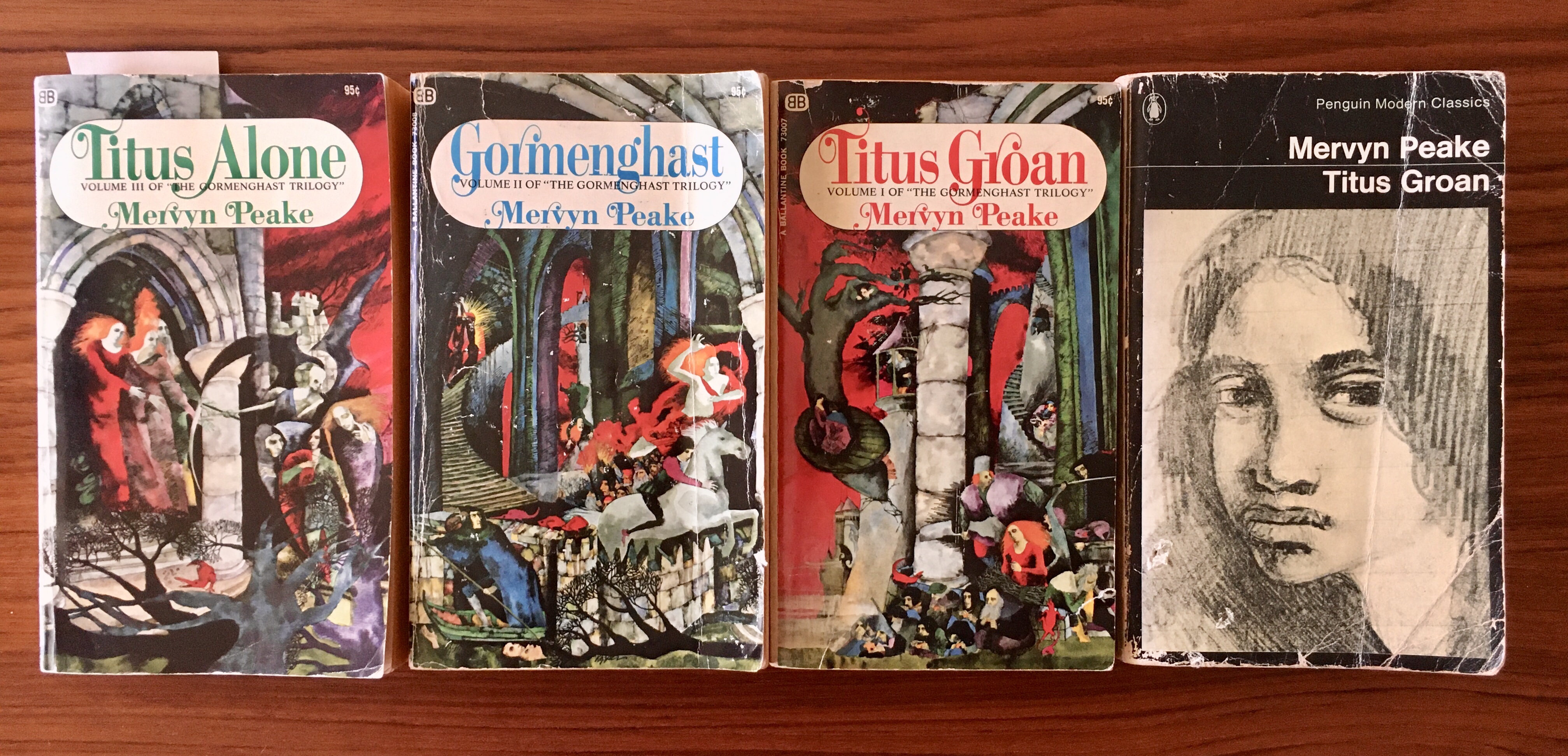
I’m obviously a sucker for covers, as any one who’s followed this blog for a while probably knows, and the Ballantine covers are better, I think—the Penguin editions of Peake’s trilogy are great, but they shy away from the bizarre nature of the narratives, tilting toward respectability.
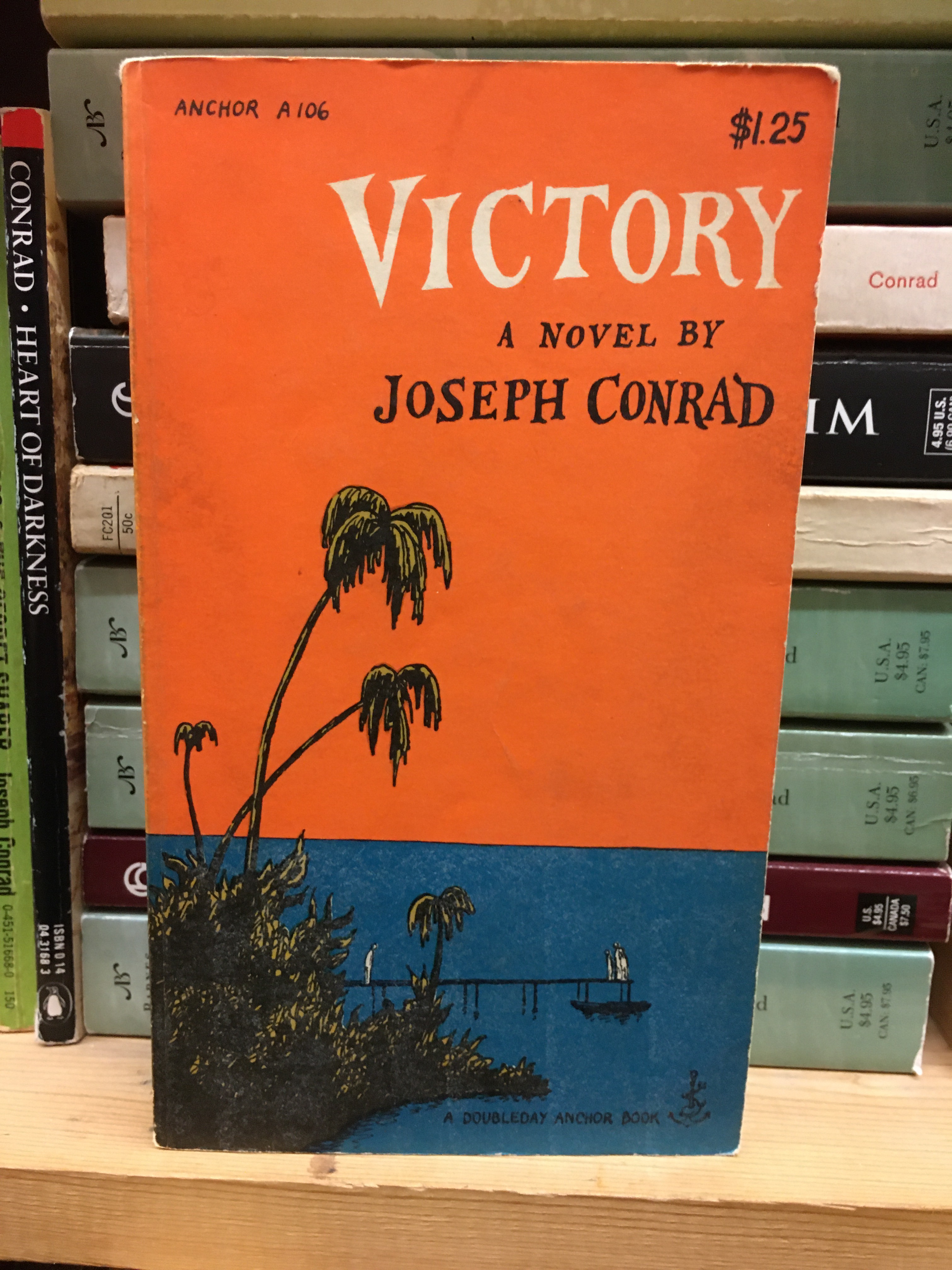
Indeed, I like browsing in large part because I like the aesthetics of books, particularly older books. I absolutely loved this Edward Gorey cover for a 1957 edition of Joseph Conrad’s Victory—but I settled for a picture. I mean, I doubt I’ll read lesser-known Conrad at this point. But I love the orange and the blue, and Gorey’s handlettering:
I often settle for just a snapshot of a beautiful cover, like this bizarre one for The Family of Pascual Duarte by Camilo José Cela. I didn’t pick it up a few weeks ago, but then wished I had.
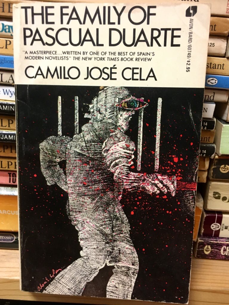
I had left it on the shelf like this, face outward. It wasn’t there today, and I wished that I had picked it up. Apparently it is brutal and was banned for a few years in its native Spain.
So well and anyway when I spied another Avon-Bard spine with a strange title I pulled it out, wowed at the cover, and dove in. Brazilian author Ignácio de Loyola Brandão’s Zero instantly struck a chord with me. The book is typographically all over the place, with text offset in boxes or laid out in columns. There are diagrams, enormous fonts, glypsh, citations, footnotes, etc. The book is a dystopian satire that seems to be written in its own idiom. The translation is by Ellen Watson. The wonderful cover art is uncredited (as far as I can tell).

I’ve never been able to get through Julio Cortázar’s famous book Hopscotch (despite many attempts), but I liked the short stories by him that I’ve read. I’m also a sucker for anything supershort, so when I saw his collection Cronopios and Famas (translated by Paul Blackburn), I was intrigued. I love a book in slices and morsels that I can snack on for a while (I’m really digging Gary Lutz’s The Complete Gary Lutz for the same reason). Most of the stuff in here is under three pages; much of it is much shorter too, like “Theme for a Tapestry”:

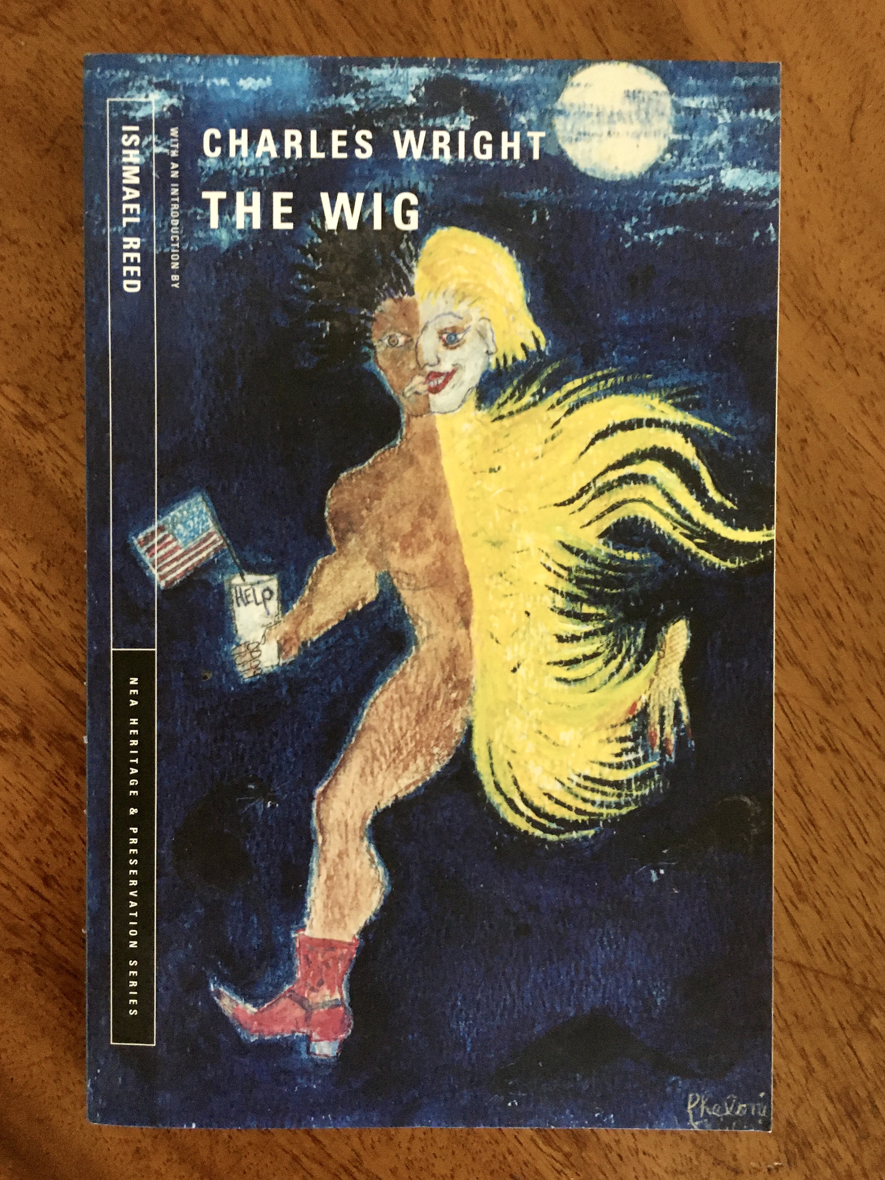
While scanning for anything by Rudolph Wurlitzer (no dice), I spied the spine of Charles Wright’s The Wig. Wright has been on my radar for a while now, mostly due to Ishmael Reed’s consistent endorsement of him (in both fiction and nonfiction alike), and when I pulled the volume to reveal its beautiful cover, I saw Reed’s name on the margin (and on the blurb on the back), and had to have it. The cover art is by Phelonise Willie; design by Scott di Giolamo:
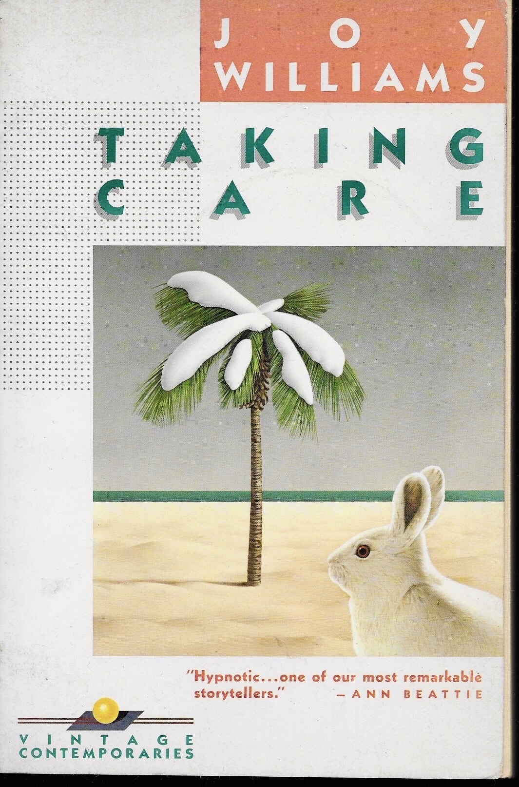
Taking Care by Joy Williams. 1985 trade paperback from Vintage Contemporaries. Cover design by Lorraine Louie. Cover illustration by Rick Lovell.
I read this book earlier this year. It’s really great. I reviewed it on this site, writing—
These are stories of domestic doom and incipient madness, alcoholism and lost pets. There’s humor here, but the humor is ice dry, and never applied as even a palliative to the central sadness of Taking Care. Williams’ humor is something closer to cosmic absurdity, a recognition of the ambiguity at the core of being human, of not knowing. It’s the humor of two girls eating chips on a beach, unable to decide if the people they are gazing at are drowning or just having a good time.

Norwood by Charles Portis. 1985 trade paperback by Vintage Contemporaries. Cover design by Lorraine Louie. Cover illustration by Rick Lovell.
Norwood isn’t the best book I’ve read so far this year but it is the book I most enjoyed reading, and after reading it, I sought everything else by Portis (consuming everything so far except the late novel Gringos, which I’m sort of holding onto as like…I dunno? A consolation prize at some point? Is that grim?). I picked Norwood up on a wonderful whim this summer, possibly simply because it was a Vintage Contemporaries edition (and slim). I’m so glad I did. Great read.

Cathedral by Raymond Carver. 1989 trade paperback from Vintage Contemporaries. Cover design by Lorraine Louie. Cover illustration by Garnet Henderson.
This was the first Vintage Contemporaries edition I ever bought. I bought it when I was maybe 17, sometime in the late nineties, I guess, and I was always vaguely embarrassed of the cover, especially when I used it in not one but two college courses at the end of that decade (Carver was still very cool in that era. He seems to have fallen out of favor. Good for him!) Henderson’s ultra-literal cover of the story “Cathedral” is…something. (I still prefer Lovell’s whimsical work, which is more, uh, I dunno, metaphysical (?)). I circled four short story titles on the table of contents for some reason: “A Small Good Thing,” “Where I’m Calling From,” “Vitamins,” and “Cathedral.” All great numbers. I also am fond of “Feathers” and “Chef’s House,” but I didn’t circle those titles. The rest of the stories I don’t remember, although I’m sure I read them at least once or twice.

Negrophobia by Darius James. Cover design by Katy Homans, employing All Cats Are Black in the Dark by Natasha Xavier. Trade paperback, NYRB, 2019.
Darius James’s Negrophobia, first published in 1992, is ugly, hilarious, abject, and gritty, a deep comic dive into American racism and the ways that massculture and urban living propagate and feed off of racism. NYRB’s blurb rightfully compares the novel to the work of William S. Burroughs and Ishmael Reed, but, in its hallucinatory film script form (an apocalyptic angles), it also recalls Aldous Huxley’s overlooked novel Ape in Essence. I loved it and am too much of a coward to attempt a real review.

The Haunting of Hill House by Shirley Jackson. Cover photograph by W. Eugene Smith; designer uncredited. Penguin Classics US trade paperback, 2006.
Jackson’s spooky 1959 novel has some of the best opening lines of a novel I’ve read in recent years. Hills’ final section answers to its weird opening, dramatizing fraught consciousness in turmoil, disintegrating in a ping-pong free indirect style that leaves the reader stunned, puzzled, and wishing for an extra chapter against his better judgment.

Berlin Alexanderplatz by Alfred Döblin. English translation by Michael Hoffmann. Book design by Katy Homans, featuring Georg Grosz’s painting Down with Liebknecht (1919). NRYB trade paperback, 2018.
I picked up Döblin’s 1929 Berlin Alexanderplatz on a whim a while ago at a bookstore and picked it up off the shelf today on a different whim and laughed in sympathy through the first two chapters. It’s a long book but I think I’ll keep going.

So I couldn’t pass up this first edition hardback Grove Press edition of William Burroughs’ 1964 novel Nova Express (with cover design by Grove Press stalwart Roy Kuhlman) that I found a few hot days ago, wandering decomposing stacks of pressed leaves here in North Florida. It ate up half of my credit at this particular used bookstore and yet was still cheaper than a new hardback NYT bestseller. Haven’t read the damn thing since college, and don’t own a copy so. Here’s the back cover with an author photo of Burroughs in which he looks like a goddamn baby (how did he live so long?):

“[T]he greatest satirical writer since Jonathan Swift”! I’m sure Jack Kerouac wouldn’t like hyperbolize even a smidge. What was Burroughs satirizing? Like modernism, modern machine life, etc. Control, as in all Burroughs.
Biologic Agent K9 called for his check and picked up supersonic imitation blasts of The Death Dwarfs — “L’addition — Laddition — Laddittion — Garcon — Garcon — Garcon” — American tourist accent to the Nth power — He ordered another coffee and monitored the café — A whole table of them imitating word forms and spitting back at supersonic speed — Several patrons rolled on the floor in switch fits — These noxious dwarfs can spit out a whole newspaper in ten seconds imitating your words after you and sliding in suggestion insults — That is the entry gimmick of The Death Dwarfs: supersonic imitation and playback so you think it is your own voice — (do you own a voice?) they invade The Right Centers which are The Speech Centers and they are in the right — in the right — in thee write — “RIGHT” — “I’m in the right — in the right — You know I’m in the right so long as you hear me say inside your right centers ‘I am in the right’” — While Sex Dwarfs tenderize erogenous holes — So The Venusian Gook Rot flashed round the world —

This morning my dean told me that I needed to pack up my office over the summer as the building I’m in will be undergoing a renovation. Even though I knew this was coming, the prospect hit me as a series of big anxiety waves. My walls are covered with masks, art, pictures. I have file drawers of student work going back over a decade. And books. Lots and lots of books. Books and art and stuff that I don’t really have room for anywhere else, even for a season.
Three shelves in my office are doublestacked with old mass market paperbacks from my youth—-Vonnegut, Edgar Rice Burroughs, Hemingway, Jack London, Philip K. Dick, Richard Adams, Stephen Crane, etc. Shabby books, well worn, glue splitting. Over the years I’ve acquired nicer versions of the ones I want to reread, but my sentimental attachment to this small library of paperbacks doesn’t quite fade. When I taught high school, they were the bulk of my classroom library. I insisted on their return, and was always disappointed in students who seemed interested in certain novels but never quite managed to steal them. I was always thrilled when a student would ask to borrow one “over the summer” and then forget to return it.
This sorry shabby mass-market library has been depleted over my past decade teaching community college. Every semester, a few students ask if they can borrow something they see on the shelves when they stop by to chat. It is the most wonderful feeling to give a young person a copy of Brave New World (“I’ve heard it’s good”) or Cat’s Cradle (“Is it as good as Slaughterhouse Five?”) of Studies in Classic American Literature and then insist that they keep it and not worry about returning it.
This morning, a young man approached me after class and told me he’d noticed I had a copy of Do Androids Dream Electric Sheep? in my office—could he maybe borrow it? He made a point of calling it Do Androids Dream Electric Sheep? and not Blade Runner, despite the fact that it’s a movie tie-in. He seemed so happy when I repeated that the book was his now.
Earlier that morning I gave another student my copy of Howard Zinn’s A People’s History of the United States. He’s taken a couple of classes with me, and based on our conversations and his writing, I thought he could us the book more than I could. Again—young kid so happy to get a book, to think that someone thought he should read a particular book—I recall the feeling so vividly, from the other side. I love watching the old library dwindle away. Maybe I can give away more before I have to pack it up again.

After classes and office hours I swung by my beloved bookstore. I do this a lot on Fridays, in the spare hour that I have between work and picking up kids. I had a little mission this time—buying some books for a great old friend who turns forty this weekend. He loves hiking and camping and poetry—more than I love those things, I think—so I asked twitter to throw out some recommendations, which they did. I had fun browsing the “Nature” section. I ended up getting three: Tom Clark’s Fractured Karma (a favorite of mine), Gary Snyder’s Turtle Island (I had never heard of it until today), and Annie Dillard’s Teaching a Stone to Walk (I dug a few of the short essays I read in the store). I enjoyed buying books for my friend. I am almost 100% he never reads this blog so I’m sure my posting this will not spoil his present, and, if not, Happy Birthday.
While browsing the “Nature” section, I resisted Shelters Shacks and Shanties—for now. Apologies to D.C. Beard, whose hut diagrams are exquisite:

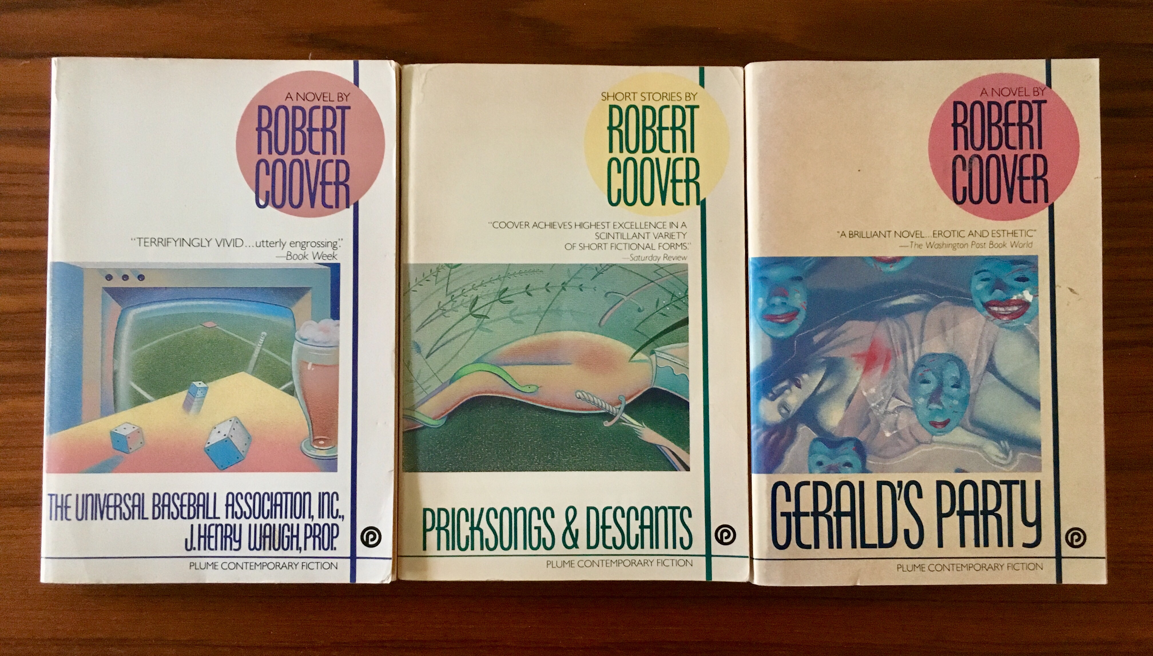
I of course selfishly picked up books for myself, although I didn’t browse for myself. I keep a silly geeky list of names to check in on, including Robert Coover. Even though I’m slogging my way through his first novel, The Origin of the Brunists, I still have a desire to read its sequel, The Brunist Day of Wrath. No wrath, but I picked up Plume editions of Pricksongs & Descants (which I’ve read but didn’t own) and Gerald’s Party (which I haven’t read and now own). The editions match the copy of The Universal Baseball Association, Inc., J. Henry Waugh, Prop. I picked last summer (and no I have not read goddamn it).
I was also thrilled to pick up a 1974 Daw Paper edition of Wendayne Ackerman’s translation of Arkadi and Boris Strugatsky’s Hard to Be a God. I read Olena Bormashenko’s translation as an e-book a few years ago, after seeing Aleksei German’s film adaptation. (I loved Bormashenko’s translation of Snail on the Slope, by the way).

This copy of Hard to Be a God, blurbed by Ursula K. Le Guin, will end up in a stack on my shelf of massmarket paperbacks, cheap pulp editions with colorful, zany, vibrant covers. Lovely unroughed, somehow pristine copies of Philip K. Dick and Stanislaw Lem and Ishmael Reed and Ursual K. Le Guin and J.G. Ballard and etcetera that’s been building up over the years, a private collection—but another library I’m sure I’ll eventually end up giving away.

I went to the book store this afternoon to pick up a copy of the latest graphic novel in by Kazu Kibuishi’s Amulet series for my kids, and of course I browsed a while. Looking for a copy of Anne Carson’s Plainwater, I ended up finding Angela Carter’s 1972 novel Infernal Desire Machines of Doctor Hoffman. It’s a British edition, 1985, Penguin, with a lovely Boschian cover by James Marsh. Here’s a detail from the cover:
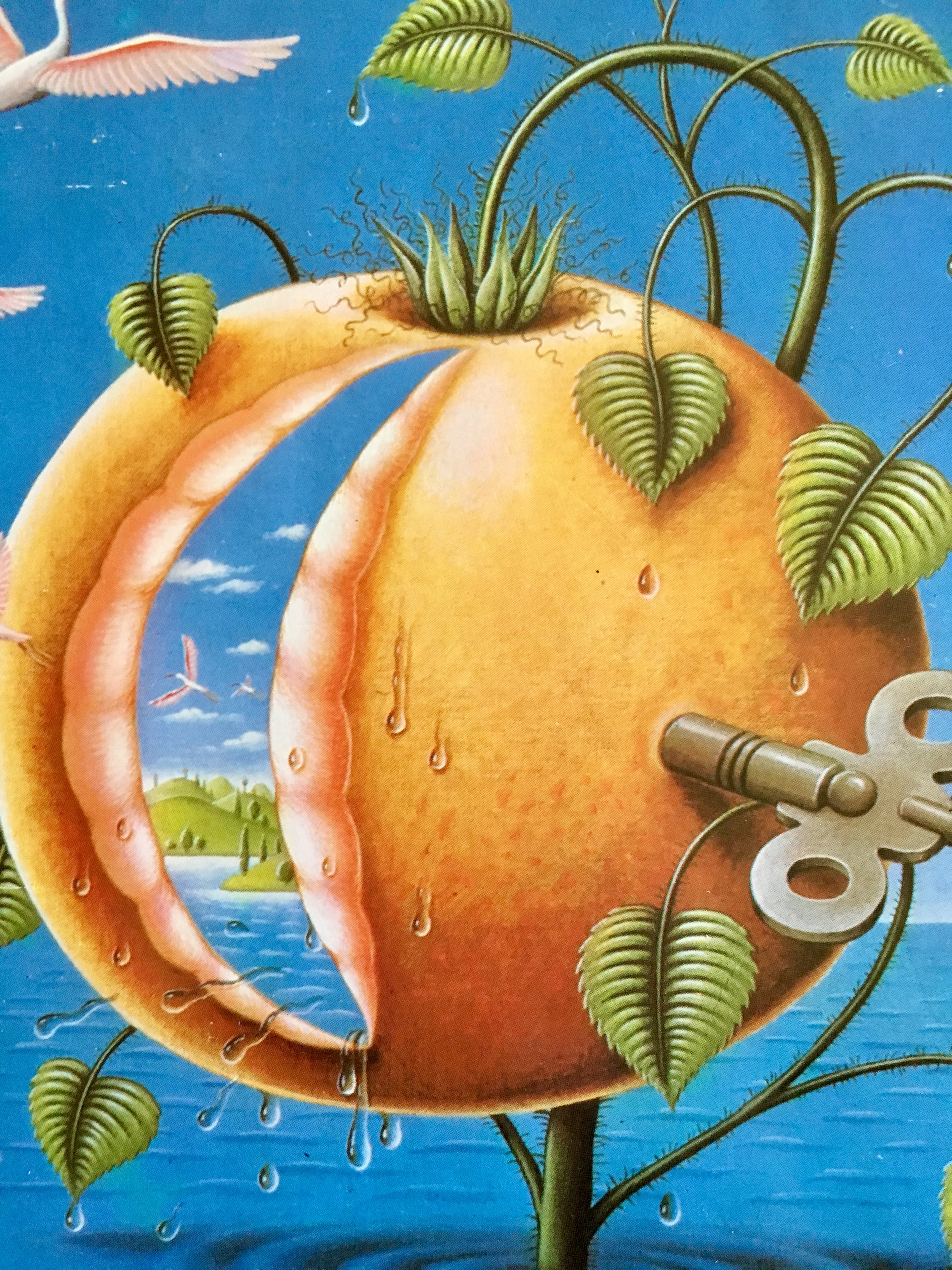
I’ve wanted to pick up Carter’s novel since I read about it on a silly good dystopian fiction list last year, and I’m thrilled that I was able to get one with a Marsh cover. This particular cover, along with Marsh’s cover for The Bloody Chamber, are included in Phil Baines lovely book Penguin by Design.
Baines’s book doesn’t include any of Marsh’s fantastic covers of J.G. Ballard novels, opting instead to include Dave Pelham’s versions. I love both Pelham and Marsh’s Ballard covers, and would love to get my mitts on one at some point. I always browse for old mass market paperbacks of sci-fi authors I like — Philip K. Dick, Ursula K. LeGuin, the Strugatsky Brothers, J.G. Ballard — hoping to find an interesting cover, something inventive and fun, something from before their works were, under the cloak of awful respectability, given safe, boring literary covers. I didn’t find any Ballard editions with Marsh or Pelham covers, but I did come across this lovely pair of mass market paperback:

They’re US Vintage versions, 1985, with covers by Chris Moore. There’s like a proto-Cherry 2000 thing going on here that I kinda love, but I already own these novels, and I don’t love the covers quite enough. So instead, this post. Here are the covers of my copies of Crash and Concrete Island:
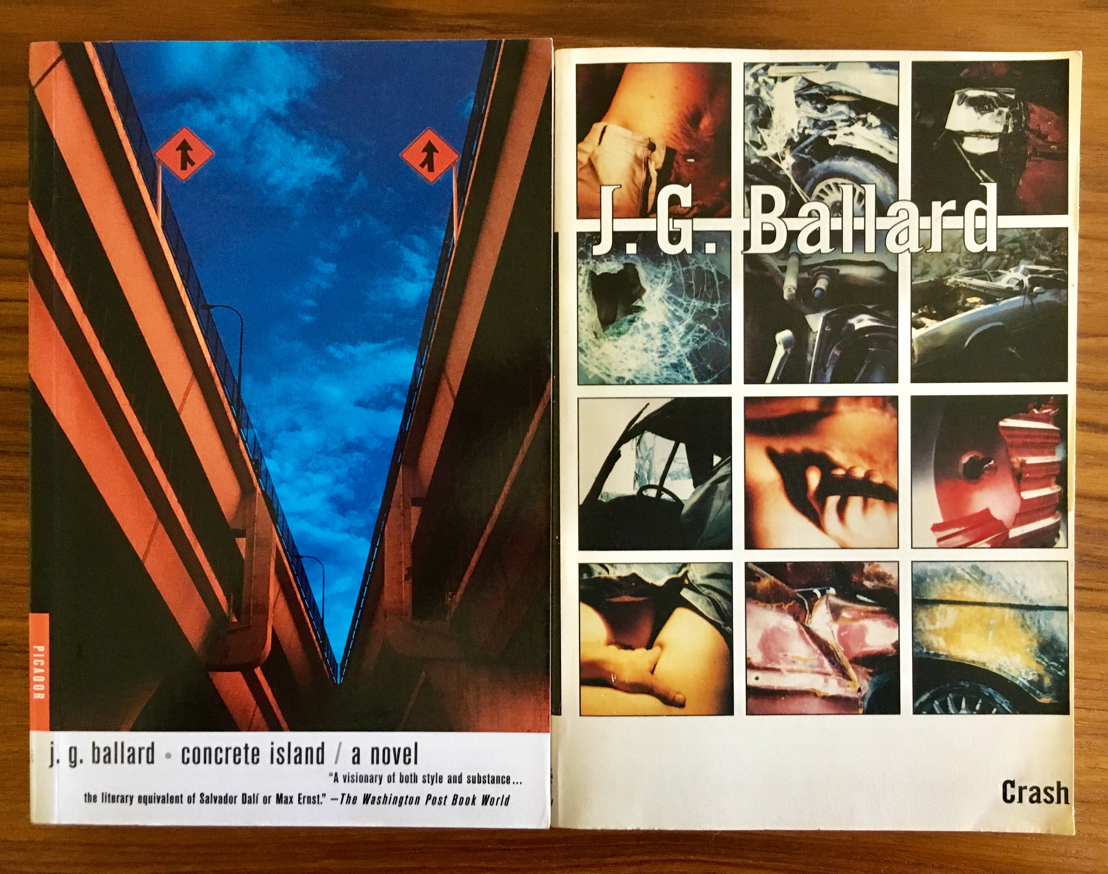
While Henry Sene Yee’s cover design for my copy of Concrete Island (using a photograph by Kevin Laubacher) isn’t terrible, it is a good example of what I mean by boring respectable literary covers. Still, this trade edition (Picador, 2001) is really readable—I mean, it’s easy to read. The pages are nice, the typeset is great, etc. (And the book is killer). I actually like the cover of my copy of Crash, a lot (design by Michael Ian Kaye and Melissa Hayden), but it’s also trying just a little too hard. (Again—very readable version from FS&G’s Noonday Press imprint, 1994).
While I had to pass today on the mass market copies of Crash and Concrete Island today—not because they would have set me back five bucks in store credit, but because I don’t need them, because I hope some kid goes in there and picks them up—while I had to pass on those lurid beauties, I did pick up a mass market 1967 copy of The Crystal World. Publisher Berkley Medallion didn’t bother to name the cover designer/artist, and I haven’t been able to track it down, but it is, I admit, a bit disappointing—an early pulp bid for literary respectability. At least I can be on the look out for a weirder one in the future.

I went to my favorite used bookshop on Friday afternoon to browse, order another Gerald Murnane novel, and pick up a copy of George Eliot’s Silas Marner.
I spied a late fifties mass market copy of Albert Camus’ novel Exile and the Kingdom from Vintage Books. I fell in love with the cover (by George Giusti) and ended up picking it up, although I’ll admit I haven’t read a Camus novel since college (it was The Plague if memory serves).
Browsing copies of Silas Marner, I found this monstrosity:
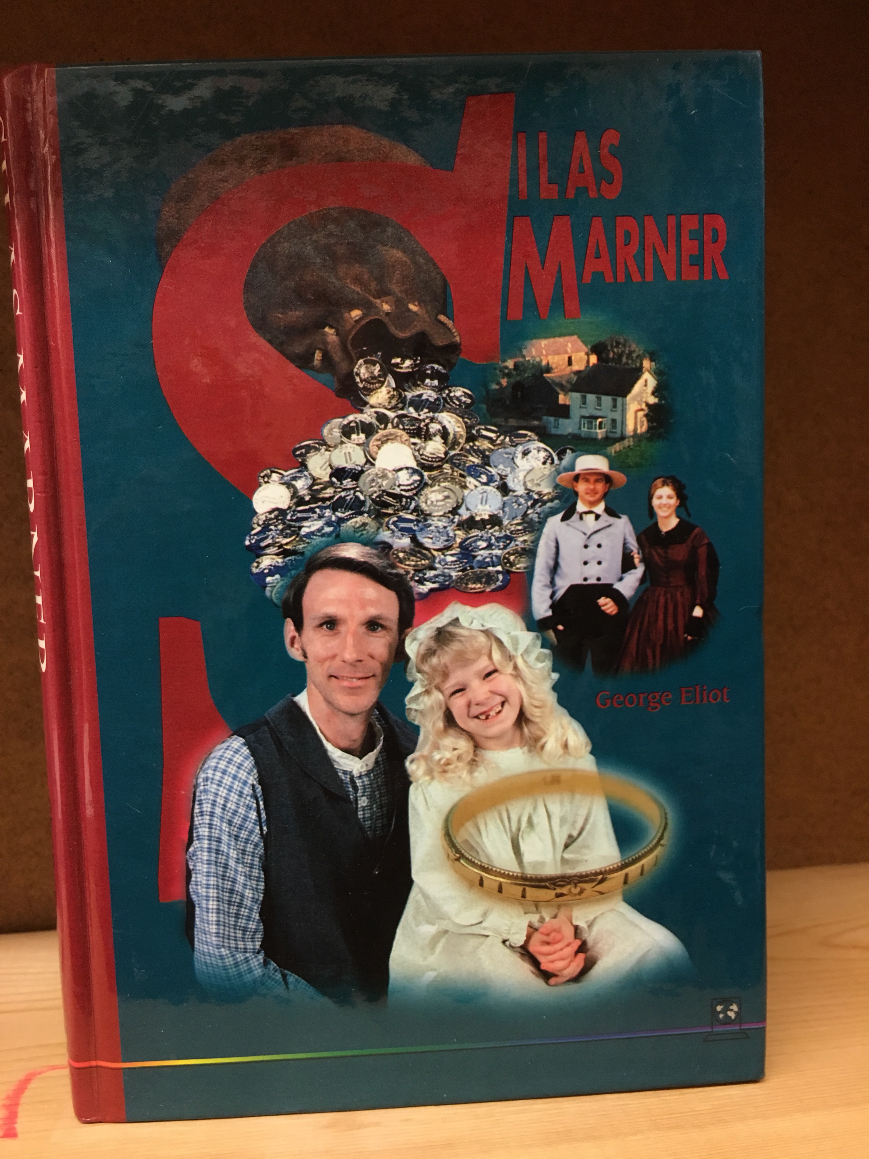
I don’t even know where to start with this cover. I mean, even the colors seem to clash. It doesn’t really come across in the photo, but this hardback has a cheap greasy feel to it. I initially assumed that it was some kind of TV or film tie in, but as far as I can tell…no. Horrifying. I ended up going with the Oxford edition with Ferdinand Hodler’s painting Unemployed on the cover.
When I got home, the mail had come. It included a copy of Peter Kuper’s Kafkaesque, which collects 14 of Kuper’s illustrated Kafka translations. Publisher Norton’s blurb:
Award-winning graphic novelist Peter Kuper presents a mesmerizing interpretation of fourteen iconic Kafka short stories.
Long fascinated with the work of Franz Kafka, Peter Kuper began illustrating his stories in 1988. Initially drawn to the master’s dark humor, Kuper adapted the stories over the years to plumb their deeper truths. Kuper’s style deliberately evokes Lynd Ward and Frans Masereel, contemporaries of Kafka whose wordless novels captured much of the same claustrophobia and mania as Kafka’s tales. Working from new translations of the classic texts, Kuper has reimagined these iconic stories for the twenty-first century, using setting and perspective to comment on contemporary issues like civil rights and homelessness.
Longtime lovers of Kafka will appreciate Kuper’s innovative interpretations, while Kafka novices will discover a haunting introduction to some of the great writer’s most beguiling stories, including “A Hunger Artist,” “In The Penal Colony,” and “The Burrow.” Kafkaesque stands somewhere between adaptation and wholly original creation, going beyond a simple illustration of Kafka’s words to become a stunning work of art.

My daughter asked to go to our favorite used bookstore a few weeks ago, and while she was milling around the children’s section, I dipped through the adjacent biographies area, an area I admit I seldom visit. Hugh Trevor-Roper’s Hermit of Peking was literally lying on the floor. The Arcimboldosque cover (by Peter Brookes—the political cartoonist?) caught my eye. The blurb, which notes that Sir Edmund Backhouse was “one of the most outrageous forgers, confidence trickster and eccentrics of the century” intrigued me; I posted the pic on Twitter and a good source vouched for Hermit. I picked it up. Read more about Backhouse’s frauds and schemes here.

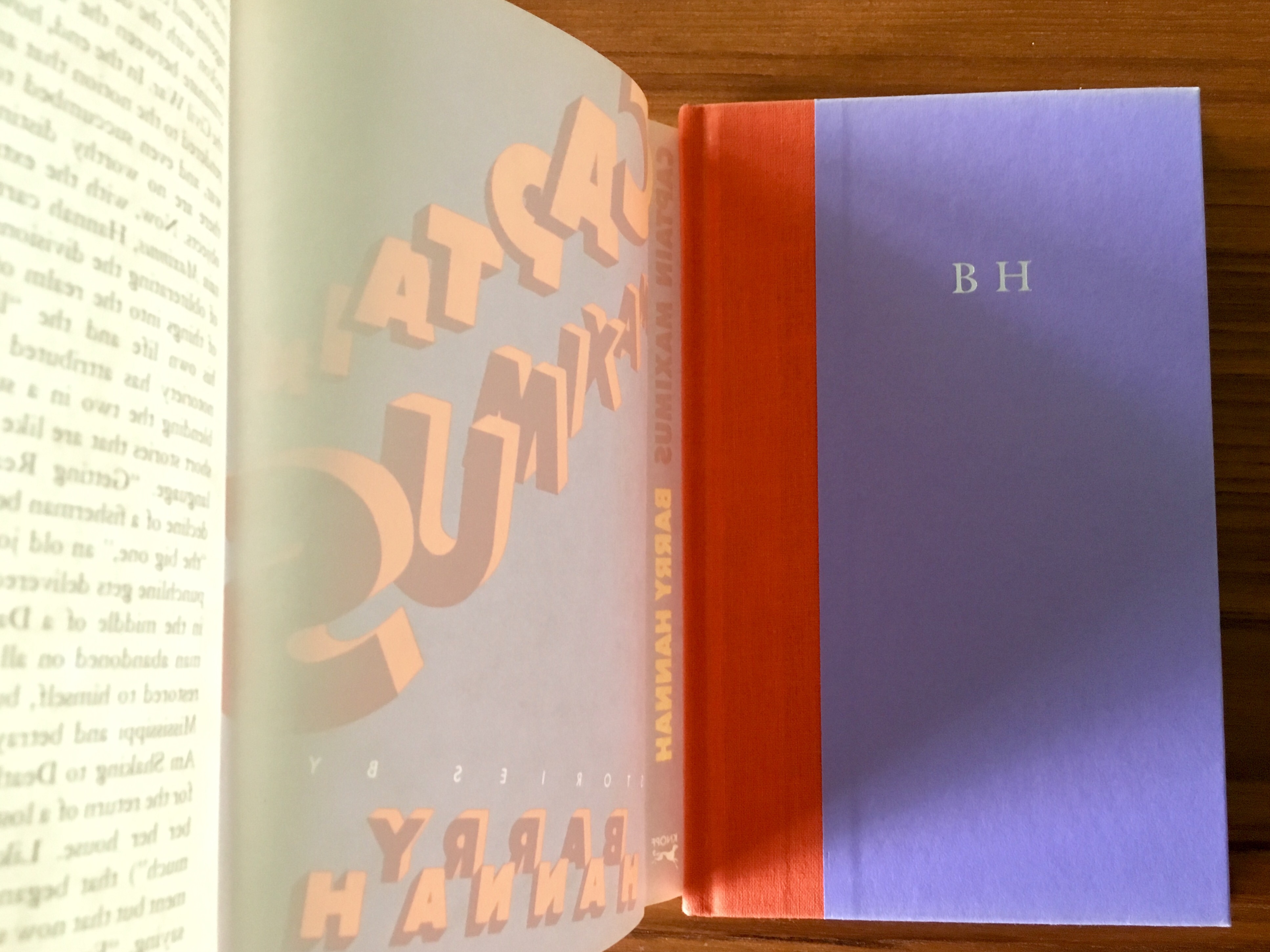
Earlier this summer I visited Alias East Books East in Los Angeles, where the clerk kindly let me handle a signed first edition of Barry Hannah’s novel Ray. It was like sixty bucks, so I didn’t handle it too fondly. But somehow the image of the signature rattled around in my silly skull all summer—probably because I spent a big chunk of July slurping up Long, Last, Happy. I wanted to find out some info about Hannah’s last quartet of stories—the last four stories in L, L, H—and doing a search of his name in Twitter led me to a link for a signed first-edition hardback copy of his slim 1985 collection Captain Maximus. (The title is a joke on his then-editor, Gordon “Captain Fiction” Lish, who apparently Hannah referred to as “Captain Minimus” in some of their letters). I might have had a scotch or two, but I bid on the book (eighteen bucks). No one else bid on it, so it’s mine now.
The cover is lovely, purple and orange, designed by Fred Marcellino, and under the bright shiny jacket is this:
I love the reserved arrogance of those initials!
And of course the signature, dated five years after the book’s publication and geographically anchored to the town my grandfather and namesake attended college in—

I didn’t actually own a copy of Captain Maximus beforehand, and I think the only stories from it included in Long, Last, Happy (which, by the way is a great starting place for Hannah) are “Fans,” “Ride, Fly, Penetrate, Loiter” and “Even Greenland” (you can read “Even Greenland” at Ben Marcus’s website). This particular copy has clearly never been read. Which leads me to this afternoon. I went to my favorite used bookstore to pick up a copy of Ishmael Reed’s The Terrible Threes—I just finished The Terrible Twos, a novel that is too prescient and too funny and too cruel and you should read it read it read it—and well anyway, I went to see if maybe they had a copy of Yonder Stands Your Orphan, which they didn’t the last time I was there, but they did today. Under it was a well-thumbed 1986 Penguin paperback edition of Captain Maximus. I need to read Yonder (which hell by the way my god what a bad cover c’mon people) before I can write the Thing I want to write on the final stories in Long, Last, Happy (or at least I think I need to read it, or anyway, I want to). And the second copy of Captain Maximus, at three dollars in store credit, is something I don’t have to worry about cramming into a pocket or dropping into a bathtub or eventually giving away to a friend.
