Mass-market Monday | Muriel Spark’s Robinson

Robinson, Muriel Spark. Penguin Books, (1964). Cover art by Terence Greer. 175 pages.

Terence Greer illustrated six midsixties Muriel Spark Penguin editions. I would love to own the other five.

Robinson is Spark’s second novel, and not her finest (of the ones I’ve read I’d argue for Loitering with Intent or The Prime of Miss Jean Brodie.)

Mass-market Monday | Arkadi & Boris Strugatski’s Hard to Be a God

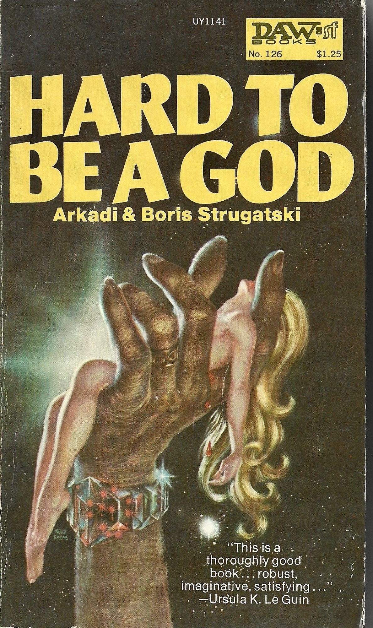
Hard to Be a God, Arkadi & Boris Strugatski. Translation by Wendayne Ackerman. Daw Books, first edition, first printing (1973). Cover art by Kelly Freas. 205 pages.

Like many anglophones, I first sought out the Brothers Strugatsky–which I will continue to spell with a final –y here, in line with the spelling variation I’ve used on this blog for years now, while also above conceding this 1973 Ackerman translation uses the –variant—like many anglophones, I first sought out the Brothers Strugatsky sometime after seeing Andrey Tarkovsky’s 1979 film Stalker, an adaptation of their 1972 novel Roadside Picnic. And, as I expect is the case with many anglophones seeking out Strugatsky novels, I had to wait quite some time to get my hands on one. The English translations of the Strugatsky’s novels were out of print and hard to find second hand.

In 2012, a new translation of Roadside Picnic by Olena Bormashenko was issued by Chicago Review Press; it was the first one I was able to get my paws on. Over the next decade CRP would release several more Bormashenko’s translations of Strugatsky novels, including Hard to Be a God. It was actually this translation of Hard to Be a God that I read, not the Ackerman version above, which I was stunned to find used and in pristine condition a few years ago (I paid about three dollars for it). Bormashenko’s translation came out a year or two after Alexei German’s film adaptation came out (or at least became available for me to watch on Netflix a dozen times over six months). It would be silly to say the book is “nothing” like the film, and the book is very good, but German’s film is a masterpiece. Those interested in the Strugatsky’s sci-fi might want to start with Roadside Picnic; I think my favorite that I’ve read so far is Snail on the Slope.

The translator of this edition, Wendayne Ackerman, also translated Stanisław Lem’s 1964 novel The Invincible, working from a German translation of the book and not the Polish original. Her bread and butter though, it seems, was translating dozens and dozens of novels in the German space opera franchise, Perry Rhodan.

Kelly Freas, the cover artist of this edition, had a long and extensive career creating sci-fi covers and illustrations, including covers for novels by Philip K. Dick and Samuel R. Delany. I like his cover (and love the font!), even if it’s a bit to King-Kongy for the novel.

Trey Ellis’s Platitudes (Book acquired, 6 June 2022)

I had a full 90 minutes to browse the second, downtown location of my favorite bookshop today, while my daughter completed onboarding at City Hall for her summer job. I picked up assigned summer reading for both of my kids, and came across a Vintage Contemporaries edition I’d never seen before: Trey Ellis’s debut novel PlatitudesThe blurb on the back by Ishmael Reed sold me on Platitudes:

I was zapped by Trey Ellis’s humongous talent. His book, Platitudes, is delightfully rad. He dares to have the gumption to write comically about American literary politics.

I also managed to avoid leaving with a bunch of massmarket paperbacks by Philip K. Dick—but here’s a pic of all their covers: 

—which I think are so much more interesting than these handsome, respectable, uniform contemporaries:

Instead of time there will be lateness and let forever be delayed

RIP DCB.

Thanks to this whole sick crew for the sing along.

This one tore me up.

Angela Carter’s Heroes & Villains (Book acquired 30 Nov. 2020)

I went to the bookstore today to take one last shot at finding a copy of Walker Percy’s 1971 novel Love in the Ruins (preferably a first-edition hardback…why not signed, while I’m dreaming? In pristine condition? Or an interesting beat up mass market paperback? I would’ve settled for an ugly tasteful prestige trade paperback at this point). No luck, but I just checked out a digital copy from my library.

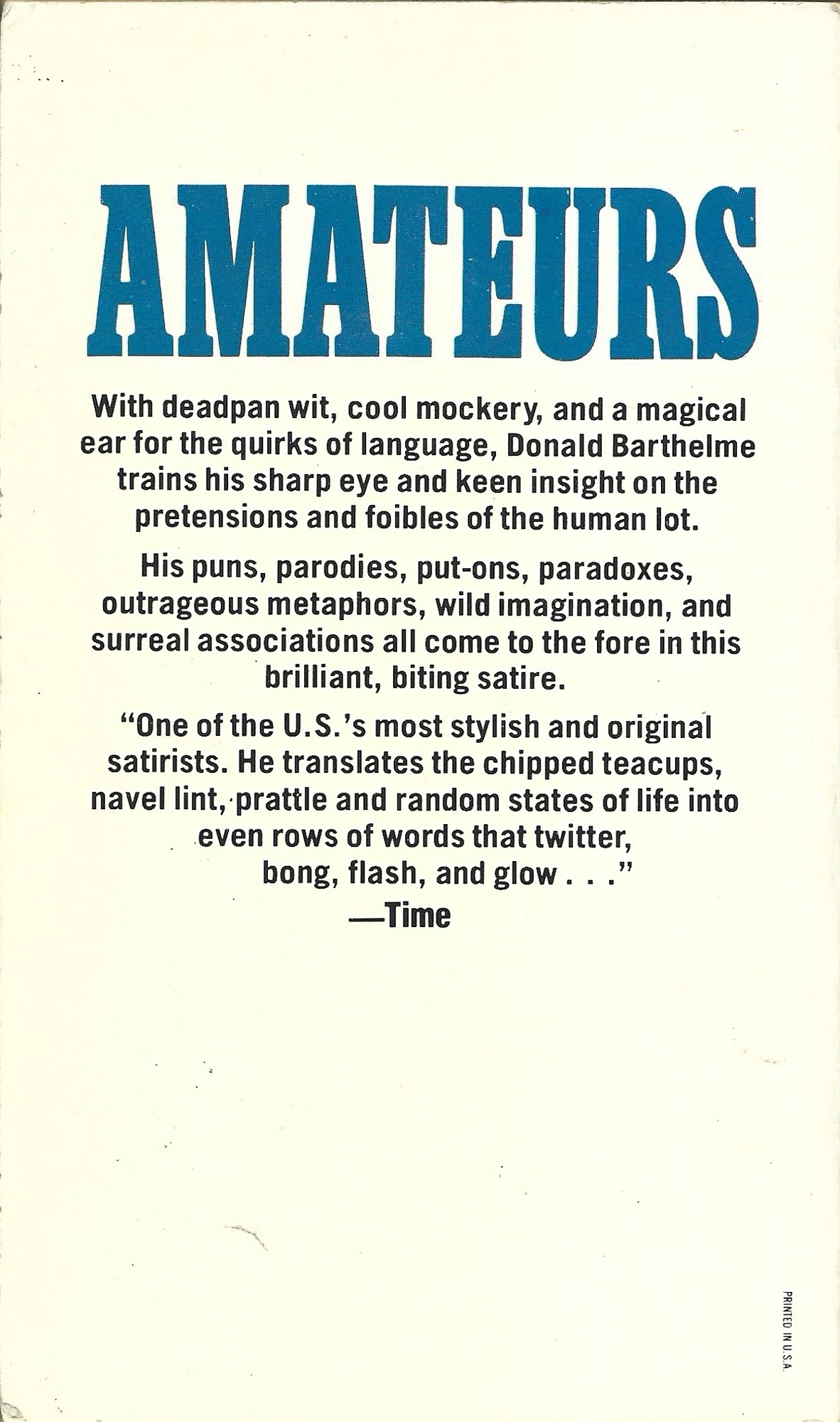
I came across this lovely 1972 Pocket Books mass market paperback copy of Angela Carter’s 1969 novel Heroes and Villains. I’m pretty sure the hornyassed so-seventies cover is by Gene Szafran, but no illustrator is credited. The back cover illustration is some psychedelic horniness too:

I know I’ve ranted on here about the trend towards tasteful book covers over the past few decades. I appreciate simple, handsome covers, to be clear—hey, look at this copy of Mark Spilka’s 1963 study Dickens and Kafka—

—I mean appreciate simple, handsome covers, to be clear—but there’s a sameness in contemporary design that is a bit wearying—I see so many new books that look like every other new book. I suppose though that the same could be said about the two examples above, each specimens of their time. Perhaps a few decades from now I’ll reflect fondly on the bold, oh-so Instagrammable cover for the first edition of Marlon James’s novel Black Leopard, Red Wolf. (jacket design by Helen Yentus; jack illustration by Pablo Gerardo Camacho):

img_2496

Three Books

2020-07-16_161411

2020-07-16_161411_1

Come Back, Dr. Caligari by Donald Barthelme. Mass-market paperback from Anchor Books, 1965. Cover art and design by Edward Gorey.

I’d only ever seen the Milton Glaser cover for Barthelme’s first collection of stories, Come Back, Dr. Caligari, and was thrilled to pick up this Gorey Anchor cover the other day. I’d almost picked up the Glaser version years ago, but it wasn’t in great shape, and I was pretty sure that all of the stories in Caligari are contained in Sixty Stories and Forty Stories (I could be wrong). I love the richness of Gorey’s cover.

2020-07-16_161411_2

Nova by Samuel R. Delany. Mass-market paperback from Bantam Books, 1979. Cover art by Eddie Jones (not credited); no designer credited.

I couldn’t make it through Delany’s cult favorite Dhalgren a few years back, but Nova was easier sledding. The book is a riff on Moby-Dick, tarot, monoculture, and the grail quest. It’s jammed with ideas and characters, and if it never quite coheres into something transcendent, it’s a fun quick read (even if the ending, right from the postmodern metatextual playbook is too clever by half).

2020-07-16_161411_3

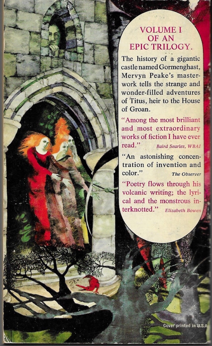
Mr Pye by Mervyn Peake. Mass-market papberback from Penguin Books, 1982. Cover art by Mervyn Peake; no designer credited.

While Mr Pye isn’t as rich, dense, or abjectly weird as Peake’s Gormenghast trilogy, it is wry and sharp, a strange morality play that made me laugh out loud a few times. (It also has a few shades of Wicker Man to it–but not too much). Good stuff.

Three Books

2020-04-05_1619032020-04-05_161903_1

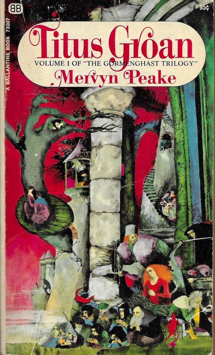
Titus Groan by Mervyn Peake. Mass-market paperback from Ballantine Books, 1968. Cover art by Bob Pepper (not credited); no designer credited.

The first of Mervyn Peake’s strange castle (and then not-castle trilogy (not really a trilogy, really)), Titus Groan is weird wonderful grotesque fun. Inspirited by the Machiavellian antagonist Steerpike, Titus Groan can be read as a critique of the empty rituals that underwrite modern life. It can also be read for pleasure alone.

2020-04-05_161903_22020-04-05_161903_3

Gormenghast by Mervyn Peake. Mass-market paperback from Ballantine Books, 1968. Cover art by Bob Pepper (not credited); no designer credited.

Probably the best novel in the trilogy, Gormenghast is notable for its psychological realism, surreal claustrophobia, and bursts of fantastical imagery. We finally get to know Titus, who is a mute infant in the first novel, and track his insolent war against tradition and Steerpike. The novel’s apocalyptic diluvian climax is amazing.

2020-04-05_161903_42020-04-05_161903_5

Titus Alone by Mervyn Peake. Mass-market paperback from Ballantine Books, 1968. Cover art by Bob Pepper (not credited); no designer credited.

I don’t usually include back covers in these Three Books posts, but I just love the way that Bob Pepper’s back-covers segue into each other.

Is Titus Alone my favorite in the trilogy, or is it just the one I read last? I don’t know. It’s a kind of beautiful mess, an episodic, picaresque adventure the breaks all the apparent rules of the first two books. The rulebreaking is fitting though, given that Our Boy Titus (alone!) navigates the world outside of Gormenghast—a world that doesn’t seem to even understand that a Gormenghast exists (!)—Titus Alone is a scattershot epic. Shot-through with a heavy streak of Dickens, Titus Alone never slows down enough for readers to get their bearings. Or to get bored. There’s a melancholy undercurrent to the novel. Does Titus want to get back to his normal—to tradition and the meaningless lore and order that underwrote his castle existence? Or does he want to break quarantine?

Titus Escapes might have been a better title for Peake’s third book, and its spirit of escape and adventure seem more compelling and comforting to me now than they did a month ago when I read this book.

Three Books

2019-10-13_183112

The Last Days of Louisiana Red by Ishmael Reed. 1974 first edition hardback from Random House. No designer credited, but the jacket flap indicates that the cover design was “suggested” by Ishmael Reed. I reviewed Louisiana Red earlier this year on this site.

2019-10-13_182907

Blue Beard by Max Frisch. English translation by Geoffrey Skelton. 1983 first edition hardback from HBJ. Design by Amy Hill.

2019-10-13_182945

Stanley Elkin’s Greatest Hits by Stanley Elkin. Foreword by Robert Coover. 1980 first edition hardback from E.P. Dutton. Cover design by Janet Halverson.

Blog about some books and some book covers and acquiring some books and not acquiring some books

img_1179

I went to the book store this afternoon to pick up a copy of the latest graphic novel in by Kazu Kibuishi’s Amulet series for my kids, and of course I browsed a while. Looking for a copy of Anne Carson’s Plainwater, I ended up finding Angela Carter’s 1972 novel Infernal Desire Machines of Doctor Hoffman. It’s a British edition, 1985, Penguin, with a lovely Boschian cover by James Marsh. Here’s a detail from the cover:

img_1180

I’ve wanted to pick up Carter’s novel since I read about it on a silly good dystopian fiction list last year, and I’m thrilled that I was able to get one with a Marsh cover. This particular cover, along with Marsh’s cover for The Bloody Chamber, are included in Phil Baines lovely book Penguin by Design.

Baines’s book doesn’t include any of Marsh’s fantastic covers of J.G. Ballard novels, opting instead to include Dave Pelham’s versions. I love both Pelham and Marsh’s Ballard covers, and would love to get my mitts on one at some point. I always browse for old mass market paperbacks of sci-fi authors I like — Philip K. Dick, Ursula K. LeGuin, the Strugatsky Brothers, J.G. Ballard — hoping to find an interesting cover, something inventive and fun, something from before their works were, under the cloak of awful respectability, given safe, boring literary covers. I didn’t find any Ballard editions with Marsh or Pelham covers, but I did come across this lovely pair of mass market paperback:

img_1176

They’re US Vintage versions, 1985, with covers by Chris Moore. There’s like a proto-Cherry 2000 thing going on here that I kinda love, but I already own these novels, and I don’t love the covers quite enough. So instead, this post. Here are the covers of my copies of Crash and Concrete Island:

img_1181

While Henry Sene Yee’s cover design for my copy of Concrete Island (using a photograph by Kevin Laubacher) isn’t terrible, it is a good example of what I mean by boring respectable literary covers. Still, this trade edition (Picador, 2001) is really readable—I mean, it’s easy to read. The pages are nice, the typeset is great, etc. (And the book is killer). I actually like the cover of my copy of Crash, a lot (design by Michael Ian Kaye and Melissa Hayden), but it’s also trying just a little too hard. (Again—very readable version from FS&G’s Noonday Press imprint, 1994).

While I had to pass today on the mass market copies of Crash and Concrete Island today—not because they would have set me back five bucks in store credit, but because I don’t need them, because I hope some kid goes in there and picks them up—while I had to pass on those lurid beauties, I did pick up a mass market 1967 copy of The Crystal World. Publisher Berkley Medallion didn’t bother to name the cover designer/artist, and I haven’t been able to track it down, but it is, I admit, a bit disappointing—an early pulp bid for literary respectability. At least I can be on the look out for a weirder one in the future.

Two Dicks (Books acquired, 17 July 2017)

img_7554

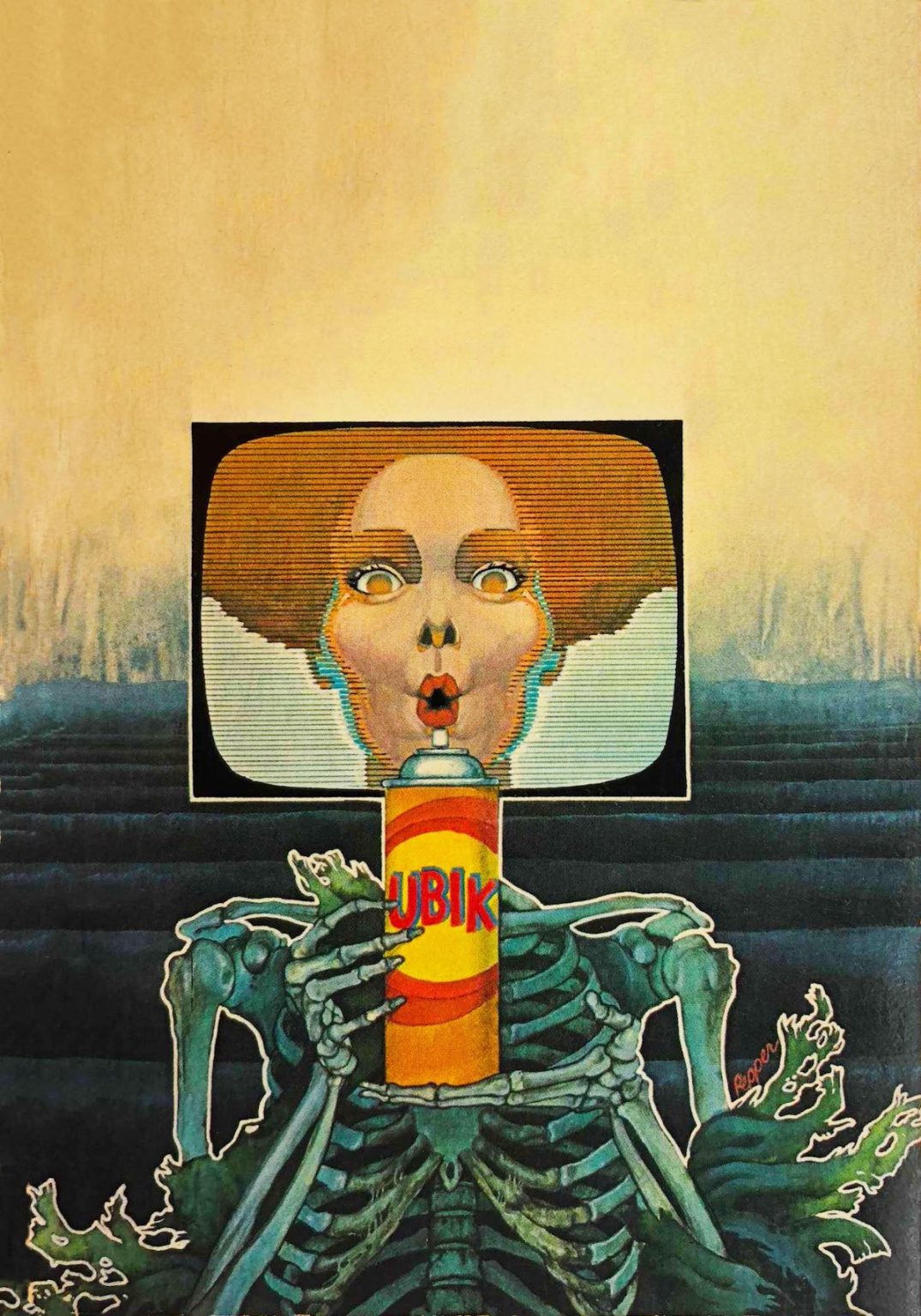
A Maze of Death, first DAW printing, 1983. Cover art by Bob Pepper.

The Transmigration of Timothy Archer, first Timescape printing, 1983.  Cover artist uncredited.

img_7555

I still regret that I failed to pick up this tattered copy of Clans of the Alphane:

Seriously though, these tasteful covers are pretty boring. Compare/contrast:

img_7553

Three Books (Possibly Cult Novels)


img_3324

Trans-Atlantyk by Witold Gombrowicz. English translation by Carolyn French and Nina Karsov. Trade paperback by Yale University Press, 1994. Cover design by Lorenzo Ottaviani. I reviewed Trans-Atlantyk here.

img_3326

Steps by Jerzy Kosinski. Another Vintage Contemporaries edition, 1988. Cover design by Lorraine Louie; illustration by Chris Moore.

I reviewed Steps here.

img_3325

The Adventures and Misadventures of Maqroll by Álvaro Mutis. English translation by Edith Grossman. NYRB, 2002. Cover design by Katy Homans; cover photograph by Sally Mann.

Biblioklept reviews here, here, and here.

These three books may or may not be cult novels.

I’ve been thinking a bit about the term cult novel, a term which used to fascinate me in my twenties, but one which I’m beginning to suspect doesn’t really mean anything, or seems to have a different value, anyway, now.

I’ve been thinking about cult novels because I’m nearing the end of Giuseppe di Lampedusa’s excellent excellent excellent 1958 novel The Leopard, which someone somewhere (who? where?) told me was a cult novel. I have no idea why The Leopard should be a cult novel. Where is its cult? By cult do we just mean “underread” or “underappreciated”?

It seems that the internet has dramatically changed what a cult novel might be/mean. (I wrote a bit about cult novels on this blog years ago, and I would expand the rough list I outlined were I to update that lousy post, which I won’t). The three books I picked today might be cult novels in the sense that they might be underappreciated/underread—although that statement strikes me as absurd somehow! (Steps won the National Book Award).

I guess a real cult novel would be a novel, or perhaps author, who inspires a cultishly devoted base of readers (is this what the kids call a fandom? Jesus Christ). And because of the internet, cults can be big now: Pynchon, Ballard, Cormac McCarthy, David Foster Wallace, Philip K. Dick. Such writers and their novels have inspired obsessive fans. But the works of these novelists are hardly samizdat. Look at PK Dick—think of how much of his work, his writing, his ideas have seeped into mainstream culture? So is it cult then?

Or am I really just stuck on an older connotation of “cult,” of cult classic, I guess, which was just a way of saying odd + underappreciated + hard to find? Which is to say in modes both literal and figurative: Inaccessible

And so well then when I say that the internet has changed what a cult novel is/isn’t, I suppose I’m simply noting access—access to the material books, access to fellow readers, access to forums, access to analysis, etc. And I suppose that’s, uh, good.

I considered hammering out a list of cult novels here at the end of this pointless little riff, but it would be too long. Besides, I really have no idea what a cult novel is anymore. I threw the question out there on Twitter, asking for examples, and got a wonderful wild range of responses, but the best response came almost immediately:

Hurrah for more intense pocket universes than ever before.

Three Books

img_2724

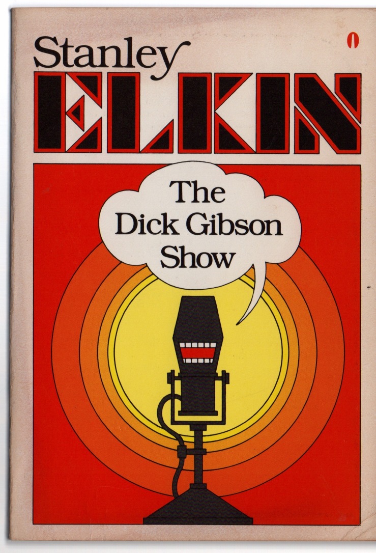
The Dick Gibson Show by Stanley Elkin. 1983 trade paperback by E.P. Dutton/Obelisk. Cover design by Janet Halverson.

I finished Elkin’s The Franchiser this week and started this one this week.

img_2722

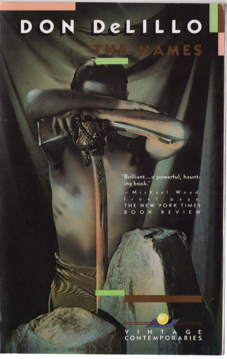
The Names by Don DeLillo. 1989 trade paperback by Vintage Contemporaries (God I love Vintage Contemporaries wonderful awful covers)God I love Vintage Contemporaries wonderful awful covers). COver design by Lorraine Louie employing an illustration by Marc Tauss.

I tried starting The Names after finishing The Franchiser, but took a pause…maybe I still have the bad taste of this recent DeLillo interview in my ears.

img_2721

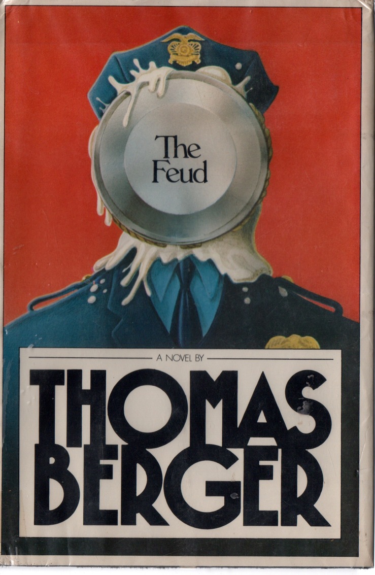
The Feud by Thomas Berger. First edition hardback by Delacorte Press, 1983. Jacket design and illustration by Fred Marcellino.

A colleague gave me this a few years ago, and I love the cover; Marcellino’s actually been featured in these Three Books posts a few times now—he did covers for Pynchon and Russell Hoban that I adore.

Three Books

img_2612

Queer by William S. Burroughs. Trade paperback by Penguin; copyrighted 1987 but no year of the actual printing, which I’m sure is sometime in the mid-nineties. Cover design by Daniel Rembert from a painting by Burroughs.

I bought Queer and Junkie at the Barnes & Noble where I spent too many Friday nights of my high school years. I was sophomore in high school, I think. My parents were concerned about the books, I recall, but in a vague, troubled way—a wrinkling of the temples, a look that I now know means, What does this mean? What are we supposed to do here? They asked me what the books were about and then told me not to do heroin.

img_2613

O Pioneers! by Willa Cather. Hardback and cloth by Houghtin Mifflin, 31st printing, 1961. No designer is credited; the book may have had a dust jacket at one point.

The dark marks are from a librarian’s tape job. She gave me this book, and dozens others, which were being remaindered. I reread the novel a few years ago, noting some of its themes, “including the divide between the New World and the Old, alienation, and the ways in which conformity and routine are antithetical to the pioneer spirit that Americans like to trick themselves into believing they are heir to.”

img_2615

My Sister’s Hand in Mine by Jane Bowles. Trade paperback by the Ecco Press, 7th printing, 1988. Cover design by Anna Demchick.

This collection includes the novel Two Serious Ladies, one of the best and strangest books I’ve read in years. I wrote about it last year on this blog, concluding:

The reading experience cannot be easily distilled. (Strike that adverb). Two Serious Ladies resists unfolding in the way we expect our narratives to unfold—to be about something—Bowles withholds exposition, clarification, and motivation—well, okay, not withholds, but rather hides, or obscures, or enshadows. (I don’t have the verbs for this book). I think of Harold Bloom’s rubric for canonical literature here. In The Western Canon, he  argues that strong literature exemplifies a “strangeness, a mode of originality that either cannot be assimilated, or that so assimilates us that we cease to see it as strange.” Nearly three-quarters of a century after its publication, Two Serious Ladies is still strange, still strong, still ahead of its time. Its vignettes flow (or jerk or shift or pitch wildly or dip or soar or sneak) into each other with a wonderfully dark comic force that simultaneously alienates and invites the reader, who, bewildered by its transpositions, is compelled to follow into strange new territory. Very highly recommended.

Three Books (On Ferrante, Knausgaard, irony, and covers good and bad)

img_2420

My Struggle, Book 1 by Karl Ove Knausgaard. English translation by Don Bartlett. First edition trade paperback by FS&G, 2013. Cover design by Charlotte Strick and Bill Zindel, with cover art by Bill Zindel.

I couldn’t really get past page 80 of My Struggle, but I like Zindel’s zany design for the first volume enough to hold on to it. Kinda reminds me of those Vintage Contemporaries I so adore.

A lot of people didn’t like the design though, and FS&G didn’t end up publishing the rest of Zindel’s designs, which would’ve looked pretty neat as a complete set. As literary critic Scott Esposito put it at the time “the market has spoken, and it hates the original paperback.”

Instead, FS&G went with variations on this—

img_2421

My Struggle, Book 2 by Karl Ove Knausgaard. English translation by Don Bartlett. First edition trade paperback by FS&G, 2014. Cover design by Charlotte Strick; photograph by Andreas Eikseth Nygjerd.

Look at our boy Knausgaard, smokin’ away! This cover is boring but not Bad, which makes it far less interesting than the Bad Knausgaard cover which is actually very Good. The Book 2 cover (and subsequent covers in the series) are safe and “stylish”—and when I write “stylish,” I use it in the way many writers use it—thoughtlessly, blankly—stylish as a word that points vaguely to the idea of style, the zeitgeistiness of style. Etc. (Again—I encourage you to check out Zindel’s vision for the whole series).
img_2419

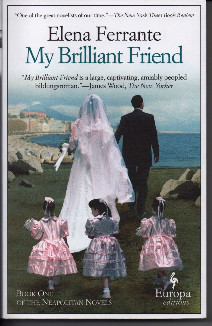
My Brilliant Friend by Elena FerranteEnglish translation by Ann Goldstein. Fifteenth printing, Europa Editions, 2015. Book design by Emanuele Ragnisco; cover photo by Anthony Boccaccio.

My Brilliant Friend is brilliant, my friend.

Its cover is awful, and the subsequent covers in the so-called Neapolitan Novels quartet are somehow worse.

A good friend who’s never steered me wrong with a reading recommendation told me to read Ferrante last year, but I didn’t—it wasn’t the hype that put me off (although the hype put me off), but the covers. I finally acquiesced to an audiobook version, and after getting a few chapters in, wanted the text. So I caved.

But my god, the cover—why?

The publisher and art director(s) claim that the Ferrante covers are bad on purpose.

An article in Quartz that I found simply by googling “Ferrante covers awful” yields this nugget:

…Sandro Ferri, Europa Editions’ publisher, says the covers were not an accident of too many cooks in the design kitchen, but rather a conscious choice. Writes Ferri in an email to Quartz, “The ‘vulgarity’ is our intention. We don’t want to make the typical ‘literary’ cover designed for an audience of ultra-sophisticated readers. … Ferrante’s novels are a mix of popular literature and highbrow, intellectual writing. We want to communicate this though our covers as well.”

And in a Slate interview, EE co-founder/publisher Sandra Ozzola again asserts that the decision for tacky covers was, um, purposeful:

From the time of our first conversation with Elena Ferrante about her intention to write this novel, we knew the book’s title and that it would be the story of a long friendship between women—and that it would conclude with a scene of a very vulgar Neapolitan wedding. The wedding and Elena’s impression of it … is an extremely important moment in the book. That’s why I intentionally searched for a photo that was “kitsch.” This design choice continued in the subsequent books, because vulgarity is an important aspect of the books, of all that Elena wants to distance herself from.

If we take a book’s cover to be where the book “begins,” where we first start to read the text, then EE’s awful kitschy crappy ugly covers signal postmodern irony—a joke on perception, the marketplace, high-low aesthetics, etc. The covers work as a kind of metatextual critique, then, as Ozzola seems to suggest above—a critique that relies on the reader’s understanding of the novel’s central character’s aesthetic viewpoint.

Well so then: Are the covers indeed ironic critiques of book-cover-aesthetics? Are we to take these covers as pop art parodies of books that traffic in romantic aspirations, that are, like, marketed to women?

Or are these covers simply designed to appeal to the very market that they would claim to ironically mock?

The have-your-cake-and-eat-it-too postmodern answer to these questions is, of course, “Yes.”

To fully appreciate the aesthetic irony of the Ferrante novels of course requires reading the Ferrante novels. And undoubtedly, many people are put off reading these books because of the covers. So much so that Ferrante’s novels got new covers for their Australian release. The new covers were designed by W.H. Chong:

Mr Chong told The New Daily it can be dangerous to try irony on a book’s cover – especially if the joke isn’t clear to readers.

“You have to signal the irony really clearly otherwise the recipient doesn’t realise the irony,” Mr Chong said.

“You have to signal the irony really clearly” — okay, sure. But the finest satire never announces itself as such.

Chong’s new covers feature simple black-and-white photographs, and they have received praise. But in a sense, the Australian covers seem, at least to me, to echo those Knausgaard updates—safe, boring even. But I’d much rather be seen reading one of those, than, say, the original EE edition of The Story of the Lost Child, which has maybe the worst cover I’ve ever seen.

Europa Editions’ forthcoming Ferrante collection, Frantumaglia, has a great cover, by the way.
Books acquired, almost for their covers alone, 4.25.2016 (Elkin, Fine, Michaux)

img_2066

I swung by my favorite used bookstore this afternoon; it’s right near the grocery store and I needed to pick up some mint and some ricotta. I was hoping to pick up Elena Ferrante’s novel My Brilliant Friend at the bookstore. I started the audiobook of My Brilliant Friend today, after finishing the audiobook of Adrian Jones Pearson’s novel Cow Country  this weekend. (Full review of Cow Country forthcoming but a real quick review: great performance/reading of a very strange book which I enjoyed very much, but which I also suspect will have very limited appeal. Cow cult classic to come). But so anyway, I’m really digging the Ferrante, and decided I wanted to obtain a physical copy to reread passages (and maybe share some on this blog). My store had several copies of four of Ferrante’s novels–but no Friend. While scanning the section, my eye alighted (alit?) on a strange-looking hardback spine—Warren Fine’s Their Family. I turned it around and the cover…well, I knew I was gonna leave with it. Knopf, 1972—a few years before Gordon Lish was to become editor there, sure, but interesting bona fides I suppose. Fine does not seem to be beloved by anyone on the internet, and his books seem to have failed to go into second printings of any kind. The Fs are near the Es, and I glanced over the works of Mr. Stanley Elkin, who has his own section there, somehow. I finally broke through the second chapter of his novel The Franchiser this weekend (it’s all unattributed dialog, that chapter, sorta like Gaddis’s JR); I’m really digging The Franchiser now that I’ve tuned into the voice. (It also helps to not try reading it exclusively at night after too many bourbons or wines). Again, the spine of the novel looked interesting so I flipped The Dick Gibson Show around and, again, I knew I was gonna leave with it. Henri Michaux’s Miserable Miracle I found in the “Drugs” section—which I was not perusing (because I am no longer 19)—well I guess I was perusing it, but that’s only because it happens to be right next to this particular bookshop’s collection of Black Sparrow Press titles, which I always scan over. Anyway, the Michaux’s Miserable Miracle was turned face out; NYRB titles always deserve a quick scan, and the cover reminded me of a Cy Twombly painting. Flicking through it revealed a strange structure, full of marginal side notes and doodles and diagrams and drawings. And oh, it’s about a mescaline trip, I think. You can actually read it here, but this version is missing all the drawings and sidenotes.

Oh, and so then I forgot to go pick up the ricotta and the mint.

Three Books

img_1930

Collected Stories by William Faulkner. 1977 first edition trade paperback from Vintage. This book is 900 pages, exactly, not including the ancillary pages that detail publication dates and rights, as well as Vintage’s back catalog—and yet not one of those pages manages to credit the cover designer or photographer.

I’ve been reading/re-reading this very slowly, with the loose goal of finishing this year.

img_1929

Nausicaä of the Valley of the Wind, Vol. 4 by Hayao Miyazaki. English translation by David Lewis and Toren Smith. Studio Ghibli Library edition by Viz Media, 2010. No designer credited, but the cover is by Miyazaki and I imagine we can probably credit Studio Ghibli with the design.

I started rereading Nausicaä this week after revisiting Princess Mononoke this week. Then I got horribly ill, and the only stuff I can really read when I’m really sick are comics. I scanned Vol. 4 for this week’s Three Books post; I finished it pretty late last night. Vol 5-7 remain.

img_1931

Junkets on a Sad Planet by Tom Clark. First edition trade paperback by Black Sparrow Press, 1994. Cover design by Barbara Martin. The image is of Benjamin Robert Haydon’s life mask for John Keats (from a photo by Christopher Oxford).

I awoke around 1am in the middle of last week, and unable to sleep, I wandered to our den and randomly took this from the shelf to begin reading/rereading. The book (its title is a pun) is difficult to explain, a beautiful experience, rich. Here’s Clark’s own description: “…an extended reflection on the modern poet’s life, as Keats lived it. The book may be read by turns as poetic novel, biography in verse, allegorical masque, historical oratorio for several voices.”

Three Books

img_1820

Madness and Civilization by Michel Foucault. English translation by Richard Howard. Second edition Pantheon hardback, 1965. Cover design by Pan Visual, featuring a detail from Bosch’s Christ Carrying the Cross.

img_1819

Correction by Thomas Bernhard. English translation by Sophie Wilkins. 1983 first edition trade paperback by Aventura. Cover design by Keith Sheridan featuring an illustration by Marshall Arisman. I wrote about Correction here.

img_1818

The Tanners by Robert Walser. English translation by Susan Bernofsky. Irregular-sized trade paperback by New Directions, 2009. Cover design by Erik Rieselbach.