J R J R J R | Three Books

J R by William Gaddis. 2020 trade paperback edition by NYRB. Cover design by Katy Homans. Introduction by Joy Williams (xi pages). 770 pages.

J R by William Gaddis. 1993 trade paperback edition by Penguin. Cover art is a detail of an Associated Gas and Electric Company stock certificate “Courtesy of William Gaddis.” No designer credited. Introduction by Frederick R. Karl (xxi pages). 726 pages.

J R by William Gaddis. 1975 trade paperback edition by Borzoi/Knopf. Cover design by Janet Halverson. 726 pages.

Three Books (Books acquired, 31 July 2020)

2020-08-02_185600_1

The Dead Father by Donald Barthelme. Mass market paperback from Pocket Books (S&S), 1976. Cover art and design uncredited.

2020-08-02_185600

Unspeakable Practices, Unnatural Acts by Donald Barthelme. Mass market paperback from Bantam, 1969. Cover art and design uncredited.

I found a lovely copy of Donald Barthelme’s story collection Come Back, Dr. Caligari! a few weeks ago, and I’m pretty sure these two guys are twin triplets with that guy. (I found Caligari under “Classic Literature” in my local favorite sweetass bookstore; found these two in “General Fiction.”) No artist credited, which is a shame. I already own a copy of The Dead Father—maybe Barthelme’s best “novel”?—but I couldn’t pass up the mass market edition. I live with myself, but. I’ve read everything in Unspeakable —think — but again, great edition. This is probably the best starting point for Barthelme, with no fewer than five perfect or near-perfect short stories: “The Indian Uprising,” “The Balloon,” “Robert Kennedy Saved from Drowning,” “Game,” and “See the Moon?”

2020-08-02_185600_2

Epitaph of a Small Winner by Machado de Assis. English translation by William L. Grossman. Mass market paperback from Avon-Bard, 1978. Cover art and design uncredited.

I’m a huge fan of these Bard-Avon Latin American editions, and although this cover isn’t one of their weirdest, it’s not bad. I’m not sure if Grossman’s translation is the one to tackle, but I’m up for it.

Three Books

2020-07-16_161411

2020-07-16_161411_1

Come Back, Dr. Caligari by Donald Barthelme. Mass-market paperback from Anchor Books, 1965. Cover art and design by Edward Gorey.

I’d only ever seen the Milton Glaser cover for Barthelme’s first collection of stories, Come Back, Dr. Caligari, and was thrilled to pick up this Gorey Anchor cover the other day. I’d almost picked up the Glaser version years ago, but it wasn’t in great shape, and I was pretty sure that all of the stories in Caligari are contained in Sixty Stories and Forty Stories (I could be wrong). I love the richness of Gorey’s cover.

2020-07-16_161411_2

Nova by Samuel R. Delany. Mass-market paperback from Bantam Books, 1979. Cover art by Eddie Jones (not credited); no designer credited.

I couldn’t make it through Delany’s cult favorite Dhalgren a few years back, but Nova was easier sledding. The book is a riff on Moby-Dick, tarot, monoculture, and the grail quest. It’s jammed with ideas and characters, and if it never quite coheres into something transcendent, it’s a fun quick read (even if the ending, right from the postmodern metatextual playbook is too clever by half).

2020-07-16_161411_3

Mr Pye by Mervyn Peake. Mass-market papberback from Penguin Books, 1982. Cover art by Mervyn Peake; no designer credited.

While Mr Pye isn’t as rich, dense, or abjectly weird as Peake’s Gormenghast trilogy, it is wry and sharp, a strange morality play that made me laugh out loud a few times. (It also has a few shades of Wicker Man to it–but not too much). Good stuff.

Three Books

2020-04-05_1619032020-04-05_161903_1

Titus Groan by Mervyn Peake. Mass-market paperback from Ballantine Books, 1968. Cover art by Bob Pepper (not credited); no designer credited.

The first of Mervyn Peake’s strange castle (and then not-castle trilogy (not really a trilogy, really)), Titus Groan is weird wonderful grotesque fun. Inspirited by the Machiavellian antagonist Steerpike, Titus Groan can be read as a critique of the empty rituals that underwrite modern life. It can also be read for pleasure alone.

2020-04-05_161903_22020-04-05_161903_3

Gormenghast by Mervyn Peake. Mass-market paperback from Ballantine Books, 1968. Cover art by Bob Pepper (not credited); no designer credited.

Probably the best novel in the trilogy, Gormenghast is notable for its psychological realism, surreal claustrophobia, and bursts of fantastical imagery. We finally get to know Titus, who is a mute infant in the first novel, and track his insolent war against tradition and Steerpike. The novel’s apocalyptic diluvian climax is amazing.

2020-04-05_161903_42020-04-05_161903_5

Titus Alone by Mervyn Peake. Mass-market paperback from Ballantine Books, 1968. Cover art by Bob Pepper (not credited); no designer credited.

I don’t usually include back covers in these Three Books posts, but I just love the way that Bob Pepper’s back-covers segue into each other.

Is Titus Alone my favorite in the trilogy, or is it just the one I read last? I don’t know. It’s a kind of beautiful mess, an episodic, picaresque adventure the breaks all the apparent rules of the first two books. The rulebreaking is fitting though, given that Our Boy Titus (alone!) navigates the world outside of Gormenghast—a world that doesn’t seem to even understand that a Gormenghast exists (!)—Titus Alone is a scattershot epic. Shot-through with a heavy streak of Dickens, Titus Alone never slows down enough for readers to get their bearings. Or to get bored. There’s a melancholy undercurrent to the novel. Does Titus want to get back to his normal—to tradition and the meaningless lore and order that underwrote his castle existence? Or does he want to break quarantine?

Titus Escapes might have been a better title for Peake’s third book, and its spirit of escape and adventure seem more compelling and comforting to me now than they did a month ago when I read this book.

Two Books (Books acquired, 7 and 14 Feb. 2020)

2020-02-23_113226

Robinson by Muriel Spark. Penguin Books, 1964. Cover drawing by Terence Greer.

I have not yet read Muriel Spark, but I’ve noted she’s been compared to Ann Quin and Anna Kavan. Robinson looked more interesting to me (and shorter) than her more famous novels The Prime of Miss Jean Brodie and Memento Mori, and I love this cover.

2020-02-23_113226_1

Alchemy by Titus Burckhardt. Penguin Books,1974. Cover design by Walter Brooks, using a drawing from Basilius Valentinus’s “Aurelia Occulta Philosophorum” in Theatrum Chemicum, Argentoratie, 1614. vol. IV. Chocked full of glorious black and white images.

Three Books (that I loved in 2019)

I was having a tough time doing a Three Books post for the end of the year, so I divvied it up a bit, writing about three books I read in 2019 that were actually published in 2019, three books that I read in 2019 that were published in the 2010s, and three books I read in 2019 from indie presses. Here are three books that I loved in 2019.

2019-10-20_185738_3

Norwood by Charles Portis. 1985 trade paperback by Vintage Contemporaries. Cover design by Lorraine Louie. Cover illustration by Rick Lovell.

I could’ve picked any of the four novels by Portis that I read this year, but I read Norwood first, so. I wrote about his novels in a post here.

2019-10-06_172844

Berlin Alexanderplatz by Alfred Döblin. English translation by Michael Hoffmann. Book design by Katy Homans, featuring Georg Grosz’s painting Down with Liebknecht (1919). NRYB trade paperback, 2018.

“Unbe-fucking-lievable”

2019-12-31_134606

Ice by Anna Kavan. 2017 trade paperback from Penguin Classics. Cover illustration by Hsiao-Ron Cheng. No designer credited.

Imperfectly perfect. I wish I’d read it years ago but I’m glad I read it this year. More here. (I fucking loved Ice.)


Three Books (that were my favorite books published by indie presses in 2019)

2019-12-30_150344_1

Berg by Ann Quin. 2019 trade paperback (advanced reader proof) from And Other Stories. No designer credited on the advanced reader proof, but the cover photograph (of Ann Quin) is by Oswald Jones. The designer credited with the final version of the cover is Edward Bettison.

Berg might have been my favorite reading experience of 2019. Who can resist an opening sentence like this one?

A man called Berg, who changed his name to Greb, came to a seaside town intending to kill his father…

Every other sentence in the book is great as well. I read Berg in a grimy haze, the last little bit of our brief Florida spring burning off into an early muggy summer. I will likely always think of Berg as part of a strange trilogy I read in 2019, the first book in a series that led (how?) to Anna Kavan’s Ice and concluded (how?) with Shirley Jackson’s The Haunting of Hill House.

From my review of Berg:

Read the book. There’s nothing I can do in this review that approaches the feeling of reading Ann Quin’s Berg. I can make lame comparisons, saying that it reminds me of James Joyce’s Ulysses (in its evocations of loose consciousness), or David Lynch’s Blue Velvet (in its oedipal voyeuristic griminess), or Luis Buñuel’s The Exterminating Angel (for its surreal humor and dense claustrophobia). Or I can point out how ahead of her time Quin was, how Berg bridges modernism to postmodernism while simply not giving a fuck about silly terms like modernism and postmodernism.

2019-12-30_150344

Lord by João Gilberto Noll in English translation by Edgar Garbelotto. 2019 trade paperback from Two Lines Press. Cover design by Gabriele Wilson using a photograph by Jeff Cottenden.

Reading Lord is a bit like dreaming through a fever, a fever that you’ve tried to subdue with a mix of over-the-counter night-time syrup and strong black coffee: get them down the gullet and let them fight it out in your nervously nervous system. From my review of Lord:

João Gilberto Noll’s short novel Lord is an abject and surreal tale of madness. Madness is perhaps not the correct term, although it does point towards Lord’s gothic and abject modes. Perhaps it’s more accurate to say that in Lord, Noll gives us a consciousness dissolving and reconstituting itself, a first-person voice shifting from one reality to the next with absurdly picaresque energy.

2019-12-30_150344_2

Geometry in the Dust by Pierre Senges with accompanying illustrations by Killoffer. English translation by Jacob Siefring. 2019 trade paperback from Inside the Castle. Cover design by Jon Trefry, adapting the original 2004 French edition from Verticales. The cover art may or may not be by Killoffer.

From my review of Geometry in the Dust:

Senges’ prose in Geometry is syntactically thick. Sentences, like alleys in a strange city, begin in one place and end up somewhere quite different. The interposition of jostling clauses might cause a reader to lose the subject, to drop the thread or diverge from the path (or pick your metaphor). The effect is sometimes profound, with our narrator arriving at some strange philosophical insight after piling clause upon clause that connects the original subject with something utterly outlandish. And sometimes, the effect is bathetic. In one such example, the narrator, instructing his sovereign on the proper modes of religious observance in the city, moves from a description of the ideal confessional to an evocation of Limbourg’s hell to the necessity of being able grasp a peanut between two fingers. The comical effect is not so much punctured as understood anew though when Senges’ narrator returns to the peanut as a central metaphor for the scope of a city (“there are roughly as many men in the city as peanuts in the city’s bowls”), a metaphor that he extends in clause after clause leading to an invocation of “Hop o’ my Thumb’s pebbles,” a reference to Charles Perrault fairy tale about a boy who uses riverstones to find his way home after having been abandoned in the woods by his parents.

What is the path through Geometry in the Dust? The inset notes, as you can see in the image above, also challenge the reader’s eye, as do the twin columns, so rare in contemporary novels.

Three Books (that were my favorite books I read in 2019 that were published in the 2010s (or whatever we’re calling this stupid decade))

As I mentioned in my last “Three Books” post (on the books I enjoyed the most that I read in 2019 that were actually published in 2019), I don’t read too much recent fiction. I find the idea of making a list of the best novels of this decade (by which I mean 2010-2019, knowing full well that many folks argue that this decade is in fact 2011-2020) impossible, both because most of the novels that I read this decade were published in the last century or earlier. (I made some remarks on a premature canon late last year.)

Here are three books published this decade that I read this year and enjoyed very much.

2019-12-27_145844

Border Districts by Gerald Murnane. 2017 hardback from FS&G. Cover design by Sarahmay Wilkinson with art by Gregory Reid.

I read Murnane’s late novel, or “fiction,” over the course of three mornings, and then reread it, or most of it, in two afternoons.  Border Districts is a compelling meditation on seeing and trying to see what can’t be seen. Like much of Murnane’s oeuvre, the autofiction explores the intersections of place, memory, and image, as our hero susses colors and forms, awaiting an epiphany. Border Districts is thematically and rhetorically precise, unspooling as a series of deferrals that lead back to their opening or aesthetic source. A perfect starting place for Murnane.

2019-12-27_145844_2

Milkman by Anna Burns. 2018 hardback from Faber & Faber. Cover design by Luke Bird using an image by Patrick Cullen.

I loved Milkman, despite its winning a major fiction prize. From my review:

Milkman is a maybe-horror, but also a maybe-comedy (it even ends in a maybe-laugh), and like many strong works that showcase the intense relationship between horror and comedy (Kafka, BrazilThe King of Comedy, “Young Goodman Brown,” Twin Peaks, Goya, Bolaño, Get OutCandideCurb Your EnthusiasmFunny Games, etc.)—like many strong works that showcase the intense relationship between horror and comedy, Milkman exists in a weird maybe-space, a queasy wonderful freaky upsetting maybe-space that, in its finest moments, makes us look at something we thought we might have understood in a wholly new way.  Highly recommended.

2019-12-27_145844_1

The Sellout Paul Beatty. 2016 trade paperback from Picador. Cover design by Rodrigo Corral with a cover illustration by Matt Buck.

I loved The Sellout, despite its winning a major fiction prize. Kinetic, ecstatic, angry, and zany, Beatty’s hit novel satirizes the very notion of a postracial America. In the novel’s chapter penultimate—part of a denouement, not a climax—our narrator and his girlfriend attend an open-mic night at a “black L.A.” comedy club. A white couple–the only white folks in the place—show up late to the set, sit “front and center” and laughed and “snickered knowingly like they’d been black all their lives.” The performer–a “traffic-court jester,” in Beatty’s parlance, demands, “What the fuck you honkies laughing at?” before telling them to “Get the fuck out!” Why? “This is our thing!”

The narrator ends the vignette:

When I think about that night, the black comedian chasing the white couple into the night, their tails and assumed histories between their legs, I don’t think about right or wrong. No, when my thoughts go back to that evening, I think about my own silence. Silence can be either protest or consent, but most times it’s fear. I guess that’s why I’m so quiet…It’s because I’m always afraid. Afraid of what I might say. What promises and threats I might make and have to keep. That’s what I liked about the man, although I didn’t agree with him when he said, “Get out. This is our thing.” I respected that he didn’t give a fuck. But I wish I hadn’t been so scared, that I had had the nerve to stand in protest. Not to castigate him for what or to stick up for the aggrieved white people. After all, they could’ve stood up for themselves, called in the authorities or their God, and smote everybody in the place, but I wish I’d stood up to the man and asked him a question: “So what exactly is our thing?”

As a white auditor of Beatty’s comic novel, I found this particular moment particularly heavy. I’m not exactly sure how to unpack it, or if it’s even my place to unpack it, but maybe I’ll have more thoughts when I read it again. Highly recommended.

Three Books (that were my favorite books I read in 2019 that were published in 2019)

I read very few contemporary books, especially contemporary novels. This reluctance to read contemporary literature isn’t a rule as much as it is a necessity born from the human limitations of my time and the fact that I am a slow reader. (I’ll also admit to a certain wariness towards trends coupled with an antipathy toward publishing hype. (I’m sure many readers detest the trendy/hype couple, as do I. (I’m sure some readers think I use this blog to hype/trend. Forgive me; it’s not my intention. I’m enthusiastic at times.)))

I have no idea what the best books of 2019 are. Maybe I’ll know in 2039 or 2049 or 2079 (when I’ll be a magical one hundred years old).

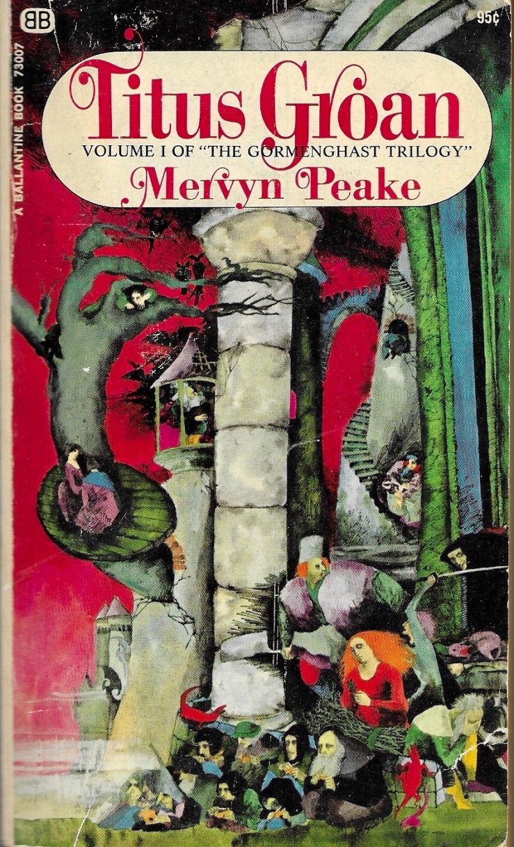
I’ve been doing these Three Books posts on and off for a few years. They give me something to do on a Sunday, except when I have something to do on a Sunday, in which case, I don’t do them. There are two more Sundays in 2019 and I figured I’d do a Three Books post about the books published this year that I enjoyed most this year. A few jumped readily to mind, including books that were translated or republished in new editions this year, like João Gilberto Noll’s short novel Lord, or Sylvia Townsend Warner’s The Corner That Held Them, or Ann Quin’s 1964 novel BergBut new editions or new/first translations isn’t exactly “2019” is it? Or is it? I mean, these were published in 2019?

Just add them to the list anyway.

And add Anna Burns’ maybe-horror/maybe-comedy novel Milkman to the list, even though it was published in 2018.

And add Anna Kavan’s definitely-horror/definitely-sci-fi novel Ice to the list, even though it was re–published in 2018, a fiftieth anniversary edition. (It’s not a new book, right? New to me though.)

Ann Quin, Anna Burns, Anna Kavan…how about Anne Boyer? For me, 2019 was a variation on Annas, I guess.

2019-12-22_155858_1

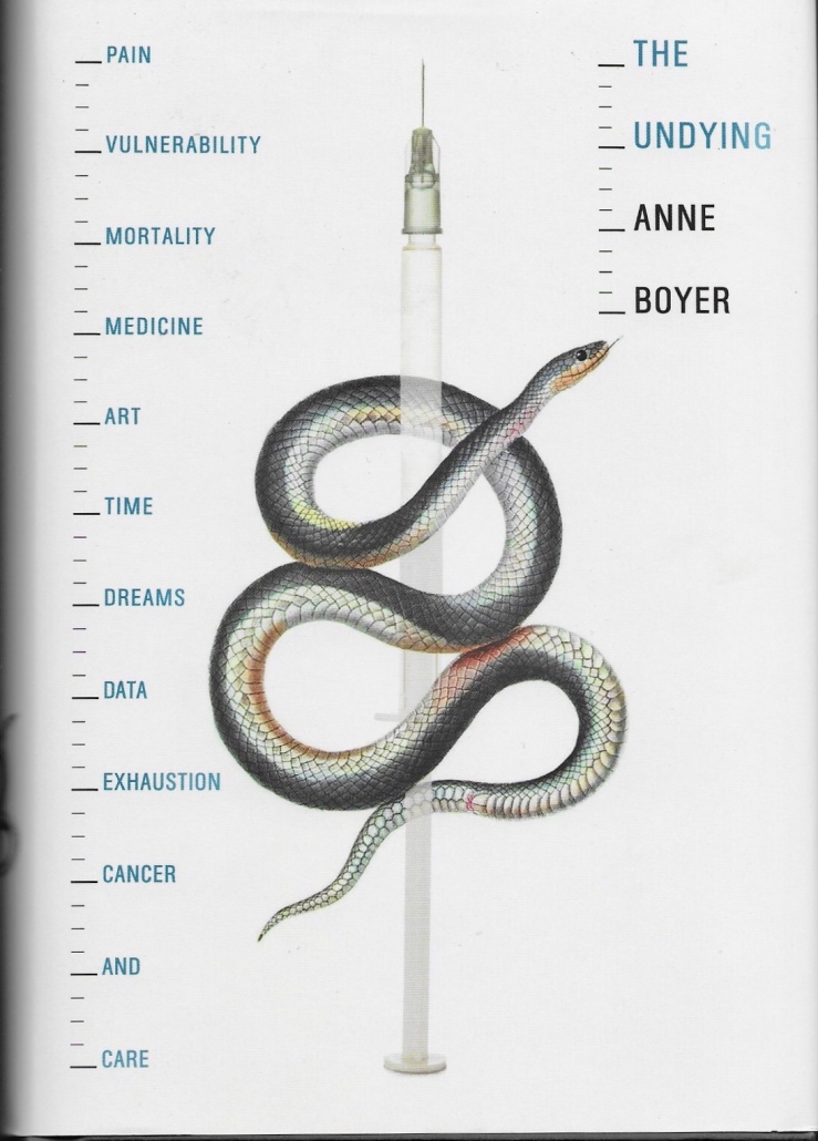
The Undying by Anne Boyer. 2019 first edition hardback from FS&G. Jacket design by Srick&Williams; jacket art by Mykola Davydenko.

This is a wonderfully angry, discursive, recursive book: literary biography, literary criticism, art history, art criticism, Foucault, John Donne, Susan Sontag, Lucretius, Virginia Woolf; a howl at the hoaxers, frauds, self-helperists and their pinkwashed platitudes. And lots of pain, expressed with sentiment that bears no trace of sentimentality.

Boyer’s aphoristic style is engrossing. Her paragraphs and one-liners bear a ludic stamp seemingly at odds with her subject matter. The work of the writing, the heavy burden of smithing those sentences is all but elided—instead we get the clarity of a focused mind drawing together seemingly-disparate threads into a cohesive and compelling memoir that transcends the personal without necessarily meaning to.

Showing is a betrayal of the real, which you can never quite know with your eyes in the first place, and if you are trying to survive for the purpose of literature, showing and not telling is reason enough to endure the disabling processes required for staying alive.

Thank you again to BLCKDGRD for sending me this strange angry beautiful book.

2019-12-22_155858

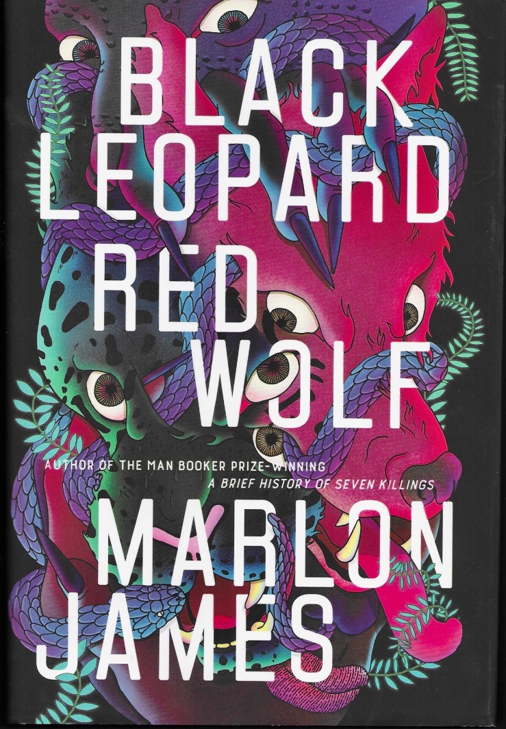
Black Leopard, Red Wolf by Marlon James. 2019 first edition hardback from Random House. Jacket design by Helen Yentus; jack illustration by Pablo Gerardo Camacho.

I wrote a review of Black Leopard, Red Wolf that I titled “Marlon James’s Black Leopard, Red Wolf is a postmodern fantasy novel that challenges the conventions of storytelling itself.”

Black Leopard, Red Wolf makes me think of that trend/hype problem I mentioned above—novels that get hyped, novels that seem trendy (“It’s Game of Thrones in a medieval mythical Africa!”) and then maybe not read. I think a lot of people read BL/RW though, and many found it Not to Their Taste, which, fine. I loved. it. From my review:

Black Leopard, Red Wolf is clearly Not for Everybody. It’s violent and strange, and the sex in it will likely upset conservative readers. It’s also shaggy and unwieldy. It probably has a future as a cult novel. You just sort of have to go with its fluid (in every sense of that word) program and enjoy the ride. I enjoyed it very much and am looking forward to the sequel.

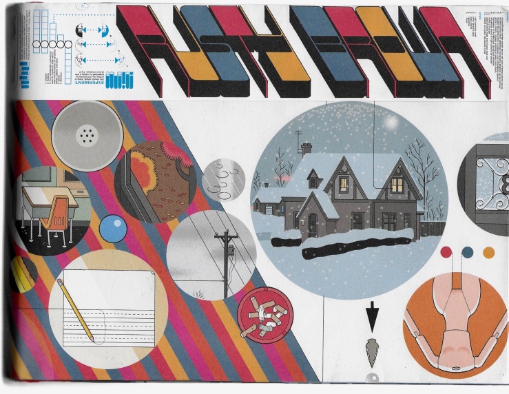
Rusty Brown by Chris Ware. 2019 first edition hardback from Pantheon. No cover designer or artist credited, but the work is unquestionably Ware’s.

A masterpiece. I reviewed it for The Comics Journal, stating that,

Rusty Brown is a sprawling story about memory and perception, about minor triumphs and chronic failures, about how our inner monologues might not match up to the reality around us. In Ware’s world, life can be blurry, spotty, fragmented. His characters are so bound up in their own consciousnesses that they cannot see the bigger picture that frames them.

Rusty Brown is only the first part of (what I understand to be) a two-part novel. It took Ware eighteen years to finish. Maybe we’ll know in 2037 if it was in fact a really great important best favorite novel of 2019. Or maybe not.

But I love it now, and I loved these books this year.

Three Books

2019-12-08_113541_2

Mulata by Miguel Ángel Asturias; English trans. by Gregory Rabassa. 1982 mass market paperback from Avon-Bard. The Boschian cover art isn’t credited; neither is the designer credited, although my assumption is that it is Sidney Feinberg, who is credited as designer on Avon-Bard’s edition of Gabriel García Márquez’s novel In Evil Hour.

2019-12-08_113541

In Evil Hour by Gabriel García Márquez; English trans. by Gregory Rabassa. 1980 mass market paperback from Avon-Bard. The cover artist is not credited; book design by Sidney Feinberg,

2019-12-08_113541_1

The Ex-Magician and Other Stories by Murilo Rubião; English trans. by Thomas Colchie.  1984 mass market paperback from Avon-Bard. No cover artist or designer is credited, but my hunch is the design is by Sidney Feinberg.

Three Books

2019-11-24-113310

Under the Volcano by Malcolm Lowry. 1965 hardback from Lippincott. Jacket design by David Lunn.

2019-11-24-113310-1

Under the Volcano by Malcolm Lowry. 2014 trade paperback from Harper Perennial Olive Editions. Cover design and illustration by Milan Bozic.

2019-11-24-113310-2

Under the Volcano by Malcolm Lowry. 1962 paperback from Vintage. Cover design by Harry Ford.

I have now bought four copies of Malcolm Lowry’s 1947 novel Under the Volcano. The first copy I bought was a cheap movie tie-in edition with a ghastly cover. I later replaced it with the 1962 edition, and reread it. A few years later I resisted buying a 2007 Harper Perennial paperback edition that featured an afterword by William Vollmann. (You can read Vollmann’s afterword—and the entire book, if a 700 page pdf is your thing—here).

On 8 Nov. 2019, I picked up the 2014 Olive edition.

On 22 Nov. 2019, I picked up the 1965 Lippincott hardback, blowing the rest of my store credit in the process. I couldn’t not buy it. I had to have it.

It also matches a folding hard print of Hokusai’s Red Fuji that a student gave me as a gift when I left Tokyo.

IMG-4400

This clipping of a 1984 not-really review of John Huston’s film adaptation was folded inside of the book.

IMG-4399

I wrote a review of Under the Volcano on this website back in 2011. From that review:

For all its bleak, bitter bile, Volcano contains moments of sheer, raw beauty, especially in its metaphysical evocations of nature, which always twist back to Lowry’s great themes of Eden, expulsion, and death. Lowry seems to pit human consciousness against the naked power of the natural world; it is no wonder then, against such a grand, stochastic backdrop, that his gardeners should fall. The narrative teems with symbolic animals — horses and dogs and snakes and eagles — yet Lowry always keeps in play the sense that his characters bring these symbolic identifications with them. The world is just the world until people walk in it, think in it, make other meanings for it.

Three Books

2019-11-10_152719

Masters of Atlantis by Charles Portis. 1985 first-edition hardback from Knopf. Jacket design by Sara Eisenman; jacket illustration by Dagmar Frinta.

2019-11-10_152719_2

The Dog of the South by Charles Portis. 1985 trade paperback from Windstone Trade. Cover art by Linda Bordelon; no designer credited.

2019-11-10_152719_1

True Grit by Charles Portis. 1968 hardback Book Club from Simon & Schuster. Jacket design by Paul Davis.

I picked up a 1985 Vintage Contemporaries edition of Charles Portis’s first novel Norwood this summer and promptly snorted the thing up my brain. I then sought out the rest of Portis, and read most of it, with the exception of Gringos, which I’m, I don’t know, saving, if that makes sense.

True Grit might be the best of the novels, from a technical standpoint. Walker Percy’s blurb on the back of my copy compares it to Adventures of Huckleberry Finn, and he’s not wrong. Mattie Ross’s is as achieved and engrossing and complex as Huck’s, a wonderful layering of author-narrator-speaker. The prose is beautiful and Mattie is an endearing American hero. I wish I had read it years ago. I’ll make sure my kids don’t repeat my error. Like Huck FinnTrue Grit seems like a book one returns to like an old friend, only to find the friend has changed in some deep way. (But of course it’s only you that’s changed you old bastard, reading now through older dimmer eyes.)

While True Grit is likely Portis’s best novel, my favorite in the quartet I’ve read is The Dog of the South, a road trip novel, shaggy, grotesque, and very, very funny. It reads like a novel that Barry Hannah was never quite sober enough to manage—or maybe that’s unfair (I love Hannah, godbless his soul)—maybe what I mean is that Portis’s loose ironic folk-blues ballad of a novel has more structure than Hannah’s jazz. Anyway, I loved Dog, but in spite of and because of its faults.

Masters of Atlantis is the strangest in the quartet. It’s a novel about con-men and poseurs, secret societies and secret scams, capitalism and the price of knowledge. Again, a very American novel, whatever that means. Atlantis has a Pynchonian paranoid vibe and a Pynchonian zaniness. It also belongs to the American tradition of grifter novels (think of Melville’s The Confidence-Man, or Baum’s Oz, or Adventures of Tom Sawyer, or Gatsby, etc.). Atlantis, told in a third-person voice, feels a bit more distant than the first-person immediacy of True Grit or The Dog of the South, or even the third-person voice of Norwood, which hovers around its protagonist’s brain pan and eye line, and doesn’t flit much farther. Atlantis also covers a hearty lifetime of secret society shenanigans. It’s a loose, shaggy epic, and seems to sprawl beyond its 250-odd pages. In any case, I ate it up, just like I ate up the other three. I waited far too long for Charles Portis, but I suppose late is better than never. Highly recommended.

Three Books

2019-10-13_181512

Don Quixote by Kathy Acker. Grove Press trade paperback, 1986. Cover design by Neil Stuart. Cover illustration by Catherine Denvir.

A messy punkpostmodern cartoon, a big long jazz howl at the moon.

2019-11-03_163857

The Egghead Republic by Arno Schmidt; English translation by Michael Horowitz. Marion Boyars trade paperback, 1982. Cover design by Imre Reiner, who likely drew the illustration (although he is not explicitly credited).

I found the first 50 pages utterly exhausting, and there were 100 more. I tried. The cover designer Imre Reiner is most famous for his font designs, but he also illustrated many many books, including a 1941 edition of Cervantes’ Don Quixote.

2019-11-03_163857_1

Sanatorium under the Sign of the Hourglass by Bruno Schulz; English translation by Celina Wieniewska. Cover design by Neil Stuart. Cover illustration by Bruno Schultz. (The novel includes thirty black and white illustrations by Schultz.)

A gross, surreal, dispiriting nightmare. I recall “enjoying” it.

Three Books

2019-10-27_164045

Complete Tales & Poems by Edgar Allan Poe. Fat trade paperback by Vintage; most recent date indicates 1975 but that can’t be right. No designer credited.

You know Poe.

2019-10-27_164045_1-1

Tell My Horse by Zora Neale Hurston. 1983 trade paperback edition from Turtle Island. Neither designer nor photographer are credited.

A wonderful and weird trip to Jamaica and Haiti…and zombies!

2019-10-27_164045_2

From Hell by Alan Moore & Eddie Campbell. 2004 irregular-big trade paperback from Top Shelf. No designer/artist credited, but it’s clearly Campbell’s work.

One of my favorite scary novels ever. I reviewed it like a decade ago on this site. I found this postcard in it, a collage by the surealist Jacques Prévert:

2019-10-27_170449

The postcard, from James Cooke, included this text, a quote of Cormac McCarthy’s horror novel Blood Meridian:

They entered the city haggard and filthy and reeking with the blood of the citizenry for whose protection they had contracted.

James won a postcard-based contest on this site like a decade ago, god love him.


Three Books

2019-10-20_185738_1

Taking Care by Joy Williams. 1985 trade paperback from Vintage Contemporaries. Cover design by Lorraine Louie. Cover illustration by Rick Lovell.

I read this book earlier this year. It’s really great. I reviewed it on this site, writing—

These are stories of domestic doom and incipient madness, alcoholism and lost pets. There’s humor here, but the humor is ice dry, and never applied as even a palliative to the central sadness of Taking Care. Williams’ humor is something closer to cosmic absurdity, a recognition of the ambiguity at the core of being human, of not knowing. It’s the humor of two girls eating chips on a beach, unable to decide if the people they are gazing at are drowning or just having a good time.

2019-10-20_185738_3

Norwood by Charles Portis. 1985 trade paperback by Vintage Contemporaries. Cover design by Lorraine Louie. Cover illustration by Rick Lovell.

Norwood isn’t the best book I’ve read so far this year but it is the book I most enjoyed reading, and after reading it, I sought everything else by Portis (consuming everything so far except the late novel Gringos, which I’m sort of holding onto as like…I dunno? A consolation prize at some point? Is that grim?). I picked Norwood up on a wonderful whim this summer, possibly simply because it was a Vintage Contemporaries edition (and slim). I’m so glad I did. Great read.

2019-10-20_185738_2

Cathedral by Raymond Carver. 1989 trade paperback from Vintage Contemporaries. Cover design by Lorraine Louie. Cover illustration by Garnet Henderson.

This was the first Vintage Contemporaries edition I ever bought. I bought it when I was maybe 17, sometime in the late nineties, I guess, and I was always vaguely embarrassed of the cover, especially when I used it in not one but two college courses at the end of that decade (Carver was still very cool in that era. He seems to have fallen out of favor. Good for him!) Henderson’s ultra-literal cover of the story “Cathedral” is…something. (I still prefer Lovell’s whimsical work, which is more, uh, I dunno, metaphysical (?)). I circled four short story titles on the table of contents for some reason: “A Small Good Thing,” “Where I’m Calling From,” “Vitamins,” and “Cathedral.” All great numbers. I also am fond of “Feathers” and “Chef’s House,” but I didn’t circle those titles. The rest of the stories I don’t remember, although I’m sure I read them at least once or twice.

Three Books

2019-10-13_183112

The Last Days of Louisiana Red by Ishmael Reed. 1974 first edition hardback from Random House. No designer credited, but the jacket flap indicates that the cover design was “suggested” by Ishmael Reed. I reviewed Louisiana Red earlier this year on this site.

2019-10-13_182907

Blue Beard by Max Frisch. English translation by Geoffrey Skelton. 1983 first edition hardback from HBJ. Design by Amy Hill.

2019-10-13_182945

Stanley Elkin’s Greatest Hits by Stanley Elkin. Foreword by Robert Coover. 1980 first edition hardback from E.P. Dutton. Cover design by Janet Halverson.

Three Books

2019-09-29_132359

I haven’t read every Italo Calvino novel, but of the ones I’ve read, If on A Winter’s Night a TravelerInvisible Cities, and The Baron in the Trees are my favorites. I have a Harcourt Brace Jovanovich three-volume in slipcase edition designed by Louise Fili. The illustration on the slipcase is uncredited.

2019-09-29_132723

Fili’s design for If on a Winter’s Night a Traveler features Giorgio de Chirico’s 1915 painting Autumnal Melancholy. English translation by William Weaver.

This was the second Calvino novel I read. I was in my early twenties, still very much enamored of John Barth and David Foster Wallace, and Traveler’s formal postmodernism did something electric to me.

2019-09-29_132512

Fili’s cover features a woodcut of a seventeenth-century drawing screen. English translation by William Weaver.

Invisible Cities was the first Calvino novel I read. I read it in 2002 when I was 22, mostly in Chiang Mai, Thailand. A friend who met me in Bangkok had brought it with him in his backpack. I couldn’t find more Calvino in Chiang Mai, but I did manage a copy of Pynchon’s V. 

2019-09-29_132614

Fili’s design for The Baron in the Trees features a detail from on of Pablo Picasso’s drawings for La Guerre et la paix. English translation by Archibald Colquhoun.

Baron is probably my favorite Calvino novel, which is maybe strange because it’s not a very Calvinoesque (Calvinoish?) novel—it’s funny, absurd, and witty, true, but it’s not formally postmodern. It reads very much like a picaresque novel, jaunty and romantic, with an intriguing lead in the rebellious and charismatic hero Cosimo Piovasco di Rondo. Writing this makes me want to read it again.