Book Shelves #5, 1.29.2012

Book shelves series #5, fifth Sunday of 2012: In which we leave the southern wing of the house where the bedrooms are and enter a formal sitting room.

Okay. So. When I started this project, it was easy to identify the rooms in the house—they were bedrooms. As we go, I’ll have to occasionally make up names for rooms, often names that don’t really fit. Our house is a 1956 ranch with some of the atomic flavor, so it’s long and rectangular and very open—rooms open up into other rooms; spaces are demarcated more by ideas of rooms and not, say, walls. The house is essentially three sections; we’ve left the first, the bedrooms, and now move into a series of rooms for living and eating and cooking and sitting. And reading. I mapped out a little route for the rest of this series, and the first stop is this mid-century LP cabinet in what I’ll call, for lack of a better term, our formal sitting room. The cabinet once held many of my records but is now filled with comic books (more on those next week).

20120129-123357.jpg

The books that set on top of it are coffee tablish, I suppose, and they tend to rotate, although there’s usually a stray novel or two that sets here as well. Today we’ll look at the two on top now: Penguin by Design and Atomic Ranch.

20120129-123410.jpg

There’s also an Emerson Wondergram record player that sets on the table; I suppose it was the iPod of its day (see one in action here).

20120129-121621.jpg

Atomic Ranch is my wife’s, although I don’t really make such distinctions when it comes to books. We lived for years in a bungalow and she amassed books dedicated to craftsman homes during that time; when we moved to the ’50s ranch, she wanted this:

20120129-123515.jpg

Penguin by Design is essential for anyone who drools over beautiful modern book covers.

20120129-123508.jpg

My pics are lousy—sorry—but just a few editions I’d love to pick up one day:

20120129-123417.jpg

20120129-123443.jpg

20120129-123449.jpg

Next week, we’ll look at some of the comic books inside the cabinet.

Book Acquired, 8.10.11

20110810-042316.jpg

I don’t know if this one actually counts; Atomic Ranch is a book my wife ordered (not that my wife doesn’t count). But I’ve started to (at least try to) document all the books that come into the house, so, yeah, here’s Atomic Ranch, which is about 1950s ranch homes, which I guess my wife bought because we bought such a home earlier this year.

The History of Science Fiction — Ward Shelley

(Via, via).

A Typographic Anatomy Lesson

Check Out This Amazing Fore-edge Painting


Jonathan Safran Foer Talks About His New Book, Tree of Codes

Jonathan Safran Foer’s new book, Tree of Codes, is a cut-up — or cut-out, rather — of Bruno Schulz’s The Street of Crocodiles. More here.

“Three Figures and a Dog” — Roberto Ransom (A Single Sentence Animation by Andre da Loba)

Andre da Loba animates a sentence from Roberto Ransom’s “Three Figures and a Dog.” Published in Electric Literature No. 4. Here’s the first paragraph–

He liked to be in the chapel at dawn, and also in the afternoon when something similar, though not identical, occurred. For that to happen, he had to leave home when his wife got up to milk the cow. He’d finally wake himself up by putting his hand into the bucket next to the well and wiping his face. He usually carried a loaf of bread, a piece of onion, and sometimes a little cheese, wrapped in a handkerchief. He’d leave his brushes, pencils, paints, and other tools in a corner of the chapel, behind some stones that hadn’t been used during its construction. He didn’t paint at that hour. He was waiting for the right color. He’d observe the sky and mix paints in a small clay vessel, smudging them with his finger, measuring quantities, adding water or oil or, on one occasion, wine. He imagined that if the wine was his blood and the blue of the sky he was seeking was the Virgin’s color, and the Virgin was his mother and if he and the Virgin were of the same blood, then maybe…

“Riverrun, past Eve and Adam’s” — Stephen Crowe Illustrates Finnegans Wake

First Line - Stephen Crowe

At Wake In Progress, Stephen Crowe has given himself the daunting task of illustrating James Joyce’s novel/linguistic black hole Finnegans Wake. It’s pretty cool stuff, and we love projects like these (see also: Six Versions of Blood Meridian and One Drawing for Every Page of Moby-Dick). Crowe’s site makes an interesting if different companion for the ongoing project at Ulysses “Seen.” Good luck to Stephen–keep them coming! (and thanks to @RhysTranter for sharing). More images–

Page 8 - Stephen Crowe
Page 19 - Stephen Crowe
Page 16 - Stephen Crowe

Better Book Titles

Check out the frank and funny images at Better Book Titles (via @MelvilleHouse). A few of our favorites–

Rift — James Jean

James Jean’s Rift looks pretty cool. More here.

Penguin Books Turns 75

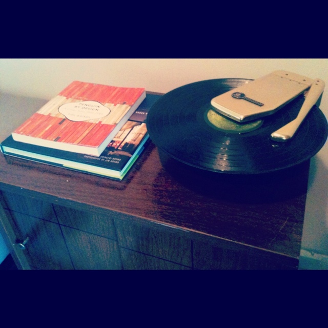
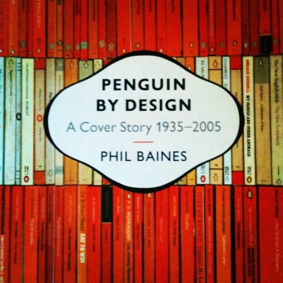
Penguin Books turns 75 today. Happy birthday! More here. There’s a great Penguin Books sci-fi cover gallery here. If you are the sort of philistine who doesn’t dig Penguin’s iconic covers, you can order your own blank art paper quality covered books here.

Chris Ware’s Rejected Fortune Cover

Cartoonist Chris Ware’s rejected cover for Fortune magazine. Guess his satire was too sharp. Via RW730:

“Books in the Age of the iPad” — Craig Mod

In his recent essay, “Books in the Age of the iPad,” Craig Mod distinguishes between “Formless” and “Definite” content:

Formless Content is is unaware of the container. Definite Content embraces the container as a canvas. Formless content is usually only text. Definite content usually has some visual elements along with text. Much of what we consume happens to be Formless. The bulk of printed matter — novels and non-fiction — is Formless.

Mod argues that the rise of e-readers like the Kindle and (presumably) the iPad are harbingers of a new age in reading, where both formless and, now, definite content might be readily (and easily) displayed. He makes a brash judgment:

The convenience of digital text — on demand, lightweight (in file size and physicality), searchable — already far trumps that of traditional printed matter.

Really? On demand? For whom? “On demand” here presupposes a number of conditions, first and foremost, that each person who wishes to enjoy this new medium has the economic means to do so. The projected retail cost of the iPad is currently $500, a price that does not include monthly ISP fees, let alone the prices of e-books and other e-texts. The Kindle retails now for about half the price of the iPad. Although these prices will certainly fall over time, it is difficult to imagine that the “convenience of digital text” will trump equitable access to “traditional printed matter” — particularly for families with multiple children (at least any time soon).

Mod makes some good points about the future of printed, physical books in the age of e-readers (or, the iPad, a device he seems to think will normalize the medium):

I propose the following to be considered whenever we think of printing a book:

  • The Books We Make embrace their physicality — working in concert with the content to illuminate the narrative.
  • The Books We Make are confident in form and usage of material.
  • The Books We Make exploit the advantages of print.
  • The Books We Make are built to last.

The result of this is:

  • The Books We Make will feel whole and solid in the hands.
  • The Books We Make will smell like now forgotten, far away libraries.
  • The Books We Make will be something of which even our children — who have fully embraced all things digital — will understand the worth.
  • The Books We Make will always remind people that the printed book can be a sculpture for thoughts and ideas.

Anything less than this will be stepped over and promptly forgotten in the digital march forward.

Goodbye disposable books.

Hello new canvases.

Books as aesthetic, durable objects — great idea. But books as relics, as things to recall the smell of “now forgotten, far away libraries”? Really? Libraries function as an important space in communities that transcend the mediums of information in those libraries. It’s almost downright scary to posit some kind of project-utopia where a library becomes “digitized.” Also — and again, much of what Mod suggests here is great — but also, who are “our children” who “have fully embraced all things digital”? In the current geopolitical climate, Mod’s line of thinking can only realistically apply to “First World” countries. Even in our own beloved United States, first among the “First World,” we have difficulty feeding all of our children or funding their educations. E-readers like the iPad or Kindle could presumably do much to ameliorate the burgeoning education gap, but recent efforts haven’t gained much momentum or praise.

It’s not that I disagree with (what I perceive to be) Mod’s overall thesis — that the iPad and successive e-readers will revolutionize how we read, access, and store information. I do, however, think that his rosy-toned enthusiasm has led to a number of blind spots in his article. Why should e-readers eliminate libraries? What, exactly, are “disposable books”? Who will have access to these “new canvases,” and in what capacity? Why the implicit presumption that digital storage of media is fail safe, easier than current methods, and more permanent?

Finally, my biggest problem with the piece is the simple assumption that any e-reader could be more comfortable than a paperback book. Mod addresses arguments like mine:

When people lament the loss of the printed book, this — comfort — is usually what they’re talking about. My eyes tire more easily, they say. The batteries run out, the screen is tough to read in sunlight. It doesn’t like bath tubs.

Mod responds to these arguments:

Important to note is that these aren’t complaints about the text losing meaning. Books don’t become harder to understand, or confusing just because they’re digital. It’s mainly issues concerning quality. One inevitable property of the quality argument is that technology is closing the gap (through advancements in screens and batteries) and because of additional features (note taking, bookmarking, searching), will inevitably surpass the comfort level of reading on paper.

While Mod’s point of meaning vs. quality (what I’d refer to as readability) is certainly right, his assumption that technology “will inevitably surpass the comfort level of reading on paper” is wholly unfounded and unsupported. It’s exactly the kind of teleological claim we see too often about technology — that technology always progresses to an inevitable, good, and superior end point. Still, Apple can feel free to send me an iPad and I’ll be sure to test my own assumptions on the issue, and redress them here if need be.

Web Services Book Covers by Stéphane Massa-Bidal

Stéphane Massa-Bidal (aka Hulk4598, aka Rétrofuturs) created these fantastic “book covers” for internet services late last year, so you might’ve already seen them; anyway, they fit nicely into Biblioklept’s Book Covers Week. Massa-Bidal’s images of familiar web two point oh apps masquerading as book covers remind us that book covers are their own special medium, and that we perhaps read the information in book covers in its own special way, regardless of whether the book actually exists or not (or, in this case, exists as something other than a book. See also: Spacesick’s “I Can Read Movies” Series).

Book Covers: Brits vs. Yanks

Thanks to C. Max Magee at The Millions for making Biblioklept’s Book Covers Week so much easier. What can we say, we’re lazy. Here’s his fun post on American book covers versus British editions. And, just to prove that we’re not that lazy, we did two of our own:

The American version of Don DeLillo’s Point Omega, on the left, attempts to capture some of the book’s wistful tone and convey its sense of desert geography and handling of epochal time. But against this background, the book’s vaguely military name enclosed by that infinity loop all sort of looks a bit like like an espionage thriller. We’re not really thrilled about the British cover either–black, white, and gray might look better than the cool blues here–but its energy and sense of disconnection better suit DeLillo’s spare, sad novella than the American cover.

We like both of these covers more than we liked the actual book, but damn if the British cover (on the right) isn’t one of the best editions we’ve ever seen. Someone give the designer a cookie. Or a prize. Or something.

Why Don’t They Make Book Covers Like This Anymore?

Cover design for Giuseppe di Lampedusa’s The Leopard by Jerome Moriarty, 1966 Time Reading Program edition.

“The Philosophy of Furniture” — Edgar Allan Poe

“There is reason, it is said, in the roasting of eggs, and there is philosophy even in furniture — a philosophy nevertheless which seems to be more imperfectly understood by Americans than by any civilized nation upon the face of the earth.”

I started Roberto Bolaño’s faux-encyclopedia, Nazi Literature in the Americas last night. In the first section, Edelmira Thompson de Mendiluce creates a room based on Edgar Allan Poe’s essay “The Philosophy of Furniture.” I’d never read or even heard of that essay up until now, and, given Bolaño’s penchant for invention, I wondered for a moment if it even really existed. Edelmira recreates the room according Poe’s specifications and then writes Poe’s Room, her defining novel, in its rich confines. The essay exists outside of Bolaño, of course, as does the room–it’s part of the Edgar Allan Poe National Historic Site.