Three Books (On Ferrante, Knausgaard, irony, and covers good and bad)

img_2420

My Struggle, Book 1 by Karl Ove Knausgaard. English translation by Don Bartlett. First edition trade paperback by FS&G, 2013. Cover design by Charlotte Strick and Bill Zindel, with cover art by Bill Zindel.

I couldn’t really get past page 80 of My Struggle, but I like Zindel’s zany design for the first volume enough to hold on to it. Kinda reminds me of those Vintage Contemporaries I so adore.

A lot of people didn’t like the design though, and FS&G didn’t end up publishing the rest of Zindel’s designs, which would’ve looked pretty neat as a complete set. As literary critic Scott Esposito put it at the time “the market has spoken, and it hates the original paperback.”

Instead, FS&G went with variations on this—

img_2421

My Struggle, Book 2 by Karl Ove Knausgaard. English translation by Don Bartlett. First edition trade paperback by FS&G, 2014. Cover design by Charlotte Strick; photograph by Andreas Eikseth Nygjerd.

Look at our boy Knausgaard, smokin’ away! This cover is boring but not Bad, which makes it far less interesting than the Bad Knausgaard cover which is actually very Good. The Book 2 cover (and subsequent covers in the series) are safe and “stylish”—and when I write “stylish,” I use it in the way many writers use it—thoughtlessly, blankly—stylish as a word that points vaguely to the idea of style, the zeitgeistiness of style. Etc. (Again—I encourage you to check out Zindel’s vision for the whole series).
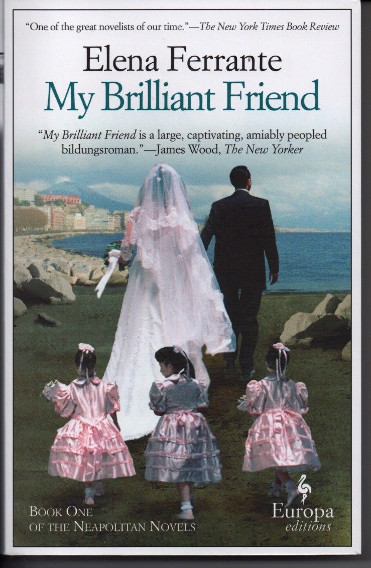
img_2419

My Brilliant Friend by Elena FerranteEnglish translation by Ann Goldstein. Fifteenth printing, Europa Editions, 2015. Book design by Emanuele Ragnisco; cover photo by Anthony Boccaccio.

My Brilliant Friend is brilliant, my friend.

Its cover is awful, and the subsequent covers in the so-called Neapolitan Novels quartet are somehow worse.

A good friend who’s never steered me wrong with a reading recommendation told me to read Ferrante last year, but I didn’t—it wasn’t the hype that put me off (although the hype put me off), but the covers. I finally acquiesced to an audiobook version, and after getting a few chapters in, wanted the text. So I caved.

But my god, the cover—why?

The publisher and art director(s) claim that the Ferrante covers are bad on purpose.

An article in Quartz that I found simply by googling “Ferrante covers awful” yields this nugget:

…Sandro Ferri, Europa Editions’ publisher, says the covers were not an accident of too many cooks in the design kitchen, but rather a conscious choice. Writes Ferri in an email to Quartz, “The ‘vulgarity’ is our intention. We don’t want to make the typical ‘literary’ cover designed for an audience of ultra-sophisticated readers. … Ferrante’s novels are a mix of popular literature and highbrow, intellectual writing. We want to communicate this though our covers as well.”

And in a Slate interview, EE co-founder/publisher Sandra Ozzola again asserts that the decision for tacky covers was, um, purposeful:

From the time of our first conversation with Elena Ferrante about her intention to write this novel, we knew the book’s title and that it would be the story of a long friendship between women—and that it would conclude with a scene of a very vulgar Neapolitan wedding. The wedding and Elena’s impression of it … is an extremely important moment in the book. That’s why I intentionally searched for a photo that was “kitsch.” This design choice continued in the subsequent books, because vulgarity is an important aspect of the books, of all that Elena wants to distance herself from.

If we take a book’s cover to be where the book “begins,” where we first start to read the text, then EE’s awful kitschy crappy ugly covers signal postmodern irony—a joke on perception, the marketplace, high-low aesthetics, etc. The covers work as a kind of metatextual critique, then, as Ozzola seems to suggest above—a critique that relies on the reader’s understanding of the novel’s central character’s aesthetic viewpoint.

Well so then: Are the covers indeed ironic critiques of book-cover-aesthetics? Are we to take these covers as pop art parodies of books that traffic in romantic aspirations, that are, like, marketed to women?

Or are these covers simply designed to appeal to the very market that they would claim to ironically mock?

The have-your-cake-and-eat-it-too postmodern answer to these questions is, of course, “Yes.”

To fully appreciate the aesthetic irony of the Ferrante novels of course requires reading the Ferrante novels. And undoubtedly, many people are put off reading these books because of the covers. So much so that Ferrante’s novels got new covers for their Australian release. The new covers were designed by W.H. Chong:

Mr Chong told The New Daily it can be dangerous to try irony on a book’s cover – especially if the joke isn’t clear to readers.

“You have to signal the irony really clearly otherwise the recipient doesn’t realise the irony,” Mr Chong said.

“You have to signal the irony really clearly” — okay, sure. But the finest satire never announces itself as such.

Chong’s new covers feature simple black-and-white photographs, and they have received praise. But in a sense, the Australian covers seem, at least to me, to echo those Knausgaard updates—safe, boring even. But I’d much rather be seen reading one of those, than, say, the original EE edition of The Story of the Lost Child, which has maybe the worst cover I’ve ever seen.

Europa Editions’ forthcoming Ferrante collection, Frantumaglia, has a great cover, by the way.

Three Books

img_2089

Their Familyby Warren Fine. 1972 first edition hardback from Knopf. Cover illustration by James Grashow; cover design by R.D. Scudellari. I’ll admit I had to have this because of the cover alone, although its subject matter–an American frontier journey–is also a point of interest

img_2388

Star Maker by Olaf Stapledon. 1973 Penguin paperback. Cover design by David Pelham. I first read Star Maker when I was maybe 12 or 13—in the middle of what I now think of as a massive gorging of sci-fi and fantasy novels, a kind of rushed reading I’ll maybe never be able to return to. I haven’t read it since then but would like to revisit it later this summer.

img_2390

The Franchiser by Stanley Elkin. 1988 trade paperback by Nonparelil Books. Cover illustration by Joan Elkin; cover design by Louise Fili. After a few false starts I finally got into The Franchiser. I’m about half way through. It’s fucking great—a funny but scathing critique of America that seems utterly prescient (in the same way that Gaddis’s J R is a predictor novel, not just a zeitgeist novel).


Three Books (that are good starting points for reading Thomas Pynchon)

Today is Pynchon in Public Day, so today’s Three Books blog offers three books that I think may make good entry points for those interested in, but perhaps unnecessarily daunted by, Thomas Pynchon. My intuition is that many readers’ first experiences reading Pynchon may have been like mine: I read The Crying of Lot 49 as a college assignment, found it bewildering and baffling, and despite understanding almost none of it, I then attempted Gravity’s Rainbow (the key word is attempted (failed will also do in a pinch)).

Many readers start with The Crying of Lot 49 because it’s short. While I like the novel (I wrote about it here), it’s also extraordinarily dense, a box so crammed with jokes and japes that some fail to spring out at full force. Lot 49 is a much better reading experience after you’ve read more of Pynchon.

Lots of readers new to Pynchon plunge into Gravity’s Rainbow, probably because it’s famous. I love love love Gravity’s Rainbow, but along with Mason & Dixon (which may be my favorite Pynchon novel), I do not think it is a good starting place for Pynchon. Gravity’s Rainbow is a rich, ringing vortex, a seven-hundred-and-something pager that almost necessitates that its reader immediately reread it. Gravity’s Rainbow is a very funny and very tragic book, and I think it is the work of genius that its reputation suggests—but it’s also one of the few books I can think of that get put on lists of Big Difficult Novels that is, actually, Difficult.

So here are my suggestions for starting places for Pynchon.

img_2195

Against the Day by Thomas Pynchon. First edition Penguin hardback, 2006. Jacket design my Michael Ian Kaye.

Okay. So maybe you’re saying, Waitisn’t that one, like, really long? Reader, you’re correct. At 1,085 pages Against the Day is Pynchon’s longest novel to date. But it’s also one of his most accessible, and, most importantly, it offers a condensation of Pynchon’s Big Ideas and Big Themes. (I wrote a list of 101 possible descriptors for Against the Day, if you’re interested in a short take; I also riffed on the book at some length in a series of posts).

img_2194

V. by Thomas Pynchon. Vintage UK trade paperback edition (1995). Cover by Paul Burgess.

V. is Thomas Pynchon’s first novel. It’s also the first Pynchon novel I read and loved and (possibly) understood. Like Against the DayV. lays out many of the themes and styles (and even a character or two) that appear elsewhere Pynchon’s oeuvre. In a loose sense, V. feels like a dress rehearsal for Gravity’s Rainbow. Oh, it’s also pretty discursive—in fact, you can read chunks of it almost as short stories. In fact, here’s a good way to break into Pynchon: Get V., and read Ch. 9–it stands on its own as a long short story, the tale of Kurt Mondaugen—and colonialism, siege paranoia, dark dread, etc.

img_2197

Inherent Vice by Thomas Pynchon. First edition hardback, Penguin, 2009. Jacket design by Tal Goretsky and Darren Haggar; image credited to Darshan Zenith and Cruiser Art.

I’ve heard Inherent Vice dismissed as “Pynchon lite,” which may be true—I’ve read the book twice now and if its shaggy threads connect, I can’t see it (unlike, say, Gravity’s Rainbow, which resolves like a complicated math problem). Still, Inherent Vice makes a nice gateway drug to Pynchon—it’s funny and loose, and even though it rambles through an enormous cast of characters and settings, it’s ultimately far, far more contained than sprawling novels like Mason & Dixon and Gravity’s Rainbow. Paul Thomas Anderson’s film adaptation also makes an interesting visual counterpart to the novel—which it somehow simultaneously condenses and expands. Inherent Vice—the novel—also seems to me a kind of bookend or sequel to The Crying of Lot 49. (I wrote a bit about that here).

Last thought: Ignore my suggestions. Pick any novel that interests you by Pynchon and dive in. Don’t get too frustrated if you’re not sure what’s going on. A lot of the time, that’s the point of it all. Enjoy it.

Three (Purple) Books

img_2050

Andersen’s Fairy Tales translated by E.V. Lucas and H.B. Paull. Illustrations by Arthur Syzk. First edition cloth-bound hardback by Grosset & Dunlop, 1945. No designer credited, but the cover illustration is by Syzk. This was a gift from a former student.

img_2051

Chicken with Plums by Marjane Satrapi. English translation by Anjali Singh. First Pantheon paperback printing, 2009. Cover image by Satrapi; cover design credited to Brian Barth. I reviewed Plums some years back.

img_2052

The Transmigration of Bodies by Yuri Herrera. English translation by Lisa Dillman. 2016 paperback by And Other Stories. Cover design by Hannah Naughton from an image credited to iivangm. I wrote a bit about Bodies here; full review next month closer to its publish date.

I finished Herrera’s novella The Transmigration of Bodies a few days before Prince died. The book’s neon purple cover seemed to glare at me from my coffee table when I returned home on the afternoon of April 21, 2016, stunned—yes, stunned is the right word—at learning of the death of one of my heroes. Not just stunned—but stunned at how stunned I was, how sad I felt, how awful and sick Prince’s unexpected, uncalled for, fucking cosmically unjust death was and is. —Wait, I didn’t sign on for this, you protest, eh, dear reader? —No, I didn’t ask for another remembrance or whatever this is, especially not from some blog dude who never knew the guy; look, Biblioklept, the internet’s seams are burstin’ with other, more interesting folks’ thoughts and memories on Prince, you don’t need to—Well I know but I need to. I loved Prince—I loved his music, sure, 1999 and Purple Rain in particular, every song of those records grooved into my mental ear, I can call them up at will—but I loved Prince as an artist, as the Artist, as an aesthetic—which is what I think we, the Big We, all mourn when we mourn Prince. I could go through litany of personal anecdotes about Prince—tell you in detail about first seeing the video for “When Doves Cry” as a child and just totally losing my shit; I could tell you about buying the Batman soundtrack on tape (one of my first album purchases); I could tell you about the summer and fall of 1991, when I was an impressionable twelve years strong, when MTV dared to air Prince’s video for “Gett Off”—I could tell you about how that video accelerated my puberty (I see you plug your ears, reader); I could tell you about discovering that Prince and I shared the same birthday (we are Gemini!) and I could tell you that I always thought about Prince on our birthday, even after I learned that he didn’t celebrate his birthday; I could tell you that my high school band made an album and we named it Prince (it sounded nothing like Prince; nothing sounded like Prince); I could tell you about the year 1999, when I was a junior in college, and how we wore the apocalyptic vinyl thin; I could tell you about djing at a small coffee shop and playing “I Would Die 4 U” five times in one night because I fucking love that song; I could tell you about pulling over the car, late at night, to cry while I listened to “Purple Rain”; I could tell you about dancing to Prince songs at my wedding, at other weddings; I could tell you about how sad I now feel that I never got to go to a Prince concert but how happy I am that I got to see a few on TV, got to see him play and dance and sing; I could tell you I could tell you I could tell you…but I won’t tell you. Maybe you know—maybe you have your own details, your own I could tell yous (forgive me my rhetorical conceits; sometimes it seems that they are all that licenses me to write)—I think you know, I think you have your own I could tell yous. Prince was a fucking genius and he shared that with us (sometimes he shared his genius with us by withholding it from us). Prince was his own genre, his own aesthetic, his own art. How wonderful to have lived on the planet at the same time that he did.

Three Books

img_1947

Has Man a Future? by Bertrand Russell. 1961 Penugin U.S. paperback. Cover design by Richard Hollis, using a photo credited to USIS.

img_1949

I’m Not Stiller by Max Frisch. English translation by Michael Bullock. 1961 Penguin paperback (Great Britain). Cover by John Griffiths.

img_1946

The Last Summer by Boris Pasternak. English translation by George Reavey. 1961 Penguin paperback (Great Britain). Cover illustration of the author by his father, Leonid Pasternak.

Three Books

img_1930

Collected Stories by William Faulkner. 1977 first edition trade paperback from Vintage. This book is 900 pages, exactly, not including the ancillary pages that detail publication dates and rights, as well as Vintage’s back catalog—and yet not one of those pages manages to credit the cover designer or photographer.

I’ve been reading/re-reading this very slowly, with the loose goal of finishing this year.

img_1929

Nausicaä of the Valley of the Wind, Vol. 4 by Hayao Miyazaki. English translation by David Lewis and Toren Smith. Studio Ghibli Library edition by Viz Media, 2010. No designer credited, but the cover is by Miyazaki and I imagine we can probably credit Studio Ghibli with the design.

I started rereading Nausicaä this week after revisiting Princess Mononoke this week. Then I got horribly ill, and the only stuff I can really read when I’m really sick are comics. I scanned Vol. 4 for this week’s Three Books post; I finished it pretty late last night. Vol 5-7 remain.

img_1931

Junkets on a Sad Planet by Tom Clark. First edition trade paperback by Black Sparrow Press, 1994. Cover design by Barbara Martin. The image is of Benjamin Robert Haydon’s life mask for John Keats (from a photo by Christopher Oxford).

I awoke around 1am in the middle of last week, and unable to sleep, I wandered to our den and randomly took this from the shelf to begin reading/rereading. The book (its title is a pun) is difficult to explain, a beautiful experience, rich. Here’s Clark’s own description: “…an extended reflection on the modern poet’s life, as Keats lived it. The book may be read by turns as poetic novel, biography in verse, allegorical masque, historical oratorio for several voices.”

Three Books

img_1894

Light in August by William Faulkner. Vintage International trade paperback. Design by Marc J. Cohen from a photograph by Marion Post Wolcott. I wrote about Light in August here. Joe Christmas is a Jesus Christ figure.

img_1895

The Grapes of Wrath by John Steinbeck. An oversized trade paperback edition with French flaps and deckle edges from Penguin. Cover design by Paul Buckley, using art by Andrew Davidson. This was part of a class set I used in a school where I used to teach; it left with me when I left. Jim Casy is a Jesus Christ figure.

img_1893

The Red Badge of Courage and Selected Short Fiction by Stephen Crane. A cheap trade paperback by Barnes & Nobles Classics. Cover design by Dutton & Sherman, using a detail from Winsolw Homer’s painting Drum and Bugle Corp, Civil War Encampment. Another class set copy that made its way to my home. Jim Conklin is a Jesus Christ figure.

Three Books

img_1820

Madness and Civilization by Michel Foucault. English translation by Richard Howard. Second edition Pantheon hardback, 1965. Cover design by Pan Visual, featuring a detail from Bosch’s Christ Carrying the Cross.

img_1819

Correction by Thomas Bernhard. English translation by Sophie Wilkins. 1983 first edition trade paperback by Aventura. Cover design by Keith Sheridan featuring an illustration by Marshall Arisman. I wrote about Correction here.

img_1818

The Tanners by Robert Walser. English translation by Susan Bernofsky. Irregular-sized trade paperback by New Directions, 2009. Cover design by Erik Rieselbach.

Three Books

img_1707

The Enchanted Wanderer and Other Stories by Nikolai Leskov. English translation by Richard Pevear and Larissa Volokhonsky. First edition hardback from Knopf’s Borzoi imprint. Jacket design by Peter Mendelsund. There are still a few tales in here that I haven’t read, most notably the titular novella.

img_1705

The Silmarillion by J.R.R. Tolkien (and arguably, Christopher Tolkien, whose edits gave the book shape and form). 1983 first American edition trade paperback by Houghton Mifflin. No designer credited, which is a damn shame because I love this book cover. This is maybe the first book I recall buying with my own money.

img_1706

Miruna, A Tale by Bogdan Suceavă. Translated from the Romanian by Alistair Ian Blyth. 2014 trade paperback by Twisted Spoon Press. Cover design by Dan Myer. A strange and remarkable novella set in the Carpathians that moves time and history into fantasy storytelling.

Three Books

img_1571

Baudolino by Umberto Eco. First edition hardback by Harcourt, 2002. English trans. by William Weaver. Jacket design by Vaughn Andrews, featuring a detail from the lefts side of Piero  della Francesco’s fresco Battle between Heraclius and Chosroes

I bought this in the last days of 2002 from the dollar table at the Barnes & Noble store near my parents house. I was 23 and had just moved home after living in Japan. I had no plans and was kind of depressed. I really can’t remember what I read around that time, but I know it wasn’t Baudolino. I didn’t get to it until the summer of 2011. It’s a fun, propulsive, sloppy quest narrative—bawdy, rich, a picaresque take on the (not-so-secret) mythological backgrounding of medieval Europe. It kind of unravels at the end.

I had initially planned this Sunday’s Three Books post to feature three Eco titles as a sort of tribute to our deceased semiotician, but alas I only have two here at the house (The Name of the Rose is the other one). I lost my copy of Foucault’s Pendulum over a decade ago, and I gave a colleague my copy of Misreadings just a few months ago (she had expressed a certain distaste for The Prague Cemetery). My copy of On Literature is in my office (although if I’m being honest, I use a samizdat digital copy more often as a reference point). Eco was a sort of gateway drug though to his spiritual brothers, Calvino and Borges. I actually read both of them before Eco, but understood them better when approached after Eco. I don’t know if that makes any sense (and I don’t think it has to make any sense).

img_1572

Dreamtigers by Jorge Luis Borges. An irregularly shaped trade paperback by E.P. Dutton & Co., 1970. English translation by Mildred Boyer (prose) and Harold Morland (poetry). Cover design by James McMullan. I love the cover and hate that a bookseller decided to mark out the original pricing with ugly Sharpie ink.

img_1574

Invisible Cities by Italo Calvino. Harvest/HBJ trade paperback; no year given. English trans. by (Eco’s translator) William Weaver. Cover design by Louise Fili, employing a 17th-c. woodcut of a drawing screen. I first read Invisible Cities in 2002, in spots and places around Thailand. I read my friend’s copy; he had brought it with him to meet me there. He was the same guy who took my copy of Foucault’s Pendulum and never returned it.

Three Books

img_1510


Pierre, or The Ambiguities by Herman Melville. First edition hardback, Harper Collins, 1995. Color illustrations, many blatantly erotic, including the cover, by Maurice Sendak (in the mood of Billy Blake). Design by Cynthia Krupat. The editor Hershel Parker has reconstructed the original, shorter version of Pierre that Melville sabotaged (according to Parker) by adding convoluted subplots (in revenge against the Harper brothers who did not wish to publish the book). This is the so-called “Kraken Edition”; the title comes from a letter Melville sent to Hawthorne. If Moby-Dick was the whale, Pierre was his giant monstrous squid.


img_1512

My Romance by Gordon Lish. 1993 Norton trade paperback. Cover design by R.D. Scudellari. There are two paragraphs in this 142-page novel; the first starts on page 1 and ends on page 142; the second begins and ends on page 142 and is all of one sentence.

img_1511


Erotic Poems, an Everyman’s Library Pocket Poets collection. Borzoi/Knopf, tiny hardback 1994. Jacket design by Barbara de Wilde. Happy Valentine’s.

Three Books

img_1423

Airships by Barry Hannah. 1994 trade paperback by Grove Press. Cover design by Rick Pracher. The cover painting is Chrysanthemum by Hannah’s contemporary, the photorealist painter Glennray Tutor. Hannah wrote an essay about Tutor’s work called “Deep Pop,” declaring

Once one’s amazement at the astonishing precision in the paintings of Glennray Tutor has had time to sink in, the opportunity arises to contemplate the visual eloquence in his depictions of the small artifacts of life, and how such compositions can say profound things about the nature of our existence.

I reviewed Airships on this blog some years ago.

img_1421

Ray by Barry Hannah. 1994 trade paperback by Grove Press.  Cover design by Rick Pracher. The cover painting is the center panel of Glennray Tutor’s triptych Whistling Moon Traveler. I reviewed Ray on this blog the same year I reviewed Airships.

img_1422

Bats out of Hell by Barry Hannah. 1994 trade paperback by Grove Press.  Cover design by Rick Pracher. The cover painting is the left panel of Glennray Tutor’s triptych Dragon Boat. I did not review Bats out of Hell, but some of the sketches contained therein appear in Hey Jack!, which I did review.

Three Books

IMG_0950

Speedboat by Renata Adler. 1988 trade paperback edition by Perennial Fiction Library (Harper & Row). No designer credited, but the cover illustration is by Steve Guarnaccia. A strange and funny (anti-)novel.

IMG_0953

The Uses of Literature by Italo Calvino (trans. Patrick Creagh). 1986 trade paperback by Harvest/HBJ. Design by Kaelin Chappell, with a cover illustration by Saul Steinberg. A book to never finish.


IMG_0951

The King by Donald Barthelme. Features wood engravings by Barry Moser. 1990 trade paperback by Harper and Row. No designer credited, but surely Moser had a hand, no? This is the only Barthelme novel I haven’t read. Every time I pick it up I think, But then there will be no more. Fool. One can always reread.

Three Books

lotr1

The Fellowship of the Ring by J.R.R. Tolkien.Sixty-second printing of a mass market paperback Ballantine Books edition (1977). No designer is credited, but the cover painting, titled, The Hills: Hobbiton-across-the-Water, is by Tolkien. All three books were a gift from my aunt.

lotr2

The Two Towers by J.R.R. Tolkien.Sixtieth printing of a mass market paperback Ballantine Books edition (1978). No designer is credited; cover painting by Tolkien.

lotr3

The Return of the King by J.R.R. Tolkien. Fifty-sixth printing of a mass market paperback Ballantine Books edition (1977). No designer is credited; cover painting by Tolkien.

Three Books

IMG_0620

Kidnapped by Robert Louis Stevenson. 1948 Grosset & Dunlop hardback. The designer credit goes to Oscar Ogg, but the dark and often violent images (many in full color) are by Lynd Ward.
IMG_0621

Treasure Island by Robert Louis Stevenson. A 1986 oversized hardback edition from dilithium Press. No designer credited, but he illustrations are by Milo Winter (from a 1915 edition, actually).IMG_0623

Treasure Island by Robert Louis Stevenson. A tiny little pocket hardback edition by Hamlyn Publishing/ Chancellor Press (1987). No designer credited, but the cover illustration is by Arthur Wakelin. There’s an inscription on the first page from my grandparents, who gave me the book in 1989.

Three Books

IMG_0547

Mumbo Jumbo by Ishmael Reed. 1978 mass market paperback by Bard Books, a division of Avon Books. No designer or illustrator credited. I picked this copy up after giving away the edition I read this summer. An amazing novel.
IMG_0548

Yellow Back Radio Broke-Down by Ishmael Reed. 1977 mass market paperback by Bard Books, a division of Avon Books. No designer or illustrator credited—but the cover illustration seems to be signed “Andrew Rhodes.” Haven’t read this one yet.IMG_0549
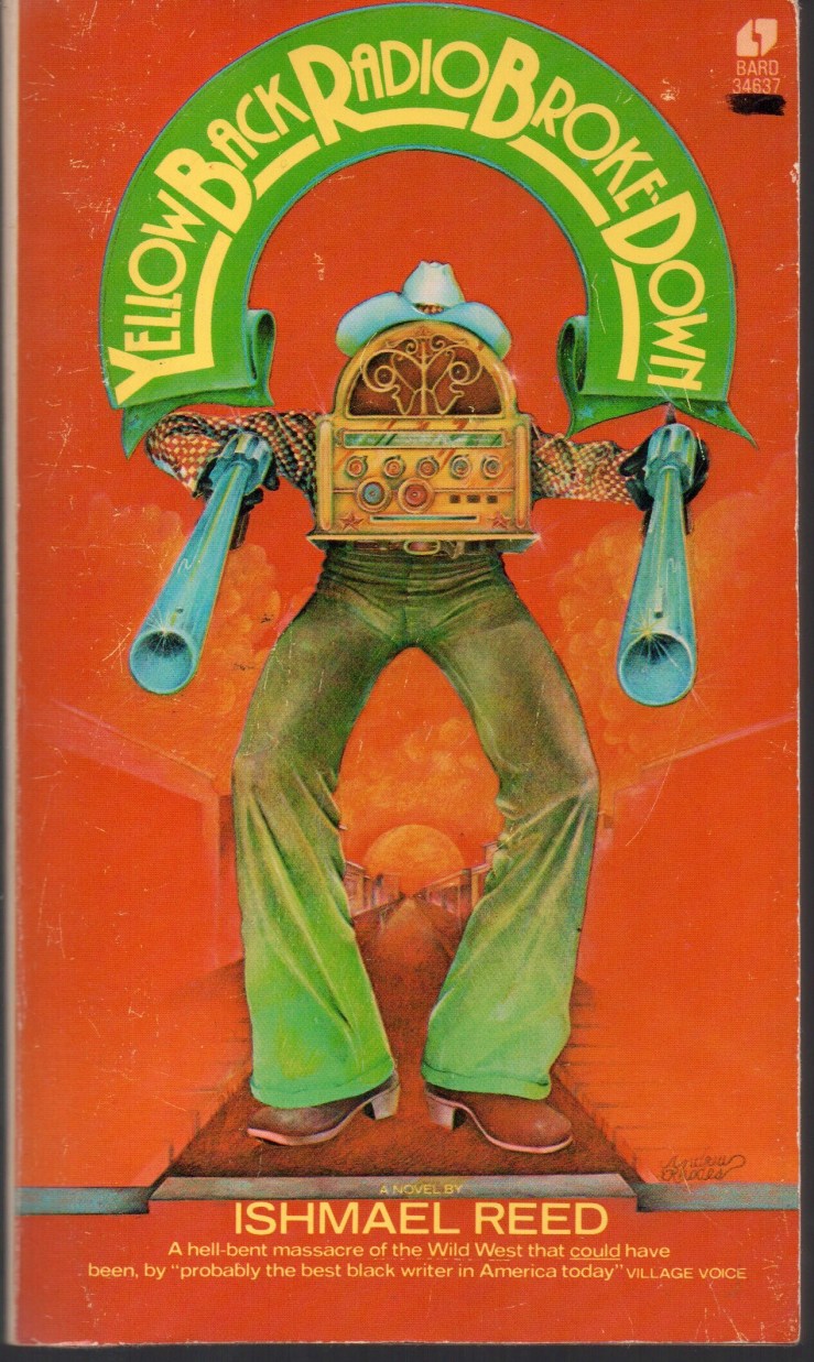
The Free-Lance Pallbearers by Ishmael Reed. 1969 mass market paperback by Bantam Books. No designer or illustrator credited. I finished this last week—a slim, strange, dazzling work.

Three Books

IMG_0525

The Habit of Being: Letters of Flannery O’Connor. Edited by Sally Fitzgerald. 1979 2nd edition hardback from FS&G. Jacket design by Janet Halverson. A marvelous book—Fitzgerald’s editing is wonderful here—there’s a rich index that makes this book a pick me up and read me anytime kind of resource. Particularly great are O’Connor’s letters to ‘A,’ a smart reader whom O’Connor struck up a friendship with in letters.IMG_0522

The Marble Faun; or The Romance of Monte Beni by Nathaniel Hawthorne. 1958 mass market paperback by Pocket Books. No designer credited. I love this cover and design—simple and elegant. The Marble Faun is the only Hawthorne novel (book, really) that I’ve yet to read.IMG_0523

Habitations of the Word: Essays by William H. Gass. 1985 trade paperback by Touchstone/Simon and Schuster. Cover design by Koppel & Scher—and what a great design! (The quotation on the cover is from Gass’s essay “The Soul Inside the Sentence”). I had pulled this book out to find some lines from the first essay, “Emerson and the Essay,” for an American lit class I’m teaching. The essays collected here are brilliant stuff—literary criticism that surpasses “literary criticism.”